Showing posts with label Japan. Show all posts

Thursday, March 1, 2012

Dydd Gŵyl Dewi Hapus / Happy St David's Day

In honour of St David's Day, the national day of Wales, today we focus on one of the Library's Welsh holdings.

One of the fascinations of archive material in particular is the way that it makes things specific: takes large, overarching topics and presents them in terms of particular instances, anchored to real people and real places. Today, of course, we will be looking at an item that takes us to Wales: to Rhagatt Hall in the valley of the River Dee / Afon Dyfrdwy, just downstream of the small town of Corwen.

Over the years this blog has featured extensive coverage of the Library's seventeenth century recipe books. Those are, however, simply the tip of the iceberg: manuscript recipe books continued to be compiled throughout the eighteenth century and on into the nineteenth, finally beginning to fade from common use in the second half of the century (although they are by no means extinct even now). Like the seventeenth-century volumes, these later examples mingle medical, culinary and household management instruction, in varying proportions according to the compilers' preoccupations. Their main point of difference from the earlier books is in their greater use of printed cuttings: as time passes we see people less willing to transcribe every recipe in longhand, when they can cut out something from a printed source and paste it into the recipe book, and some from this late period are composed almost entirely of cuttings.

Today's Welsh item is a recipe book from this late period. MS.8459 is a small volume containing some 130+ pages of medical recipes and other very assorted material, which was formerly owned by Jane Margaret Lloyd (1822-1912) of Rhagatt Hall, daughter of Edward Lloyd of Berth and Rhagatt, and Frances Madocks, daughter of John Edward Madocks of Fron Iw, Denbighshire. It is unclear whether she had the volume compiled or simply came into ownership of it at some stage. Within the volume are recipes for medicines, including homoeopathic ones, and some reports on experiences of their use; there are also recipes for the treatment of cats and dogs. Inserted items include prescriptions: one, dispensed by a chemist in Rhyl, is for a Mrs. Ffoulkes, probably Jane Lloyd herself, since in 1861 she married the Ven. Henry Powel Ffoulkes, archdeacon of Montgomery. There are various cuttings, including at least one in Welsh, the latter forming part of a collection of material on the use of violet leaves to treat cancer. Another cutting provides the lyrics to some popular songs, one of which - "The Lum Hat" - takes us into the realm of broad Scots dialect. Finally, taking us a very long way from Wales indeed, there is an invitation from the Officers and Council of the Japan Society to a Mr Herbert Tinker, asking him to an event also attended by His Excellency the Japanese Minister in the United Kingdom (this would be Count Hayashi Tadasu, who served as Minister from 1900 to 1905 and then as Ambassador for a further year). The presence of the last item, without any explanation, is evidence of the sheer unpredictability of archive material!

Archive material may be unpredictable: but one thing that one can predict, without much fear of contradiction, is that the Library's holdings are sufficiently various for pretty much any subject or part of the world to be represented somewhere in them. This one item is, of course, just a little sample of our Welsh material: the full list of hits on the words "Wales" and "Welsh" in the archives catalogue comes to over 8000. (Our sources guides on British Local History and Topographical Photographs provide a more manageable introduction.) On this day of all days, have a look through them.

Images:
1/ Daffodil, copyright Albert Bridge; from the Geograph website and licensed for reuse under this Creative Commons Licence.
2/ Title page and start of contents, MS.8459.
3/ Material on treatment of cancer, MS.8459.
4/ Inserted prescription envelope, MS.8459.
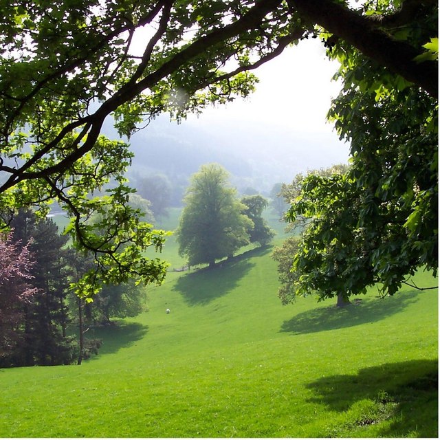
5/ Valley of the River Dee, near Rhagatt Hall, copyright Jonathan Billinger; from the Geograph website and licensed for reuse under this Creative Commons Licence.

Monday, February 27, 2012

Extreme traveller of the early C20th

John Fulton Barr as a young man
A small collection of papers of John Fulton Barr (1868-1954) has just been catalogued and is now available for reader use. Barr qualified in medicine at the University of Glasgow in 1891. According to the donor of the papers, after the relatively tame postgraduate enterprise of going to Paris to study ophthalmology, Barr then joined in the Klondike Gold Rush, an episode in his career sadly not covered by the diaries and other items we hold.

Early in 1900, like so many of his compatriots, he sailed from England to serve in the Boer War. This period of his life is covered by three diaries (PP/JFB/A.1/1-3) and nearly 100 black and white photographs showing a very wide variety of aspects of the life he encountered in South Africa. There are also a couple of postcards from him to a Miss Isabelle Carmichael of Kilmalcolm, Renfrewshire. These materials form a welcome addition to our already significant holdings relating to the war in South Africa, 1899-1902, a topic of continuing interest to researchers.

Following this episode, Barr went to Japan, and was involved in a business venture - a salmon cannery - on the Kamchatka Peninsula in Siberia. Over the years he made several expeditions into this wild volcanic region. Even these days this area presents huge challenges for the traveller because of its inaccessibility and rugged terrain, although a tourism industry is developing. His surviving diary 1907-1909 describes his travels in Japan, China, and Russia and his expeditions into Kamchatka

There are frustratingly no diaries for the period from 1909 until 1917. Thus, although Barr was commissioned as a Lieutenant in the RAMC in August 1914, we only have an account of his war service from November 1917, along with a little, mostly official, correspondence. He was discharged from service in 1919, taking a position as surgeon on one of the ships repatriating chinese labourers after the War, in order to return to Asia.

After further travels in the Far East, and also trips to North America, the Baltic and Australia, Barr returned to the UK.  According to the Medical Directory he held a few hospital medical officer posts in Scotland, before establishing himself in Unstone, Derbyshire (near Sheffield), where he continued to reside after his retirement from practice c. 1940, and to keep up his diaries. He continued to take extended periods of travel: apart from fairly frequent trips to Scotland (mainly Gelston) and a couple to Ireland, he went to South America in 1924 and South Africa in 1932, revisited Japan in 1939, and visited Sri Lanka in 1940, as well as going to Wengen, Switzerland, on  several occasions during the 1930s.

John Fulton Barr in the 1940s
There is a complete run of his diaries covering his career and travels from 1917 until 1948, although according to the British Medical Journal Barr did not die until 1954.

This collection, though small, offers considerable riches to the researcher, adding to our existing treasure-trove of unpublished travel writings as well to our extensive holdings on War, Medicine and Health, and illuminates an unusual and enterprising medical life-course.


Friday, November 19, 2010

"In an admirable manner": Darwinism on the grapevine

Left: woodcut by K. Egawa after a painting by Ryūrikyō, 18th century. Wellcome Library no. 730398i

This Japanese woodcut (left: click on image to enlarge) can be considered from several points of view, one of which is its unwitting role as an illustration of evolution, or rather coevolution. A pair of vines climb up around the stem of a bamboo plant, which helps the vines to grow fruit that serves as food to a grateful bird. Each of the three organisms has an environmental niche enabled by the other two. For example the bamboo serves as a support to the vine enabling the latter to expand its trunk and extend its branches. The bird uses the grape as food and then returns the favour to the vine by kindly depositing the seeds of the grape elsewhere in a ready-made bed of nitrogen-rich fertilizer. Bamboo is grown by humans for innumerable purposes such as bamboo shoots for food and bamboo stems as scaffolding for buildings. Conversely, vines that were less able to entwine themselves around the bamboo, or failed to grow big juicy grapes, failed in the struggle for life and are no longer with us, and the same is held to be true, mutatis mutandis, for bamboo and birds.

One would think that Charles Robert Darwin would have relished it -- all the more so because one of his lesser known publications was a treatise 'On the movements and habits of climbing plants' which was read on 2 February 1865 to the Linnean Society of London, published in its Journal in the same year, and reissued with a different title and revised text in 1882 (and subsequently). He discusses questions such as exactly how climbing plants like the vine manage to pull themselves up round any kind of support such as a vineyard trellis or a bamboo. He replies with a remorselessly systematic micro-analysis of the mechanisms involved: climbing plants are of two kinds, those that revolve around a stem and those endowed with irritable organs which, when they touch any object, clasp it. Torsion, rotation and circumnutation are among their subroutines.

Wood engraving of Bryonia dioica, from Charles Darwin,
The movements and habits of climbing plants, London 1891, p. 165.
Wellcome Library

However, the larger implications are always present. For example, how does the vine find the bamboo in the first place? Natural selection is predictably his ready-made reply: "The first purpose of the spontaneous revolving movement [of an entwining plant]… is to favour the shoot finding a support" (revised version pp. 14-15).

Darwin's conclusion is as follows, starting with a dig at the ever-present Aristotle:

"It has often been vaguely asserted that plants are distinguished from animals by not having the power of movement. It should rather be said that plants acquire and display this power only when it is of some advantage to them; this being of comparatively rare occurrence, as they are affixed to the ground, and food is brought to them by the air and rain. We see how high in the scale of organization a plant may rise, when we look at one of the more perfect tendril-bearers. It first places its tendrils ready for action, as a polypus places its tentacula. If the tendril be displaced, it is acted on by the force of gravity and rights itself. It is acted on by the light, and bends towards or from it, or disregards it, whichever may be most advantageous. During several days the tendril or internodes, or both, spontaneously revolve with a steady motion. The tendril strikes some object, and quickly curls round and firmly grasps it. In the course of some hours it contracts into a spire, dragging up the stem, and forming an excellent spring. All movements now cease. By growth the tissues soon become wonderfully strong and durable. The tendril has done its work, and done it in an admirable manner."

Note the value judgment in the last sentence. In describing the tendril as having "done its work … in an admirable manner ", Darwin uses language that that would normally be applied to a craftsperson such as the Japanese artists of our woodcut. A positive admirability in carrying out a defined task seems to be what drives all the processes mentioned here. It is what makes people want to buy and disseminate the work of the painter Ryūrikyō, while the lack of it in lesser painters prevents the survival of the works of these latter.

In fact there are several layers of competition going on here. The vines, the bamboo and the bird are competing with their respective rivals in the struggle for existence. Those depicted here have succeeded. The work of the painter Ryūrikyō was carried out in such an "admirable manner" that K. Egawa made a woodcut of it – again "in an admirable manner", for he (or more likely the pressman T. Tamura) has added individual snow flakes in gouache: it is late in the season, the leaves are sere, the bird is getting cold and needs nourishment. Within the environment or context of evolution, this work is more admirable than that of artists generally considered superior, such as this 1856 dramatic scene (right) by the illustrious Utagawa Kunisada (Toyokuni III), where the gourd-bearing cucurbitacea entwines itself around a pergola.

Above right: two actors playing as Matsushita Kahiji and Konoshita Tokichi. Colour woodcut by Kunisada I, 1856. Wellcome Library no. 35847i

Moving to another layer, Charles Darwin's literary comment on the events depicted was apt enough to be quoted in illustration of the processes of the winding vines. Darwin originally wrote "food is brought to them by the wind and rain" but later changed "wind and rain" to "air and rain" to cover himself in cases such as humid summer days when the air is still. The original phrasing including the word "wind" lost out in the struggle for existence. Darwin's text has "evolved" thanks to his rephrasing of it "in an admirable manner".

Then, just as the admirable features of the luscious grapes attracted the bird, so the admirable features of the woodcut led to its being acquired by Henry S. Wellcome and reproduced on this blog named after him: as the process has got this far, it must have been accomplished "in an admirable manner". Many other prints, paintings and photographs which could have been reproduced were rejected. And if all these things had not been carried out "in an admirable manner", you would not now be reading these words, as they would, minutes ago, have lost the competitive struggle for your attention.

Within a collection of documents as broad and many-sided as the Wellcome Library, all may look at first sight as peaceful as a country hedgerow or river bank. Once you start to look at it in detail, draw connections, make comparisons, and note differences, it begins to look as complex as the habitat so vividly described by Darwin and republished in an earlier posting on this blog: seething with an invisible struggle for existence, meaning, significance, and delight.

Notes

The original version of Darwin's work was 'On the movements and habits of climbing plants', Journal of the Linnean Society of London (Botany), 1865, 9: 1-118; available online in The complete work of Charles Darwin online at http://darwin-online.org.uk/content/frameset?viewtype=side&itemID=F834a&pageseq=1

The revised version bears the title The movements and habits of climbing plants, London: John Murray, 1891; available online in The complete work of Charles Darwin online at http://darwin-online.org.uk/pdf/1882_Movements_F839.pdf . Darwin's "concluding remarks" are on p. 206

The woodcut reproduced at the top has a guard sheet containing an attribution of the original painting to Ryûrikyô. The British Museum
online catalogue has four paintings attributed to an artist of the same name, who is identified as an 18th century follower of Yanagisawa Kien (1704-1758). He seems to be not the same as the better-known Ryūryūkyo Shinsai (fl. 1799-1823).

Thursday, September 9, 2010

Stone brocades of fish and football

In any historical library, there is a continuous conversation between, on the one hand, the subjects discussed within the library's holdings, and, on the other hand, the forms (vocabularies, media, genres, materials) in which those subjects are thought about, discussed, and transmitted. But this is particularly a feature of the Wellcome Library on account of its diversity of document-types –- not just monographs and runs of periodicals but … well, for pictorial documents alone, all of these, and more.

For convenience we usually turn a deaf ear to this dialogue, pretending (if we take examples of vocabulary) that "plague", "anatomy", "gout", "cholera" and "consumption" have always had whatever meanings we want them to have today, regardless of context. [1] Still, it is worth occasionally eavesdropping on it, as we can learn valuable lessons thereby. Let's look at an example of changing media within the field of colour printing.

Left: coloured aquatint by W. Say after F.R. Say for Richard Bright, 1 January 1827. Wellcome Library no. 30636i

Printing in coloured inks may be taken for granted by the casual magazine reader of today, but that reader's magazine can only be produced as a result of technical evolution over many centuries, and technology transfer over many thousands of miles. Before those procedures were developed, paper was printed in one colour (usually black ink on white paper) and then each copy was coloured by hand. That was the technique used for example in the anatomist Richard Bright's 1827 depiction of the distinctive dark-chocolate-like kidney which he found in people with Bright's Disease (as it was named soon afterwards).


Right: colour woodcut by Kunisada I, 1857.Wellcome Library no. 35824i

Japan has a long history of colour printing which can be studied in the Wellcome Library through colour woodcuts. There are currently about 700 Japanese woodcuts in the Wellcome Library catalogue, and others yet to be catalogued, in addition to Japanese printed and handwritten books. Unlike Richard Bright's print, most of these woodcuts were actually printed in colours.

The example on the right, dated 1857, shows the actor Ichikawa Kodanji in character enjoying a summer meal. In order to show the different ceramics (teacups, ashtray, etc.) and papers (his fan alone is printed with papers of two different colours and designs), a different woodblock was cut for each colour, each block was inked with ink of one colour, and the same sheet of paper was printed from each of the blocks in turn. The technique was introduced by Harunobu (1725-1770) around 1765. [2]

Such colour woodcuts were called nishiki-e, or "brocade prints", because the existing things which they most resembled were brocades or embroideries. In brocades the colour was not applied to the substance of the product but was inseparable from that substance. Just as no dying was needed for brocades, so no hand-colouring was needed for colour woodcuts: hence the latter were nishiki-e, brocade prints.

Above, Amatai (tile-fish); below, Kurodai (black porgy). English-language equivalents are approximate only. Colour lithograph, 1883-4. Wellcome Library no. 727281i

However, these fish (above), though also printed in colours, are something different. The print is one in a set of twelve colour prints in the Wellcome Library that were produced (in 1883-1884) not on a woodblock but by lithography. Instead of being cut on a woodblock, the design was drawn in waxy crayons on the surface of a very smooth stone, the stone was inked with ink of one colour, and a sheet of white paper printed from it. Just as in woodcut printing, so with lithography, each of the parts of the design (the blue parts, the yellow parts etc.) would have to be drawn on one of several stones. Of course it was essential to make sure that the registration of the paper was absolutely identical from stone to stone, otherwise the result would look like a Picasso from one of his discordant-planes periods. That was the tricky bit, but it had already been mastered in Japan by professional woodcut artists.

The same principle is used with modern rotary presses, in which the paper passes in succession between several sets of rollers, each one inked by jets emitting a different colour of ink. However our fish prints predate rotary presses: they were printed by hand on flat stones. If one looks at the original impressions closely, one can see the grain of the stone, especially in the black-inked parts.

Although the phrase nishiki-e was well established as referring to colour woodcuts, the publisher of the fish lithographs gave the collection the title Namima no nishiki, or "Brocades of the waves", a title that radiates a rainbow of meanings. As viewers, we are invited by that title to consider the continuity with the traditional nishiki-e, the colour woodcuts. Then there is a reference to fish as lustrous polychrome marvels that coruscate as they dart through sunlit waters, whether carp in a Japanese water-garden or saltwater fish seen from fishing-boats in the Western Pacific. Their silvery and golden skin veined with red, blue and brown makes them shimmer like living brocades of silver or gold thread. And thirdly there is pride in the use of lithography, one of the new techniques introduced in the Meiji reign, which captures the gradations between these colours and shades as finely as the finest of silk threads, and more subtly than even the most revered traditional masters of colour woodcuts –- Kuniyoshi, Hiroshige, or Utamaro.

Top to bottom: Aji (scad); Sappa (sardinella); Kohada (shad). English-language equivalents are approximate only. Colour lithograph, 1883-4. Wellcome Library no. 727282i

Our set of twelve fish prints from 1883-1884 was produced in Tokyo by the National Printing Company, a firm that now prints official documents such as banknotes and postage stamps – paradoxically, since nowadays those are almost the only two common types of print that are not produced by lithography (they are produced by gravure, from engraved metal plates: lithographs would be too easy to counterfeit). In a brief paragraph of introduction, the director speaks on behalf of the Japanese nation. We live, he says, surrounded by a rich ocean, which perpetually supplies us with a vast variety of fish. These fish play an important role in our daily diet. Although there have been many books published that describe the minute distinctions between the many similar types of fish, these are not suitable for didactic purposes. That is the main reason for the publication of these highly detailed prints of fish. The improvements made by the technique of lithography mean that finer details of the fish can be shown, and consequently we can correct and improve public knowledge of fish, the staple of life.

He is true to his word. Few colour photographs could today reproduce the textures and hues of these gleaming "brocades of the waves". If any of the fish portrayed is or were to be thought to be extinct, these prints could be the models with which any suspected survivor might be compared.

Left: a young woman rides on horseback accompanied by an older man on horseback and his servant on foot. Colour lithograph in the style of Tosa Mitsuoki, 1894. Wellcome Library no. 728888i

From a mere ten years later (1894) we have another set of twelve colour lithographs: very different. They were produced not in Tokyo but in Osaka, and they recall the courtly life of nearby Kyoto, the former seat of the imperial court. The subject matter is the sports, recreations and pastimes of the court, probably as narrated in some work of literature such as the Tale of Genji. The identities of the characters (and the name of the series, if there is one) still have to be worked out.

The compositions are stylised in imitation of the courtly works of Tosa Mitsuoki (1617-1691). The Tosa school was officially sponsored by the court to represent its standards of aesthetic exquisiteness, much as the Limbourg brothers did for the Burgundian court over a hundred years previously. As these prints show, it was still remembered and imitated into the Meiji era, no doubt with an element of nostalgia for the finer features of the pre-industrial life of the elite.

Right: three men playing kemari (football). Colour lithograph in the style of Tosa Mitsuoki, 1894. Wellcome Library no. 728891i

One of the prints (above left) shows a woman being taught to ride, and another (right) shows dignitaries playing kemari, a form of football – though not with due dignity, as one of the eminences has lost his shoe while kicking the ball. (A game of kemari features in the Tale of Genji, where a freak accident to a spectator plays a key part in the plot, but in this print no spectator is shown.) In every one of the twelve scenes, clouds lit by golden sunshine traverse the field of view at several different heights, a favourite device of the Tosa school (and of its Art Nouveau admirers). The ease with which lithographic printing in gold can represent the sheen of sunlight is exploited to the full by our artist. Years in the future, the techniques used to render these decorative patterns would lead to the colourful wrapping papers surrounding the millions of last-minute gifts on sale in Japanese railway stations, airports and kiosks.

The Tosa lithographs preserve an ancient Japanese subject and style by means of a modern technique. The pastimes of the elite are portrayed in a medium accessible to the mass market. The fish lithographs are from a decade earlier, but use a later style. To portray the staple diet of Japanese, they use a foreign technique, not much different from Austrian or German natural history prints of the same period. Historians have to try to keep in their heads a sense of what was "normal" (feasible and acceptable) at various periods, and for whom, but that requires an intimate knowledge of what actually existed, and when.

In addition to the Wellcome Library and many other repositories, students of the history of colour printing, such as Bamber Gascoigne, are fortunate to have a more specialized study collection: the magnificent Waddleton Collection, now the proud possession of Cambridge University Library. Norman Waddleton (1916-2008) was a patent agent who built up a collection of examples of colour printing: a good subject for him, as his profession depended on the discernment of small technical modifications of the type shown in the evolution of colour printing. Waddleton's database lists not only items in his collection but also, valuably, items missing from his collection. His collection includes Japanese works, but our fish prints and the Tosa set (inasmuchas it has been identified so far) seem to have eluded him in both lists.

Just as colour lithography in the 19th century incorporated and in some ways surpassed the effects of woodcuts and engravings, so our own knowledge of the past evolves by building on the knowledge of our fellow-researchers such as Waddleton. These "stone brocades" have only just been added to the Wellcome Library catalogue this summer, but there are still in prospect many other additions that can refine the continuing conversation between message and medium.

Many thanks to Mitsui Takehito for his work on the fish prints.

[1] Andrew Cunningham, 'Identifying disease in the past: cutting the Gordian knot', Asclepio: revista de historia de la medicina y de la ciencia, 2002: 54: 13-34

[2] Susanne Formanek and Sepp Linhart (edd.), Written texts--visual texts: woodblock-printed media in early modern Japan, Amsterdam: Hotei, 2005, p. 343

Monday, November 23, 2009

Courier duties to the Mori Art Museum, Tokyo

Leonardo di Vinci, Damien Hirst and Marc Quinn are just a few of the famous artists whose works will be displayed at the Mori Art Museum in Tokyo, as well as other contemporary and historical items from the collections of the Wellcome Library and Wellcome Collections. This exciting exhibition is based on the theme "Medicine and art: Imagining a future for life and love", and my colleague Stefania and I have been privileged - in our roles as conservators at the Wellcome Library - to be involved.

We travelled to Tokyo last week, arriving on 19 November when we settled into our apartments to recuperate from the long journey. Jet lag was quickly forgotten as we traveled around Tokyo, visiting the infamous fish market with Mami Hirose, the Project Manager at the Museum and two other couriers from the Science Museum (who are also loaning many items to this exhibition) - Emma Duggan and Lisa O'Sullivan among other sites.

The Mori Art Museum (located in the Mori Tower - see top image) has 6 galleries and 2 halls, and we started our first working day in Gallery 6 by unpacking the first X-ray machine and some of the iconographic items from the Wellcome Library. It was our duty to manage the unpacking and installation of items loaned by the Wellcome, and we were pleased that the objects arrived safely. Only one crate suffered minor damage; as a result, a Warhol print had dropped down in its frame and had to be rehinged and reframed. Stephania installed the largest books as well as a metal mannequin artifact that had been used as an anatomical teaching tool. This wrapped up our first busy day at work in the Mori.


Author: Gillian Boal

Wednesday, May 6, 2009

The Art Nouveau Whiplash

Illustration: Design work, 1900.

One of the defining emblems of the Art Nouveau movement was the whiplash motif. It has been known by various other names and formats, ranging from 'noodle' to 'tapeworm' but the moniker of 'whiplash' has stayed with the movement.

The lines that very often make up the design work of the period, were often seen as languorous, sensual and by some even lascivious, but they could also provoke ideas of sharper and more defined movement and gesture. 'Whiplash' is not the first word that comes to mind when thinking of the soporific qualities that Art Nouveau is often famed for. However, it does show that the movement could be adaptable and when it needed a harder edge, it could find one, even if just a metaphor.


Illustration: Design work, 1900.

No decorative style appears fully formed devoid of roots, and the Art Nouveau movement is no different. It has its origins in a number of styles and cultures from a range of eras that include Victorian Gothic and the Arts & Crafts movement. The iconic whiplash however, can trace its origin to a revived interest in the highly decorative, but very often fragile Rococo interiors of the eighteenth century.

Similarities between the two decorative styles are there and can be identified quite clearly. Both used the sensual and the sinuous in large quantities, and both have become associated as feminine in style and sympathy. However, they were also both often accused in their own contemporary eras of being overly fussy, convoluted and resorting to studied decadence and affectation. It would perhaps be stretching credulity a little too far to draw too many conclusions as to their shared similarities, this would imply that at some basic level ,they were the same, and they were clearly not. The world of the eighteenth century Rococo was not the same space as nineteenth century Art Nouveau, there were different theoretical ideals to the two decorative styles, as well as general social and political differences in the historical eras themselves.


Illustration: Design work, 1900.

There were also many new and different influences on the latter style than the former. For example, Art Nouveau was heavily indebted to traditional Japanese design culture, Japan being a largely isolated and unknown entity in the eighteenth century. Out of the interest in Japanese decorative styles and particularly their art and craft techniques, came the use of the graphic flat one-dimensional aspect of much of the Art Nouveau output. Although surface pattern and design was used extensively through much of the nineteenth century across Europe, it was the Japanese influence that produced some of the most recognised elements of the Art Nouveau period.

Illustration: Design work, 1900.

Which brings us back to the whiplash. While it undoubtedly has its origins in the European Rococo decorative style of the eighteenth century, it also owes a great debt to a range of style eras from Celtic to Japanese. it would perhaps be more accurate to call the whiplash and Art Nouveau in general an eclectic style may well help to sum up, at least broadly, both the appeal and purpose of the movement.

Further reading links:
Art Nouveau Designs (Design Source Books)
Art Nouveau
Art Nouveau: Utopia: Reconciling the Irreconcilable (Taschen's 25th Anniversary Special Editions Series)
422 Art Nouveau Designs and Motifs in Full Color (Dover Pictorial Archive Series)
Art Nouveau (Art and Ideas Series)
305 Authentic Art Nouveau Jewelry Designs
Treasury of Art Nouveau Design & Ornament (Dover Pictorial Archive Series)
Art Nouveau Flowers (Design Source Books)
300 Art Nouveau Designs and Motifs in Full Color (Dover Pictorial Archive Series)
Art Nouveau 1890-1914
Art Nouveau in Fin-de-Siecle France: Politics, Psychology, and Style (Studies on the History of Society and Culture)
The Art Nouveau Style
Art Nouveau Floral Patterns and Stencil Designs in Full Color (Dover Pictorial Archive Series)
The Essence of Art Nouveau
Art Nouveau: An Anthology of Design and Illustration from "The Studio" (Dover Pictorial Archive Series)

Sunday, March 1, 2009

The Publications of Christopher Dresser


Illustration: Christopher Dresser. Decorative example from Studies in Design, 1876.

Christopher Dresser as well as being an innovative and often ground-breaking designer and critic, is probably just as well known today for a series of books he wrote and published, starting in his early twenties and stretching throughout his career.

The titles, mostly dealing with decorative and ornamental design, tended to correspond with his frequent lecture tours throughout the UK during the latter half of the nineteenth century and were often used to publicise not so much his career, but his strong belief in the benefits of fundamental design reform in Britain.


Illustration: Christopher Dresser. Decorative example from Studies in Design, 1876.

In 1857, he wrote a series of six articles entitled Botany as Adapted to the Arts and Art-Manufacture that appeared in the prestigious British Art Journal magazine. These articles were the start of a highly successful and influential writing career.

By 1862 when he published the Art of Decorative Design, his written work had become more like a manifesto in its character, than an observational exercise. Dresser had never intended to merely sit back and dispassionately comment on contemporary and historical decorative styles without any form of engagement. He was a born reformer and had a number of fundamental and wide-ranging issues with Britain's often-difficult relationship between manufacturing and design.


Illustration: Christopher Dresser, Decorative example from Studies in Design, 1876.

A number of volumes in a largely educational tone appeared in the next few years, one of which Principles of Decorative Design published in 1873, had originally appeared as a series of articles in the monthly Technical Educator magazine.

Dresser was by no means unusual in producing educational books, articles and lectures dealing with decoration and design. There was a genuine interest in expanding the educational knowledge of the educational establishment, industry and indeed that of the general public. Both student and professional designers were encouraged to concentrate on all aspects of design thinking in order to try to produce mass produced work that could be seen as both rational and functional, rather than that of decoration and flippancy for its own sake. As far as the public were concerned, it was thought that a consumer with at least a rudimentary knowledge of good design techniques would be better placed to make wise decisions when purchasing goods. This, it was hoped, would pressurise manufacturers and retailers into producing consumer goods that were both better styled and better manufactured.


Illustration: Christopher Dresser. Decorative example from Studies in Design, 1876.

Probably Dresser's most famous and successful book was Studies in Design published between 1874 and 1876 from which these illustrations are taken. Originally published in twenty parts, Dresser himself felt that this title was his most prestigious publication. He summed up his intention with this particular publication, by explaining that the book was "to bring about a better style of decoration for our houses", though this explanation could equally apply to many of the titles published by him throughout his career.

After the publication of Studies in Design Dresser's ideas about design, decoration and manufacturing were to change direction fundamentally when in 1876 he made his first trip to Japan. Dresser had been dealing in Japanese goods for a number of years and was well aware of Japanese styles of decoration and ornamentation, as can be seen in the images shown here from his Studies in Design. However, it was the four months that Dresser stayed in Japan, travelling widely, visiting and observing every aspect of Japanese life, which changed his thinking on fundamental aspects of both decoration and design.


Illustration: Christopher Dresser. Decorative example from Studies in Design, 1876.

Dresser began to lecture and write on subjects that dealt with the use of materials and the simplicity of form. His trip to Japan put in place ideas about form and function that were to lead inevitably towards the twentieth century's mantra of  form follows function, a concept that was to be at the very core of Modernism.

In the 1880s, Dresser published a series of books that dealt with Japan and contemporary ideas on decoration and ornamentation. In 1882, he published Japan, its Architecture, Art and Art Manufactures which did much to popularise, not only Japanese styles of decoration, but more importantly, the fundamental ideas that lay behind Japanese ideas on design and the manufacturing of consumer goods.

Dresser is often classed today as a pioneer of Modernism through his work as a designer. However, he was also a great educator who believed that to progress within design you needed to bring the general population along with you, and this could only be done through education. His books helped many to understand the design and manufacturing ideals of the nineteenth century, but also helped to prepare many for the coming century where new ideas about the use of materials, form, style and function were to change design dramatically and fundamentally from all that had gone before.

Further reading links:
Christopher Dresser : A Pioneer of Modern Design
Dresser's Victorian Ornamentation: 150 Designs (Dover Pictorial Archive Series)
Shock of the Old: Christopher Dresser's Design Revolution
Christopher Dresser: A Design Revolution
Christopher Dresser
Christopher Dresser 1834-1904
Pomegranate Christopher Dresser Standard Boxed Note Card Set (Pack of 2)
Studies in Design
Alessi Christopher Dresser Tray
christopher dresser oil & vinegar set by alessi
Japan : its architecture, art, and art manufactures (1882)
christopher dresser cheese cellar by alessi
Principles of Victorian Decorative Design
Pomegranate Dresser Design Square Embossed Boxed Note Card Set (Pack of 2)
christopher dresser small footed bowl by alessi
Tea-Service with Gilt Interiors, Manufactured by James Dixon & Sons, 1880 (Electro-Plated Silver) Giclee Poster Print by Christopher Dresser, 18x24
Language of Ornament : Style in the Decorative Arts
A Fine Clutha Solifleur Vase Giclee Poster Print by Christopher Dresser, 18x24