
Tuesday, January 31, 2012
The Boilly exhibition in Lille
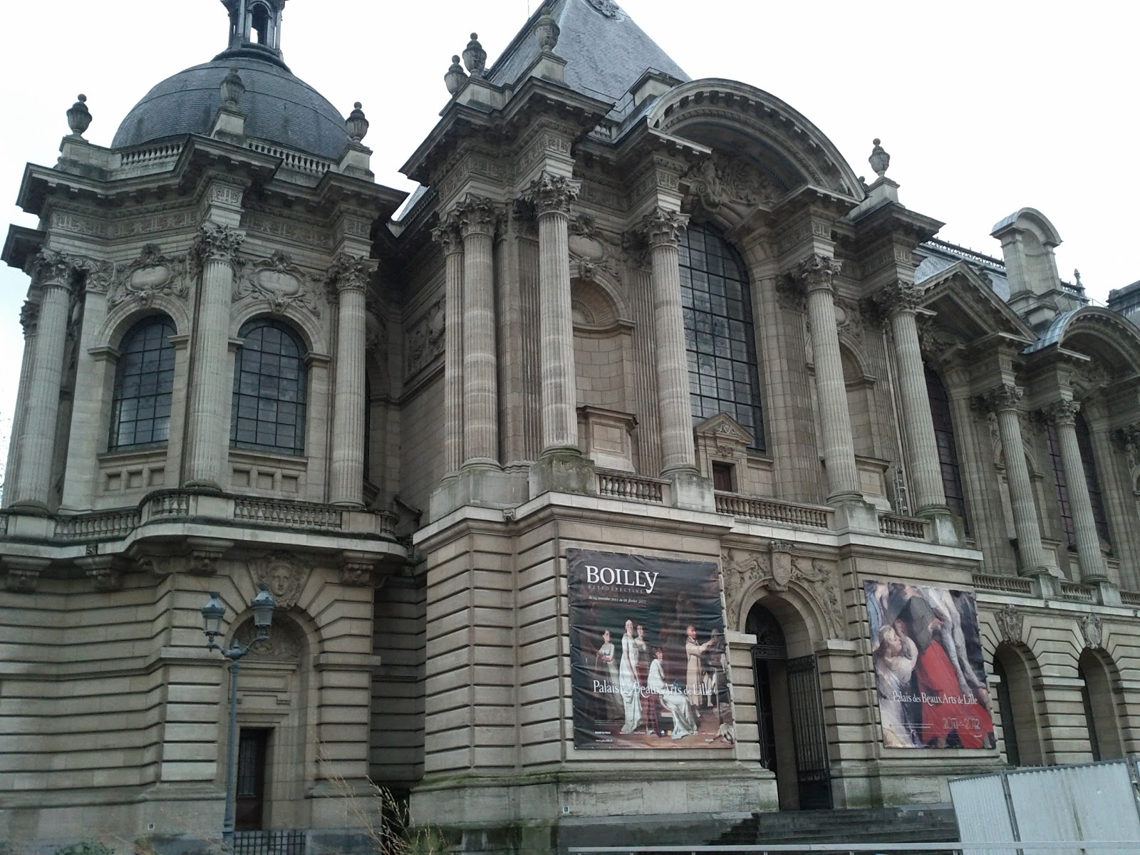
For anyone with easy access to Lille – and that includes anyone in London, which is 90 minutes from Lille by direct Eurostar train, at a price – the exhibition of works by the painter Louis-Léopold Boilly (1761-1845) is well worth visiting. It is on display at the aptly named Palais des Beaux-Arts: the photograph (left) shows the north-east corner of this truly palatial building. Boilly was a local artist: he came from La Bassée (about 20km from Lille), practised painting at Arras (about 30km from La Bassée) and moved away to Paris in 1785.

Boilly's work is admired for its precision and virtuosity, treasured for its value as a historical witness, and loved for its humour and sympathy. These qualities are well-displayed in the exhibition, and indeed in this fittingly mounted and framed self-portrait drawing (right: no. 34) on loan from the Museum of Fine Arts at Boston, Massachusetts.
Boilly's early pictures from the Ancien Regime are gallant scenes in the manner of Beaumarchais's plays. Most of those exhibited are from a series painted for a nobleman called Calvet in Avignon and are on loan from Saint-Omer. (Other paintings from the same series in the Wallace Collection in London may not be lent.)
Boilly's early pictures from the Ancien Regime are gallant scenes in the manner of Beaumarchais's plays. Most of those exhibited are from a series painted for a nobleman called Calvet in Avignon and are on loan from Saint-Omer. (Other paintings from the same series in the Wallace Collection in London may not be lent.)
We discover that the stories shown in these paintings were given to Boilly by Calvet himself. As with a series of prints from the same period (Estampes pour servire à l’histoire des moeurs et du costume des françois dans le dix-huitième siècle, 1773-1784), the "authors" of the picture include not only the painter or engraver, but also the person who devised it (in this case Calvet), even if he never lifted a paintbrush or an engraving tool.

To help earn his family's bread and butter, Boilly painted many small portraits, all in the same format but nevertheless distinctive. He may have painted over 4,000 of them; they certainly appear regularly in the auction rooms. In the exhibition their character and number are suggested by a wall containing twenty of them hung together at the beginning of the exhibition (left).

Boilly's virtuosity is shown in his amazing trompe l'oeil paintings. One (no. 169) bought by Lille in 1974 is available in the museum shop in the form of trays, mouse-mats and fridge magnets. The catalogue reveals (p. 63) that the term trompe l'oeil was coined in 1800 to describe Boilly's paintings, though the genre itself had existed at least since the 17th century. Another superb example not in the exhibition was sold at Christie's New York last week (The Art of France, New York, 25 January 2012, lot 144: image, right, from Christie's catalogue). It shows the back of a torn canvas, with a cat looking though the hole at a pair of mackerel hanging from the back of the stretcher: all painted in oils! For this marvel a European private individual paid $842,500 (£541,649, €650,981) including buyer's premium. In the exhibition, Boilly's genius is demonstrated in his trompe l'oeil oil paintings in grisaille imitating non-existent engravings after his own paintings: one such grisaille painting is lent by the National Gallery, London (reproduced further below).

Caught up in the French Revolution, Citoyen Boilly could not but be overwhelmed by daily life in Paris, which thereafter dominated his paintings, giving them great historical value. In portraiture, his masterpiece is the Atelier of Isabey from the Louvre (no. 68), showing 31 men, mostly fellow artists, in the studio of the painter J.B. Isabey. They include the rising stars of the day such as the flower painter Pierre-Joseph Redouté, the Romantic mythologist Anne-Louis Girodet, the brilliant pair of neoclassical architects Percier and Fontaine, and Boilly himself. Equally significant are those omitted: the big guns of the establishment, such as Gros, David, and Ingres. A sensation when first exhibited in An VI (1798), at Lille it is shown with a number of painted sketches for the figures, showing the great amount of work that Boilly put into both the individual portraits and the mellifluous composition. One of the studies was stolen in 1964: its reproduction in the catalogue (p. 156) may lead to its identification.

Paris as a city of pleasure is brilliantly portrayed in the Entrance to the Turkish gardens (1812, no. 136) which was bought by the Getty Museum at Christie’s New York on 27 January 2010. Boilly normally works on a very small scale by the standards of his time, but this picture is large for him (73.3 x 91.1 cm.) and contains a very rich cast of characters amusing themselves in the square outside a Turkish restaurant and ice-cream parlour. One can see why the Getty was prepared to put aside $4.5 million for it. Also exhibited is one of Boilly's preliminary drawings for the painting, which was identified in Antwerp as a result of the publicity surrounding the Getty's purchase of the oil painting: the Getty Museum subsequently bought the drawing too (no. 137).

It is one of several paintings which excel at showing contemporary moeurs: others are paintings of women playing billiards (no. 126, from the Hermitage, St Petersburg), a father giving his daughter a geography lesson (no. 138, from the Kimbell, Fort Worth), and conscripts from 1807 passing through the Porte Saint-Denis (no. 130 from the Musée Carnavalet, Paris): a tiny detail in the lower right corner of the last painting shows a veteran who has lost his sight (right).
 |
| Wellcome Library no. 40474i |
One of these contemporary scenes (here dated to 1807) is a painting lent by the Wellcome Library (above: no. 131). It shows vaccination being carried out, within the first decade of its introduction into France: the procedure is said to have been first carried out by Pinel at the Salpêtrière in 1800. It was shown next to no. 128, on loan from St Louis, Missouri, which is from the same year and about the same size, and shows a less affluent family following the progress of Bonaparte's army through Prussia on a map.


Above and right, the installation of the Wellcome Library and St Louis paintings, supervised by Gillian Boal (Wellcome Library), Thierry Germe (Architect) and Annie Scottez de Wambrechies (Conservateur en Chef).
Also on display was one of Boilly's drawings for the Wellcome Library painting (below: no. 132), suggesting that he had previously thought of it as a more compact and intimate scene, but later enlarged it to emphasize the gravity of the occasion.

The catalogue includes an essay by Humphrey Wine (of the National Gallery, London) on Boilly and Great Britain. It was a subject well worth investigating, but unfortunately it reveals that the British have been little interested in Boilly. Perhaps this is not surprising considering the amounts paid by British collectors for the home team: painters such as Devis, Zoffany, Edward Bird, Wheatley, Rowlandson, David Wilkie, and many other artists whose work overlaps with some aspect of Boilly's. Boilly was of course collected by the 4th Marquis of Hertford (the creator of the Wallace Collection, so named after his illegitimate son), but then Hertford was specializing in French art of the period. As a notable exception to the general British indifference, the author is kind enough to mention the Wellcome Library painting, which was acquired in 1994.

Provenances in the catalogue show who really did value Boilly. Williamstown, Massachusetts (pop. 7,754) in the Berkshires provides no fewer than three paintings. One (left: no. 65) had belonged to the Singer Sewing Machine heir Robert Sterling Clark, and passed to the Sterling and Francine Clark Art Institute in Williamstown. Following his example, the Clark Institute has bought another two pictures by Boilly, including a trompe l'oeil piece (no. 163). Lille itself, other institutions in the Nord such as Saint-Omer and Tourcoing, Versailles, the Musée du Louvre, the Musée Marmottan (where the present writer was privileged to see a smaller Boilly exhibition in 1984), the Musée Carnavalet and other Paris institutions, have also acquired valuable works which are on show here.
In Boilly's own lifetime, Prince Nikolai Borisovich Youssoupoff (1751-1831) owned four of the paintings now on display in Lille, one of which was bought before 1812: two are from the Pushkin Museum, Moscow (nos. 43 and 66), one from the Hermitage, St Petersburg (no. 126), and one was sold by the Soviet Union and is now on loan to Dallas Museum of Art (no. 44). Prominent dealers who have committed themselves to his work in recent times include Agnew's (nos. 128, 129, 131), Hazlitt Gooden and Fox (nos. 113, 138, 163, all now in America), Didier Aaron (191), and Etienne Breton (nos. 105, 189).

It is striking that three of the four paintings on loan from British collections have belonged to women. The National Gallery's grisaille (left: no. 186) was presented in 1937 by Emily Iznaga Clement, of a Cuban sugar-refining family, and had belonged to her sister Doña María Consuelo Iznaga y Clement, sometime Duchess of Manchester (1858-1909). The extraordinary trompe l'oeil table from Wimpole Hall, Cambridgeshire (below: no. 164, National Trust) had been bought by Rudyard Kipling's daughter Elsie, Mrs George Bambridge (1896-1976). 
The Wellcome Library painting came from the sumptuous residence of Graziella Patiño de Ortiz-Linares, in the Avenue Foch, Paris. Another painting, the one owned by Robert Sterling Clark, had previously been bequeathed by Alfred De Rothschild to Almina, Countess of Carnarvon, who in 1895 had married the 5th Earl (d. 1923): she sold the painting from Highclere in 1925, and died as recently as 1969.

The Wellcome Library painting came from the sumptuous residence of Graziella Patiño de Ortiz-Linares, in the Avenue Foch, Paris. Another painting, the one owned by Robert Sterling Clark, had previously been bequeathed by Alfred De Rothschild to Almina, Countess of Carnarvon, who in 1895 had married the 5th Earl (d. 1923): she sold the painting from Highclere in 1925, and died as recently as 1969.
A further point that could be observed only by visiting the exhibition is that the ornate neoclassical frame of the Wellcome Library painting (above) has strong similarities to frames on two other works in the exhibition: no. 114, from the Louvre, and no. 184, from Saint-Omer. All three works passed through Galerie Charpentier: the Saint-Omer and Wellcome paintings both on 11 December 1934, the Louvre painting in 1959. Could the Galerie Charpentier have commmissioned these carved and gilt frames?
Congratulations to Lille for a fitting tribute to its brilliant native son on his 250th anniversary. The exhibition is considered to be of national importance and has therefore received funds from the French Republic. It is also sponsored by the Wellcome Library's Euston Square neighbours Grant Thornton. Unfortunately the exhibition is due to close on Monday 6 February, but for anyone who has a free day before that date, here is the Eurostar timetable from St Pancras to Lille. If you can't make it, both Louis-Léopold and his son Julien Léopold (called Jules, 1796-1874) are abundantly represented in the Wellcome Library by their graphic work, which is not treated very thoroughly in the exhibition. For students of the reception of literary works by women, the collection of portraits of women writers by Jules is particularly noteworthy (Wellcome Library no. 40182i).
The Lille exhibition catalogue is also available in the Wellcome Library: click here for details. Other reviews of the exhibition available online include those of The Art Newspaper and La Tribune de l'Art .
The Lille exhibition catalogue is also available in the Wellcome Library: click here for details. Other reviews of the exhibition available online include those of The Art Newspaper and La Tribune de l'Art .
One Man's Treasure | Creative Stars: Lost is Found | Cornerhouse | Manchester


Text by Liz Buckley
Found Objects have been popular as a medium since Robert Rauschenberg (1925-2008) began experimenting with the discarded and lost in the 1950s. The idea of making something out of nothing was intriguing for many post-war artists. Finding beauty in superfluous scrap is perhaps more challenging than putting paint to canvas, and the new exhibition at Manchester’s Cornerhouse, Creative Stars: Lost is Found, is a celebration of such. Lost is Found is a group show of work from nine artists based in the North of England. The exhibited works find beauty in the redundant and discarded, explore past lives and find new stories in transformations and fleeting identities.
Curated and developed by the Creative Stars, 19 talented young people from the Greater Manchester region, Lost is Found explores themes ranging from the displacement of identity, relics of childhood, secret desires, fragments of memory and traces of history. Brought to life through sculpture, photography, installation and drawing, the exhibition presents itself as a complex network of objects and experiences which act as the building blocks for identity.
Featured works include photography by Lucy Ridges, a visual exploration of intuitive understanding and unexplained meanings. Ridges’ images show fragments of people, as well as parts of bare trees, acutely relating the literal network of branches with the invisible network of imaginative thoughts which make up our everyday lives. This expression of all that can be imaginatively derived from our everyday thoughts and subconscious mind is a common theme in this exhibition, which focuses on the absurdity and often impossibility of a train of thought, a common occurrence in the fast paced life of a human brain.
Jon Barraclough’s All or Nothing graphite drawings are busy scribbles which possess a nest-like quality. Exploring the idea of networking, they are a clever representation of identity. Whilst the drawings could be “nothing”, they indicate the secrecy and personal nature of self, further implied by a blurred outline of a head in one of the two pieces.
One of the most interesting, and perhaps resourceful, inclusions in the exhibit is Richard Proffitt’s Louisiana Blues, Anywhere, an absurd totem of the modern world. Glorifying the found object, this piece uses everything from sticks, scrap metal, fur and light bulbs to fashion a makeshift ceremonial artefact inspired by the biker and teenage subculture, the hinterlands of suburban Britain and the deserts and ghost towns indicative of the American west. While this combination of redundant objects may not function as a bike should, it is certainly a thought-provoking comment on what can be made from what one would normally regard as waste. Displaying Proffitt’s interest in subculture, Louisiana Blues, Anywhere is an emblem of a biker’s way of life, and the disarray of objects and memories which coincide with constant travel.
Lost is Found is certainly a fitting title for this exhibition, as all the included artists have aptly demonstrated that a displacement of identity can often be found by looking to the past rather than the future. Clever "found object" pieces make the viewer question what one usually denotes as a "still life," and literal objects replaced by words bring to light alternative interpretations of accepted reality. Contrasting media is brought together here by shared themes and a desire to bring history back to life, whilst exploring all the fragments of existence, secret mind maps of experiences and misplaced memories that create an identity. The Cornerhouse have certainly presented a reminder for viewers that one man’s trash is another man’s treasure, and that beauty, or sometimes even oneself, can most certainly be found in the discarded.
Lost is Found, 14/01/2012 - 19/02/2012, Cornerhouse, 70 Oxford Street, Manchester, M1 5NH. www.cornerhouse.org
Aesthetica in Print
If you only read Aesthetica online, you're missing out. The February/March issue of Aesthetica is on sale tomorrow and offers a diverse range of features from an examination of the diversity and complexity of art produced during the tumultuous decade of the 1980s in Art, Love & Politics in the 1980s, opening 11 February at MCA Chiacgo, a photographic presentation of the Irish Museum of Modern Art's latest opening, Conversations: Photography from the Bank of America Collection. Plus, we recount the story of British design in relation to a comprehensive exhibition opening this spring at the V&A.
If you would like to buy this issue, you can search for your nearest stockist here. Better yet call +44 (0) 1904 629 137 or visit the website to subscribe to Aesthetica for a year and save 20% on the printed magazine.
Captions:
1. Installation shot, Lucy Ridges
2. Installation shot, Mark Beecroft, Untitled (2010), Dimensions Vary, Mixed Media
3. Installation shot, Emily Speed, egg, nest, home, country, universe (2010)
4. Installation shot, Richard Proffitt, Louisiana Blues, Anywhere (2010), Moped, branches, sheep skull, light bulb, wood, twigs, t-shirts, blu tack, fake fur
All images courtesy the artist and Cornerhouse, Manchester
Photo credits: Paul Greenwood
Item of the Month, January 2012: Everard Digby's De Arte Natandi
As the Olympic Games move ever nearer and as swimming is a sport for which Team GB has high hopes of medal success, we've dived into our collections and pulled from their depths one of the most influential works on swimming ever written.
Published in 1587, De Arte Natandi ("The Art of Swimming") is the first swimming treatise published by someone from these islands.

It was written by Everard Digby, a Cambridge Don more noted by his contemporaries for a number of theological works.
De Arte Natandi is a tremendously important book in the history of swimming. Albeit a short work, the first half of the book covers the theory of swimming; the second half, techniques. Aided by over 40 woodcuts, listed are over forty different strokes and manoeuvres described "more methodically than anyone else had ever done" [1].
The work is alive to the dangers of swimming outdoors: Digby makes careful note of the safest methods of entering rivers, warning against jumping in feet first (particularly if the water has a muddy bottom to which your feet would stick) and advocating a slow and patient entry. Swimmers are also advised to have a companion with them, to help if they get into difficulties. Digby also advises on the different kinds of water that can be swum in, advising against swimming in murky ponds (in which animals may have been washed).
Digby sees swimming as something natural to humans, arguing that man excels in the water over all the other beasts (and so fits with the prevailing view that man's place was at the head of the great chain of being). Digby doesn't discuss group swimming nor racing and rather sees swimming as a rather solitary exercise. With this focus - and particularly with its depiction of swimming in rivers - one can perhaps see Digby as a forerunner of the late writer and wild swimmer Roger Deakin (author of Waterlog: A Swimmer's Journey Through Britain).
Through highlighting the dangers of entering the water, Digby's book is particularly relevant in light of recent research into the large number of deaths from drowning in Tudor England (as explored in recent article in BBC History Magazine [2]). In some ways, De Arte Natandi is as much safety manual as exercise guide.
It has been argued that Digby saw himself with De Arte Natandi writing a canonical work: perhaps seeing himself as the Hippocrates or Galen of swimming. Digby's work greatly influenced what's seen as the two most important English and French titles on swimming in the 17th Century, so much so that the author of Digby's Dictionary of National Biography entry claims that he "may be said to have influenced the understanding and teaching of swimming for the next 200 years".
So, when July rolls around and we ready ourselves to cheer Rebecca Adlington and co diving into the uniform and clear waters of the Olympic Aquatics Centre, remember De Arte Natandi and spare a thought for Everard Digby carefully stepping into the rivers of Tudor England and performing some of the manoeuvres illustrated in this book.

All the illustrations from De Arte Natandi are available on Wellcome Images. Search for the work here or click on the thumbnails from its record in the Wellcome Library catalogue.
[1] Nicholas Orme, Early British swimming, 55 BC-AD 1719: with the first swimming treatise in English, 1595 (University of Exeter, 1983)
[2] Steven Gunn and Tomasz Gromelski, 'Drowning in Tudor England', BBC History Magazine, Christmas 2011, pp47-49
Outdoor Hour Challenge Blog Carnival - January Newsletter Edition
 The end of January is already here! This has been a very fast moving month with weather that was very conducive to getting outdoors for nature study...at least in our part of the world. There is a wonderful mix of winter nature study blog entries for this carnival and I hope you can make some time to visit each entry and be encouraged. I gleaned some good ideas and loved seeing all the children getting outside for nature walks, bird watching, twig gathering, and have a good time!
Thank you to everyone who participated in this edition of the carnival.
 |
| Our Winter Window Garden - Cactus |
Winter Wonder
Shirley Ann writes about their Winter Wonder Silent Nature Walk on her blog Under An English Sky. She does a wonderful job documenting their experience in words and pictures.
Another Winter Weather Walk from Angie at Petra School finds its way to the carnival for this edition. She includes their journal pages which demonstrate that everyone can follow-up in a way that fits their personality.
Winter Wonder and Weather Walk shows how Tricia and her family completed this challenge. I loved seeing nature study at different age levels and hearing why worms are pink. :)
Julie from The Homeschool Balancing Act shares their version of the Winter Wonder challenge with Winter Walk with Nature in California. It sounds like they had a great bird day!
Kelsey has combined their Winter Wonder walk and their Chickadee study into one entry: Winter Hike. She always has such great images of their outdoor time and this entry doesn't disappoint.
Janet from Across the Page has submitted their Winter Walking: Tracks and Birds entry for your delight. It is jammed with birds, tracks of all kinds, and animals too....you will want to share this one with your children. They also share their nature journals for your inspiration.
Diana shares their Winter Weather - Silent Nature Walk entry with carnival readers. She has written such a creative entry showing all the natural and man-made things they observed during their outdoor time. Thanks Diana.
Barbara from Schoolhouse on the Prairie recorded their Silent Winter Weather Walk and I invite you to click over and read how many interesting things they found on their walk. Don't miss the hawk photo!
 |
| Our Backyard Resident Hummingbird |
Winter Bird - Chickadee
Makita from Academia Celestia shares their family Chestnut-backed Chickadee study as part of the carnival. Don't miss seeing their chickadee artwork from the chickadee pastel tutorial.
Shirley Anne shares their UK version of the chickadee study with some wonderful research information and images. Check out their Coal-tit and see if it doesn't look like the Black-capped chickadee: Under An English Sky- Chickadee/Coal Tit.
Angie has put together their Winter Bird Study on her blog Petra School. Their family spent some time observing and researching one of their Winter Wonder questions, "Why do the birds only hop and never walk?" Excellent entry full of information and images of their feeder birds. Thanks for sharing your research!
Julie from the Homeschool Balancing Act shares their Winter Bird and Twigs entry in this edition of the carnival. Her son proclaimed it the "best day of his life". That must have been some great outdoor time! They also realize that there is a lot to know about twigs.
Tricia from Hodgepodge submits their family's Backyard Birds in Winter entry for you to enjoy. She captured quite a few of their feeder birds and their extra activities too.
Diana from Homeschool Review and Crafting Too wrote about their Chickadee Study...they were able to consult a local nature center to find out which species of chickadees live in their area. This is a great idea.
 |
| Winter Weeds and a Sweet Pea |
Winter Tree -Twigs
Zonnah is sharing their Twigs Entry with carnival readers this time around. Her son was a more than willing participant and we even get a glimpse at his nature journal.
Tricia and her family treat us to their Twigs Nature Study entry showing us that this opening your child's eyes to the world around them gives them a special sort of vision. I also love the way her son shares that twigs are also useful for playing in rain puddles. Perfect.
Shirley Ann shares their Twiggy Challenge on her blog Under An English Sky. Make sure to check out her additional links for some resources you may be able to use.
 |
| Our Sharp-shinned Hawk - Verified by Cornell University |
Potpourri
Nicole from One Hook Wonder has already completed their Gall Study for carnival readers. This is an awesome entry! Nicole also has submitted their Winter Cattail Study . She does a great job showing the comparison between summer and winter cattails. Makes me want to study cattails again!
Bethany shares their Nature Study with a Naturalist entry from their blog Little Homeschool Blessings. They share photos of many of the interesting things they discovered in their little woods.
Makita has a written and entry sharing their over-wintering ladybugs: Ladybugs, Ladybugs, Ladybugs. Read her entry and learn a little about this interesting place...shhh it is a secret place.
Kim shares their Winter Bird Feeding entry with carnival readers. Lots of great information and plenty of ideas to share.
Janet from Across the Page has got a wonderful idea in her entry: Back Yard Bulletin. Check out their family nature newsletter!
Robin from Harris Homeschool shares their Tracks in the Snow. She did a great job of capturing a tough subject.
Amy from Hope is the Word made the effort to get outdoors and enjoy the fresh air. You can read their account A January Jaunt and be inspired to get outside with your family soon.

See you all next month! Remember that February's Newsletter link will be for subscribers of the blog only. You will need to subscribe by entering your email address in the subscription box on the sidebar of the blog.

Make sure to read next Monday's entry. I am linking up with five other bloggers for a nature notebook event. We will each have a free printable to encourage your winter nature study. Another great reason to subscribe to this blog...you won't miss a single entry!
Jealous at Heal's
 Try your hand as an artist. For on week (until 5 February) Jealous Gallery have a pop-up studio in the window of Heal's in Tottenham Court Road and see first hand original and limited edition art work being created.
Among the artists you can meet are Jayoon Choi and Diana Taylor . The window is set up like three mini studios and each will have 3-4 artists working.
You can even get to partake in making your own print.
Monday, January 30, 2012
Viennese Art Nouveau Lace

Illustration: Franziska Hofmanninger. Lace design, c1899.
Although lace work is often thought to be traditionally bound up with distinctive regions of Europe, it has also had a relatively recent history as a design led craft. The craft of lace has in fact been involved in a number of eras where it has been closely associated with distinctive decorative art periods, one of the most creatively inspiring and original of these would have to be that of the Art Nouveau.
The Art Nouveau decorative era which was at its height during the last decade of the nineteenth and first decade of the twentieth century, was a particularly creative period with many designers and decorators incorporating, either wholesale or at least elements of its individual style into their work. There was little that was not incorporated into the style and Art Nouveau ranged from architecture, through to ceramics, glass, metal, wood, graphics, illustration, wallpaper and textiles.

Illustration: Franziska Hofmanninger. Lace design, c1899.
As far as textiles was concerned Art Nouveau could be seen in all of the mainstream textile manufacturing outlets as well as in hand craft. Therefore, there was Art Nouveau styled printed, woven, embroidered and lace textiles which could be seen in finished articles in both costume and interior fabrics. On the whole, much of the output was highly creative and although there was a certain element of formulaic work, this seems to have been a smaller percentage of the textile output than would be expected.
Europe being a continent made up of a complex patchwork of sometimes widely differing cultures, regions and ethnic groups, it is not surprising that one decorative style should be interpreted in a variety of ways and this is true of Art Nouveau. The style was interpreted in Russia for example, differently than it was in Spain, and likewise what appeared culturally suitable in Finland was interpreted differently in Italy. It is not therefore surprising that in Vienna Art Nouveau should be interpreted yet again as a relatively distinct and independent decorative style separate from not only other areas of Europe, but indeed other areas and regions within the Austro-Hungarian Empire.

Illustration: Franziska Hofmanninger. Lace design, c1899.
The five examples shown in this article are of Art Nouveau inspired lace design from Vienna. Four were produced in about 1899, while one is slightly later and was produced in about 1902; they are therefore perfect candidates for the style. One designer produced the design work for all five pieces, and that designer was Franziska Hofmanninger who was an important figure in the expansion of Austrian lace into the contemporary world of Art Nouveau.
It has to be remembered that Art Nouveau was a style that many in Europe were suspect of and in some cases openly hostile to. The contemporary can often discomfit individuals and groups; hostility is often shown because of confusion, intransigence or just simply an unwillingness to accept the challenge of change and the refreshment of ideas. Art Nouveau was seen very much from the start as a passing fad, an affectation of the French imagination. However, the decorative style did not whither or simply go away, and the number of interpretations across Europe shows perhaps the strength of its creative adaptability, one that was hidden from some by its more obvious affectations.

Illustration: Franziska Hofmanninger. Lace design, c1899.
Hofmanninger chose to interpret, through lace, a series of delicate patterns largely based on floral motifs. While there is a certain element of languorous naturalism in her pattern work, much of the more overtly stylised interpretations found in the French and Belgian versions seem to be largely missing. While to a certain extent this could be seen as within the practicalities of the craft itself, it is also perhaps part of the differing style interpretation across Europe of the Art Nouveau movement. While Vienna was by no means denied the more overt styling that is synonymous with France and Belgium, there was perhaps less reliance on the super imposed affectation and more on the use of nature, and particularly floral work.
Some of Hofmanninger's slightly later lace design work - Lace Work of Franziska Hofmanninger - is a little more naturalistic than the pieces shown here and is perhaps a little more reminiscent of the decorative work of Gustav Klimt for example. This does not necessarily imply that Hofmanninger either copied or was inspired by Klimt, although she might well have been. It does perhaps suggest that there was a core intrinsic approach to Art Nouveau that seemed more natural to Austrians than to others. This would be seen as part, of not the fragmentary aspect of Art Nouveau, but its ability to adapt and reflect the cultural dimensions of regional Europe, something every good decorative design era needs to address in order to be considered successful.

Illustration: Franziska Hofamnninger. Lace design, c1902.
Art Nouveau, although seemingly short-term in its longevity, did in part, give life to the following European Art Deco movement. Art Nouveau itself has to be seen as a particularly successful and wide-ranging decorative style that breathed new creative life into many of the manufacturing and hand craft disciplines and launched a large proportion of creative careers, some of which stretched well into the twentieth century.
Further reading links:


Subscribe to:
Posts (Atom)

