Tuesday, June 30, 2009

Outdoor Hour Challenges-Nature Study for the Whole Family

This week I have done some soul-searching about how to proceed with the Outdoor Hour Challenges. Not only how to proceed but why we should keep going at all.

Outdoor Hour Challenge History
  • There are fifty-two challenges on the sidebar to freely choose from on a variety of topics.
  • In addition, there is a whole series of bird challenges that are great fun to work through as a family.
  • The first Outdoor Hour Challenge eBook was published and has far exceeded my expectations.
  • We started a Flickr group to gather nature journal pages to share with each other to inspire and encourage.
  • 1,175 links shared on Mr. Linky for all the challenges so far!
Outdoor Hour Challenge Present Day
  • Currently taking a short break to regroup and to organize the next series of challenges either about Crop Plants or Invertebrates, leaning towards Crop Plants.
Outdoor Hour Challenge Future
  • Two new eBooks in the works: Garden Flowers and Birds. Garden Flowers will be completed very soon if you are looking for a great summer series of challenges.
  • More free challenges as soon as I get them pulled together.
Time for Reflection
The soul-searching part of this process is trying to decide why families should stick with the Outdoor Hour Challenges and not switch to some other nature study program available.

What makes the Outdoor Hour Challenges unique? How are they different from what is offered from other places?


I thought about this long and hard. One afternoon I was typing an email to a mom who was just getting started with the Outdoor Hour Challenges. As I was typing, it came to me like a flash.

The Outdoor Hour Challenges are challenges for the whole family.
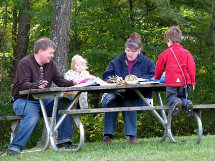

They were written to encourage and challenge parents to get started with nature study and to participate with their children as they go outdoors for a few minutes each week. These challenges were not written for the children but to the parents. This sort of nature study allows the parents to develop a passion for nature study and that is what is at the heart of the Outdoor Hour Challenge. The parent is not the teacher but the co-learner when the whole family accepts the challenge.
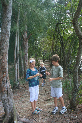
Everyone goes outdoors together and you all are searching for things to observe and learn about as a family. Everyone can share their experiences afterwards and all can make their own nature journals. The challenges are not assignments for the children to complete, but the idea is to stimulate a curiousity about nature in your own backyard by having prepared some ideas for study ahead of time.

The Outdoor Hour Challenges are written in such a way that you can be flexible and adapt to whatever interesting subject comes your way. You are successful just for having spent fifteen minutes outdoors, even if you never complete a nature journal page. The time spent outdoors as a family is the precious gem that your child will treasure in the years to come.

Here are some quotes from emails that I have received recently about the Outdoor Hour Challenges.

"Although I have always wanted to know more about nature, it hasn't happened until now. Your guidelines and direction have encouraged me to make it my own...." J. in North Carolina

"Just wanted to thank you again for all your encouragement, and your wonderful nature study plans. I had really hit a wall in homeschooling, and had been praying constantly for renewal and inspiration, and relief from my burn-out. " C.

"I have always struggled with the nature study because I do not feel very competent, but I am very drawn to it, and feel that it is one of the most important things I can do with my kids. I had been praying that God would help me in this area, and I even get Comstock's book out occasionally but am overwhelmed by it. Well, your blog has helped me to wrap my mind around nature study, and to make it a part of school and life, more importantly. My boys, being boys, love outdoors, and my husband seems to know a lot about anything nature-oriented. And now, I feel more equipped to "lay the feast" for them." P.

I read every email and try to comment on every link entered in Mr. Linky. I also save every "thank you" email to go back through when I am having a rough day.


I truly think that as far as the Outdoor Hour Challenge, I have received back more in return than I have ever put into it. The photos people email me of different things they discover during their nature study, the comments made in blog entries that are shared on Mr. Linky, the community of encouragement that I see growing worldwide, and so much more are worth the time and effort I put into the challenges.

This week of reflection on the foundational ideas for the Outdoor Hour Challenge has given me a renewed spirit to continue.

I will take this opportunity to thank everyone who has encouraged me over the last year and a half.......you have been an inspiration to me.

If you have not had a chance to pop over to Lulu.com to see the preview of my Outdoor Hour Challenge-Let's Get Started eBook, here is the link:
Outdoor Hour Challenge EBook
Be sure to read the reviews of the eBook at the bottom of the page at Lulu.com.

Barb-Harmony Art Mom

Please Note: All of the photos in this entry are past "Outdoor Hour Photos of the Week". Each week, or just about, I try to choose a photo from a family's blog entry that I share on the right sidebar of my blog. If you do not have a blog but you would still like to send me a photo for consideration, please send it in JPG format to my email: harmonyfinearts@yahoo.com

Kodachrome


Ever since last week's announcement that Kodak was discontinuing production of Kodachrome film, professional and amateur photo-
graphers alike have been busy mourning its demise. Kodachrome was known for its rich color saturation and was widely used by professional print photographers since it's introduction in 1935.

Depending on how you see and process the world, Kodachrome can either look very realistic or not. I happen to find it pretty accurate but to many people it does seem oversaturated.

Unlike other color films, Kodachrome, is purely black and white when exposed. The three primary colors that mix to form the spectrum are added in the development steps rather than built into its layers. Because of the complexity, only Dwayne’s Photo, in Parsons, Kan., still processes Kodachrome film. The lab has agreed to continue through 2010, Kodak says, but the reason the film's demise has been getting so much attention is that it's yet one more sign that the pre-digital world is irrevocably behind us.

For the record, I'm a big fan of digital - mostly because it's so easy to manipulate and control. However, I also love the look of Kodachrome, so here are a few gems. An early shot of Marilyn Monroe, above, by Andre de Dienes. Below, a group of pictures from the archives of FORTUNE Magazine kindly sent to me by their deputy photo editor Scott Thode. (For the full FORTUNE album click here.)


This shot of caddies from the Pinehurst Golf Course in North Carolina in 1957 was taken by Walker Evans!


From the same year, W. Eugene Smith caught this moment at the headquarters of the Connecticut General Life Insurance Company.


The celebrated French photographer Robert Doisneau was commissioned to shoot a story on Palm Springs where he grabbed this shot.


And lastly, it should come as no surprise to any regular followers of this blog that my very favorite story shot on Kodachrome was of course Paul Fusco's "RFK Funeral Train". Below, one of my favorite images from the series.


Knitting by Wind

No I'm not pulling your leg this time. This really is knitting by wind power. Part of the current exhibition of the Royal College of Art in the research section.
This work is the brain child of Merel Karhof.

Monday, June 29, 2009

Harlequin Cabbage Bug: A True Bug


Harlequin Cabbage Bug, or Calico Bug or Fire Bug

We shared these a few weeks ago and I just now had time to look it up in my field guide.

Habitat: Crop fields, orchards, gardens, and meadows

Food: Juice of cruciferous plants, including commercial cabbage, kale, and broccoli crops; also turnip, horseradish, potato, beet, bean, grape, squash, sunflower, ragweed, and citrus foliage.

The field guide says that this insect causes white and yellow blotches on the foliage of infested plants.....

These bugs are right on my sunflowers and the sunflowers are right next to my squash plants.

It is always nice to put a name with an insect.
"Some insects go through all the stages of their development on land; these are the insects of fields and woods. This group includes some of the most interesting and beautiful of insects. They are especially well adapted for nature-study because specimens are constantly available."
Handbook of Nature Study, page 301
Here is my very first sunflower of the summer.

If you are interested in focusing on insects this summer, you can go back and work through Outdoor Hour Challenges 22-28. These challenges cover butterflies, moths, crickets, houseflies, ladybugs and aphids, honeybees, and dragonflies. Look on the right sidebar of my blog for each challenge.

Barb-Harmony Art Mom


Exhibition's Sweet Smell Acid Bath


1957 Manhattan in Sweet Smell Of Success was moviegoing Heaven from where I sit in 2009. Watching again this week (on MGM-HD) satisfied me that Sidney and J.J. had lives of Riley amongst clubs, theatres, and an overall seedy elegance long since no more. Never has New York looked so good on film. The opening credits show delivery trucks dropping newspapers along corners and back of them are theatre marquees at night. One features Seven Wonders Of The World in Cinerama. I wondered why Falco concerned himself with placement in Hunsecker’s column when he could be watching that … at least three times in a week … as I would. Newsreel theatres were in evidence when Sweet Smell was made (the Trans-Lux is visible during several shots). Warners was at the point of abandoning their headline service, but Universal-International still had current events on screens. So did Fox and Metro (Paramount bailed in 1957). Imagine going into a theatre to watch news. And speaking of dailies, did people really hover about stands waiting for the morning edition to arrive as Sidney does? What a world --- back when newspapers mattered. I noted that he left his (early breakfast?) hot dog unattended to score the morning Chronicle, coming back to find it unmolested (you can’t say Sweet Smell’s altogether cynical). They should have given Tony Curtis an Academy Award for this. He’s somewhere beyond great. Falco apparently doesn’t sleep, changing suits between night shifts and not once using a bed back of his office. The dressing table bottle of Alka-Seltzer was a touch I noted for the first time thanks to high-definition. A really priceless sequence later on reminded me of screen and vaudeville’s coexistence well into the fifties. Sidney visits a comic backstage who’s waiting out a movie before his next turn, this the lot of many a performer doing six and seven appearances a day between unspooling reels. Big names pulled time propping up features from nine or ten AM to midnight. Live acts were reason to attend for a lot of patrons, as here where Esther Williams and comedian Wally Brown offered incentive likely more compelling than weak screen sister Always Together at Chicago’s State Lake Theatre.


Another Sweet Smell plus is music by the Chico Hamilton Quintet. I hadn’t investigated a soundtrack previous, but should have known there’d be one. It looks and sounds good (there’s samples you can play at Amazon’s listing). Jazzy scores had been around by 1957, but few so melancholic. That’s a word that might describe showmen after they got a look at Sweet Smell. They’d figured on another Trapeze, a sockeroo Lancaster and Curtis bestowed the year before. Whether they liked it or not, these were action stars and their public was frankly confused at notions of Burt and Tony lingering over telephones and furtive passing of notes. Exhibitors wondered why they’d spend audience capital on this sort of downer. Lancaster backed chamber pieces that hit like Marty but mostly appeared onscreen in work more conventional (Gunfight At The OK Corral was the same year). To don owlish spectacles and be photographed so harshly made merchandise tough to sell. Sweet Smell posters read The Picture That Will Never Be Forgiven --- Or Forgotten. The first part was certainly true for theatres playing it. The second would manifest within a decade when critics and buffs began discovering it. Sweet Smell was a problem you couldn’t solve with ads and posters. Just what in blazes was this thing about? A hit’s most saleable points take few words to put across. This one needed more, plus a sophisticated audience to decode media-speak and acid drippings not necessarily recognized as such by hick viewers. Premiering in New York was a foregone conclusion. United Artists announced 255 key dates to open July 4 weekend following the world bow at Manhattan’s Loew’s State on June 27, 1957. Was the saturation bid an effort to get Sweet Smell in and out before word-of-mouth killed it off?


Either way, it died. Burt Lancaster and Barbara Nichols (both shown here with showmen and interviewers) spent July thumping Sweet Smell. Lancaster’s company had produced, so the star put forth promotional effort above and beyond calls of studio duty. Otherwise, it was left to United Artists to cobble whatever mass appeal this sour persimmon might generate. A tie-in with Topp’s Bubble Gum (photos of Burt and a pitch for the film in each pack) were among measures fairly desperate --- that plus ad cards perfumed and designed for placement in pocketbooks and lingerie drawers (!). Ads titillated with a brother/sister could-be-incest angle and promise of a fistic set-to between Burt and Tony, this being more along lines folks expected (who’d be all the more disappointed when they didn’t get it). Pete Harrison spoke for exhibition when he lauded content, but added that reception in small towns would be problematical. The counterfeit currency gimmick supplied by the pressbook was one I used years later for a University run, printing several hundred bills and spreading them around campus (we even set up a jar in Student Commons labeled Free Money). Our audience was actually pretty good, probably better than a lot of houses pulled during Summer 1957. UA’s beating could actually have been worse, as Sweet Smell took $1.422 million in domestic rentals. Foreign was harsher with only $848,000, but few could have expected this sort of material to perform overseas (what did they know or care of press agents and Broadway columnists?). There were fewer bookings (9,322) than customary for a major star offering. Lancaster’s Wyatt Earp (in Gunfight At The OK Corral) burned up the woods giving crowds exactly what they wanted that summer, and was rewarded with four million in domestic rentals for doing so. Now it’s Sweet Smell Of Success that’s the permanent classic, its brilliant dialogue an inspiration for modern writers and viewers addressing same. I’ve read several remarkable essays just this morning extolling the greatness of Hecht-Hill-Lancaster’s then-folly. If there are rewards in posterity for underappreciated films, this one more than collects. Tony Curtis has fortunately lived long enough to dine out on it for several decades. I could kick myself for meeting Martin Milner at a Courts autograph show and not mentioning Sweet Smell, instead honing on the Route 66 episode Lizard Leg’s and Owlet’s Wings and Springfield Rifle. He was responsive enough about these. Has anyone interviewed Milner at length? My Web search turned up nothing so far.

Is anyone else really into chairs?


I’m pleased to say that at the grand old age of 24, I visited Brighton for the first time this weekend – I felt like I’d found my spiritual home, all sunny café terraces, vibrant market stalls, a fabulous clean (by British standards) beach, and those mesmerising north and south lanes with their clusters of dream shops.

After sunning it up for a while on the beach, I took myself to the Pavilion and the Brighton Museum where I discovered the city’s small but exceptional collection on 20th century art and design. I remember once reading (I’m a little foggy as to where) that the one object which every designer hopes to make his own is a chair. The distinction between one chair and another is sometimes negligible, mundane even, but living as I do with a real chair enthusiast (furnishing 1 small living room = 8 random mismatched chairs, and counting) I’m starting to understand the nature of this fascination, helped along by Brighton’s collections.

The amazing thing was to see the influences of each time and each movement discussed manifested into the chairs. The arts and crafts movement’s deliberating craftsmanship in sweeping organic curves, the roaring twenties’ glistening decadence in art deco’s tasteful classicism, and the incorporation of industrialism in modernism’s clean bent wood and metal. Maybe the chair is the best representation of civilisation, of a society’s values, preoccupations and aims, but these elements can be seen in the objects all around us, our teapots and our lemon squeezers, our cabinets and our lamps, as well as our paintings and our sculptures.


Various fluctuations between form and function serve to distinguish the pragmatism of modernism, from the flights of fancy represented in the surrealist collections. The distinction between art and design and its increasingly confused boundaries is something that we recently discussed in depth with Peter Saville and the visit to Brighton’s museum, showcasing art along the 20th century’s trailblazers of design, emphasised the intertwining between the two. It reminds me of the juxtapositions in women’s fashions, and the medium’s own encroachment into areas reserved for the visual arts through creative visionaries at the helm of the world’s top labels.


My ideal chair? I love the stark metal mesh of Eames’s DKR-2, an existing element of my flat’s collection, but I’d like to combine it with the frivolity of a rocking chair, still on bent metal, but with the bikini cushioning, or maybe something a bit more sixties in fibreglass… I can see how this fascination can grow…


It’s a joy to notice the intricacies and the details of the things around us, the tiny little minutiae which makes something a pleasure or a pain to use. Collections like Brighton’s allow us to stop and take note of the everyday beauty around us, the pieces which have experienced hours at the hands of exacting designers, and if you find yourself with time to spare, I’d recommend a visit.

[Image credits: courtesy of Brighton Museum at http://www.virtualmuseum.info/]

Men at Work #10

Paying homage to fountain

Sunday, June 28, 2009

Where is our Blogger

One of the CDP (City Daily Photo) bloggers who showed his city of Tehran and pictures of demonstrations following the recent elections. We believe he is currently in police custody.

What ever your beliefs, the freedom to take pictures and report events must be defended.

Today CDP bloggers posts are dedicated to this blogger. We want him freed.

The photo above was taken outside the Iranian Embassy in London on Friday.

Please visit other CDP supporters today click here to view thumbnails for all participants

Saturday, June 27, 2009

Cheers

A combination celebration. Yesterday a glimpseoflondon was 2 years old. Tomorrow will be my 500th post.

Friday, June 26, 2009

Weekend Video


It’s been fascinating to hear and read so much about Michael Jackson in the wake of the sad news of his death – the balance of commentary between his strange acts v.s. his contribution to music and culture at large, the questions about his attitude to race and his own color.

Dying prematurely is like reading an obituary of someone who passed at a ripe old age but is pictured in their prime. It's a time disconnect and revision warp. His "moonwalk" will clearly be a large part of his legacy, hence the video above. But the most poignant aspect of his work for me was that for the last two decades, in a hip-hop environment of what were, shall we say, not the nicest lyrics - Michael Jackson's refusal to get nasty and to steadfastly focus on love and justice and harmony was a surprisingly courageous and hopeful stand.

Exploring with Pollen: Black-Eyed Susans


We were out working in the garden this morning and the topic of pollination came up. We were talking about the different ways that plants pollinate and as if to illustrate one way, this spider obliged us with his example. We were really examining these black-eyed susans and their pretty pollen spots and we realized that this very yellow spider was sitting right there in front of us. Isn't he pretty?


I ran inside and gathered a few things to use in exploring the garden and its pollens. I brought out a few Q-tips and a hand lens for gathering some pollen from the flowers and looked at it up close. We also found that many of the flowers and veggies that we observed had ants crawling in around the inside of the flower. Pollination.


Pollen on a day lily

We took a few minutes more to look at various ways that plants hold their pollen and watched a few bees at work and then we came inside.

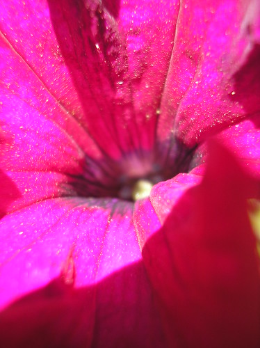
Pollen on a petunia

It was a short nature study but the best kind......stemming from curiosity about something we had close at hand.

Have a great weekend.
Barb-Harmony Art Mom

We're talking 'heads'


Last week self-styled 'Guru of the Gurners' Danny Rees treated Wellcome Trust staff to a display of rare and unusual library material on the subject of face reading. Items featured included book illustrations from Charles Darwin and phrenologist George Combe and an 18th Century Chinese medical diagnostic chart. Seen here, the mini-exhibition was held in the hallowed hall of 215 Euston Road. Colleagues could have their ears and lips 'read' in between lunchtime sandwiches. Face reading is just one of the free library Insight talks also open to the general public, current progamme:
http://www.wellcomecollection.org/press/2009/WTX054166.htm
A new programme will be announced later for the autumn/winter sessions.

Thursday, June 25, 2009

Skywatch Friday - A View from Blackfriars Bridge

I really must learn what the different cloud formations in London mean. Is tomorrow going to rain or will it be hot again? This view is taken from Black Friars Bridge facing west.

Remember to visit all the other skywatchers around the world.

Dutch Seen


I had been looking forward to the exhibition “Dutch Seen” at the Museum of The City of New York since I first heard about it. The show celebrates the 400th anniversary of the Dutch arrival in Manhattan by featuring the work of 15 contemporary Dutch photographers, and the hook is that these photographers have all created work about New York – most of it done expressly for the show.

Curated by Kathy Ryan, The New York Times Magazine’s always brilliant Director of Photography, and under the auspices of FOAM (Photo Museum of Amsterdam), the show promised to be a strong and original one, but what impressed me most was the clarity of the concept and cleanness of the layout. It’s refreshing to come into a show that’s simply laid out with one interesting body of work after another.

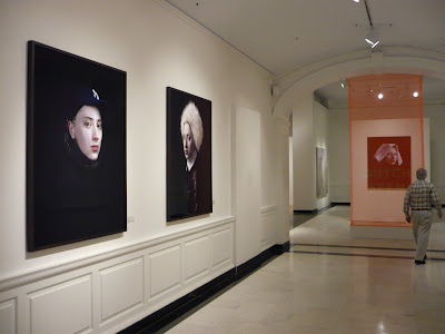
The Museum of The City of New York can be a tricky space but the north ground floor gallery has been opened up so that it’s just a wooden floor, white walls, and the pictures. The only design flourish is the simplest use of orange construction webbing (as you can see in the picture above) used sparingly to float the exhibition title in the entrance to the main gallery and elsewhere as punctuation. Anyway, it’s one of the shows not to be missed this summer and it runs through September 13.

One of the highlights of the show is a series of portraits by Hendrik Kerstens of his daughter with a series of New York related objects on her head. She’s always had a remarkable Dutch Old Master face which her father has taken full advantage of, but here he plays with us by using things like a napkin and a plastic bag as well as a Yankee cap, to go back and forth between modern and classic, past and present.


Other highlights include a small series of landscapes by Misha De Ridder (below) who set out in search of "the qualities that made New York such an ideal place to settle 400 years ago".


Danielle van Ark set about photographing more than a hundred art openings as a way of observing a particular social structure in the city. That's Chuck Close and Peter MacGill chatting it up below with someone I presume is a collector or patron.


Inez Van Lamsweerde and Vinoodh Matadin weigh in with a grid of famous people illustrating the beauty and star power of the city. That's Shalom Harlow below.


Erwin Olaf created an entire construction inspired by Frances B. Johnston's famous turn of the century photographs of middle class African Americans.


Rineke Dijkstra - described on the wall as "the matriarch of today's generation of Dutch photography" is included with a group of her early 90s portraits of Coney Island bathers. It's a testament to the quality of the work that they seem as fresh as though they were just taken.


Charlotte Dumas - another interesting pick - has concentrated on photographing animals in a unique style that's part documentary, part conceptual. For her New York project, she chose to photograph some of the stray pit bull and pit bull mixes found in so many New York shelters. An interesting and astute metaphor for New Yorkers!


Hellen van Meene, meanwhile, continues her study of adolescent girls but these are her first pictures of American subjects.


Lastly, Wijnanda Deroo looks at New York through it's many and varied restaurants - from Papaya Kings to The Tavern on the Green. Her colorful interiors from what has to be the eating out capital of the world again serve as fitting metaphor for the city's energy and diversity.


Favorites List --- The Lodger


There was no Jack ripping in 1944 when Fox’s "A" thriller got bookings at theatres normally off-limits to horror films. Younger viewers won’t regard The Lodger so highly as Greenbriar veterans who were creeped by it in theatres and syndication TV. Slashing kids expect of J the R was withheld for obvious censorial reasons in firm place then, but more than merely that imposed restraint. 40's audiences weren’t missing explicit mayhem they’d have otherwise enjoyed. Wartime crowds for The Lodger’s first-run were accustomed to filling in blanks for things heard though not seen (and the film uses sound very effectively). To show Ripper murders was to invade imagination’s personal space among these patrons, a breach of protocol we don’t appreciate for not having experienced suspense and horror programming on radio as all of them did. Late 30’s/early 40’s broadcasts I’ve played are harrowing for shock effects we can visualize to oft-disturbing effect. Listeners then honed senses far more acute than our own for envisioning horror served now to us raw. Applying imagination to things unseen really is a lost capacity. My generation missed it and certainly younger ones have. Those who’d knock The Lodger for pulling back really don’t know what they’re missing, or rather, denying themselves. For myself, there’s hesitation to watch Time After Time, a 1979 Ripper reboot with good things, though its gorier killings are ones I now scan past. Do we grow out of appetites for explicit bloodshed? I think I did years ago, and for that The Lodger serves me still, being a chiller with atmosphere to live in and a lead performer whose on and off screen complexity gets way beyond mere recital of Jack The Ripper’s fiendish way with a knife.


To delve deep into Laird Cregar’s mystery would be not unlike study of history’s real-life Ripper. Both are fascinating and impenetrable. Cregar’s life is narcotic to fans who prefer idols tormented and fated to bad ends. With talent enormous as his bulk (I don’t mean to copy you dozen other writers who have undoubtedly said that), Cregar was richly flamboyant and commanded scenes with a silken, yet forceful, voice. Losing him so early inspires reflection on missed opportunities and imaginary recasting of films he’d have made better. His agonized homosexuality was an open secret during Cregar’s lifetime, even if unpublished then, and histories since have spotted it as motivation for ill-advised (massive) weight loss and early demise. He died at thirty-one and within months of The Lodger’s release. Portly teens with orientation issues had early arrival of their own James Dean in Cregar, though misery on his sleeve would surely have made Laird's life a less likely one to emulate. I’ve long been alert to colleague observations about him. Quotes abound in reference to garrulous/withdrawn/moody/resplendent Cregar. I’m hackneyed for saying the actor himself was more interesting than parts he was given, but there it is. The Lodger might have worked with someone else --- but who? The Cregar mystique translates well to psychosis, and for Fox to have followed The Lodger so quickly with Hangover Square’s further serial slaughter must have given the actor considerable anxiety. The Ripper part was sensitively written and Cregar lends considerable empathy, but it’s no romantic lead and that apparently was his goal. Physical size and isolation thus imposed was limiting then, but it’s since conferred immortality, for nearly no one forgets Cregar once they’ve sampled him, and to The Lodger he brings tragic grandeur beyond skilled writing and direction already in place.


Particulars of knife killing figure into much of The Lodger’s dialogue. Cregar’s application of the weapon is limited, but others discuss and demonstrate its effect upon victims dispatched offscreen. Such clinical, even casual recapping of what the Ripper does to women must surely have raised gooseflesh among those for whom the idea of being stabbed, let alone mutilated, was as frightening as witnessing the act itself. Here again was a device effectively transplanted from radio. You had only to talk about effects of a madman’s assault to scare watchers silly. Characters simulate the Ripper’s moves in lieu of our watching him make them. We’re at all times removed but one step from the crime, a convention taken for granted then but almost never observed now. The Lodger was a horror movie not to be sold as such, sneaking into (most) theatres under a cloak of respectability its studio and star cast implied. All the more surprising then was the fact that this would emerge most unsettling of all thrillers released during that decade. Poster and ad mats underplayed carve-ups explored in the film, but enterprising showmen often vetoed suggested art and designed lurid come-ons of their own (as in above's display). The Lodger could have been sold like the Blood Feast of its day or as period drama for the carriage trade, so flexible were choices in an exhibition universe catering to varied audiences and communities.


Lives set to movies (like my own) intersect over and again with a favorite. Each encounter brings something new to the relationship. Mine with The Lodger began on a lumpy couch at my grandmother’s in 1965 watching a television turned low as not to wake the house. Its horrors seemed not so restrained, for hadn’t Hollywood continued operating under Code restriction, albeit a weakened one? The Lodger remained of a piece with features we were seeing in theatres (sort of a Hammer horror minus color). It was introduction of MPAA ratings and resulting explicitness that dated The Lodger and its kin. As with anything of similar vintage, I chased it around late nights and UHF backroads. A station near my college town bought The Lodger and several hundred Fox titles from NTA, retaining two dozen or so after their license period expired. Dead air was thus filled with The Lodger, Great Guns, Son Of Fury, and others ad nauseum, playing them like radio used Top 40. Film collectors would seek The Lodger and often find it, thanks again to NTA’s relaxed vigilance vis a vis 16mm prints. Some of these were spectacular. My memory suggests they looked better than the DVD. Certainly they were sharper. The blacks seemed deeper too. Could mine be selective recall of a time when mere access to such was thrill enough? 16mm rewarded on one hand and snatched away with the other. The Lodger may have been pictorially stunning, but variable density soundtracks were sometimes (often it seemed) printed too dark or light with a resulting motorboat effect that all but obliterated dialogue, especially in quieter scenes. You might pick up multiple prints or odd reels with peculiarities of their own toward constructing a perfect whole, an ideal seldom attainable. I do wonder what The Lodger would look like in 35mm. Alan Rode saw it and Hangover Square at an Egyptian Theatre revival several years ago and wrote an excellent piece about them. Anyone know if Fox still has original negative elements on these two?