Wednesday, August 31, 2011

Stained Glass Design by Ballantine and Allan

Illustration: Ballantine and Allan. Stained glass window design for Glenormiston House, 1851.

This particular stained glass window was entered as an example of the work of the Edinburgh based stained glass makers Ballantine and Allan, at the Great Exhibition of 1851 held at the Crystal Palace in Hyde Park. Many British and foreign companies displayed their work at the exhibition which was openly portrayed as a convenient marker celebrating the industrial process of the mid-nineteenth century, particularly of Britain itself. However, manufacturers and the retail trade saw it ostensibly as being the first international trade fair of its kind. Profits and full order books were hoped for, and therefore space was at a premium. Many companies, rather than display their everyday products, instead chose to feature commissioned or specially designed work, hoping that these would outshine potential rivals and increase orders, both domestic and foreign.

The stained glass example shown in this article was a case in point. It was a commissioned piece for Glenormiston House in the Tweed Valley in Scotland. it was to sit within the entrance hall and was specifically designed to reflect the unique prospect and history of Glenmormiston. This very personal piece had little connection to the Great Exhibition, but a great deal with Glenormiston itself. Because the estate was technically crown land, the occupiers were in some respects seen as tenants of the Crown. Their rent was symbolic as it entailed one red rose which was to be presented to the monarch on the festival of St John. The centre panel illustrates the handing of the rose to the reigning monarch. The standing knight in the background is holding the banner of St John. 

In actuality, the central scene is quite specific and is said to represent the handing over of a red rose by a maiden in 1529 to James V of Scotland, traditionally the last time the ceremony was held. Whether the date of 1529 was portrayed for any other reason than that it was held as a romantic point, being the last ceremony of its kind, or that it was a period that was favoured by the customer, is unknown. That it was portrayed as suitably medieval, even down to the encaustic tiled floor, also represents the intrinsic fashion of the period.

Although a black and white illustration, it was said that the window itself was richly coloured. The borders of both the central panel and the exterior frame were picked out in ruby red and gold, with imitation gemstones throughout. The background itself was in pale blue with gold bands stencilled in white enamel. The Scottish thistle, Irish shamrock and English rose were used as repeat motifs throughout the background work of the window. 

It is an interesting piece of medievalism from the mid-nineteenth century, made more interesting by being of Scottish origin, rather than English. Medieval themes were just as popular during this period in Scotland as they ever were in England. In some respects it could be said that the enthusiasm for the romance and chivalry of the medieval world was a Scottish invention, at least hugely popularised by Sir Walter Scott. Although the historical era could be said to have been overly glamorised and fictionalised by Scott himself, it does not change the fact that many got their first introduction to the medieval world from Scott's prolific novels and poetry. This importantly included William Morris, who voraciously read Scott's novels as a boy, a habit that clearly changed his perspective on the contrasts, as he saw it, between the medieval past of his imagination and the contemporary industrial world in which he lived, all produced at a very early and impressionable age.

Ballantine and Allan had been making stained glass since the 1830s. In 1843 they won a prestigious commission to produce the stained glass for the gothically inspired Houses of Parliament, though for some reason they supplied fewer windows than were actually originally expected. The company had obviously made an impression with their stained glass work and the medieval inspired commission in London must have added to their reputation as a company that could easily supply good quality medieval work for ecclesiastical and domestic buildings, hence the 1851 Glenormiston piece for the Great Exhibition. The company stayed in business until well into the twentieth century. Some of their work produced for church buildings in Wales from the 1850s up until near the end of the nineteenth century can be found here. They will perhaps give some indication as to the colour schemes that were used for the Glenormiston piece.

Glenormiston House was unfortunately demolished in 1950 like so many country estates and houses across Britain. What happened to the stained glass window celebrating the handing over of one red rose to the reigning monarch on the festival of St John is unknown. However, despite the fact that the house is no longer there, the story of the rose as a form of rent is still attached to the Glenormiston land, although the traditional ceremony seems more a matter of amusement today than a serious theme for decorative art.

Further reading links:
Victorian Stained Glass Pattern Book (Dover Pictorial Archives)
390 Traditional Stained Glass Designs (Dover Pictorial Archives)
Victorian Stained Glass
William Morris Stained Glass Pattern Book
Stained Glass and the Victorian Gothic Revival (Studies in Design & Material C)
Victorian Stained Glass Designs CD-ROM and Book (Electronic Clip Art)
The Stained Glass of A.W.N. Pugin
The Stained Glass of William Morris and his Circle (Studies in British Art)
Victorian Stained Glass. With Photographs by the Author
Encyclopedia of Victorian Colored Pattern Glass, Book 7: Ruby Stained Glass from A to Z
Edward Burne-Jones (Master of Drawing, Painted Glass and Ceramic Art)
William Chambers of Glenormiston
The Great Exhibition of 1851: A Nation on Display
Britain, the Empire, and the World at the Great Exhibition of 1851
The Great Exhibition of 1851 (Texts in Culture)

Signs of a Struggle: Photography in the Wake of Postmodernism | V&A | London


Text by Matt Swain

This display, which is a forerunner for the V&A's forthcoming exhibition Postmodernism: Style and Subversion 1970-1990, explores photographs that make reference to themselves as well as other media, demonstrating the longevity and pervading influence of Postmodernist photography over a 30 year period starting in the 1970s. You can read a preview of the upcoming show in the current issue of Aesthetica which is available here.

The images, which can initially seem superficial, link eras and media ensuring that there is a translation beyond surface depth. They all carry a strong sense of individual style with the duality of connection, this being the crucial link to their place in time as well as the here and now. Scenarios are built or staged and then quite wilfully destroyed, existing only for the purposes of that photograph. The works here, almost 40 photographs, are loosely arranged by theme and are by some of the most influential Postmodernist artists, demonstrating a wide variety of styles and techniques.

David Hockney's Photography is Dead, Long Live Painting (1995) successfully sets the tone, showing a Get Well Soon card containing a photograph of sunflowers next to Hockney's painting of them, effectively posing the question as to whether a painting of something can ever be more beautiful than a photograph. Richard Prince, who has been taking sections of advertising images from posters and magazines since the 1970s and making "re-photographs", is represented here with the Marlboro man in Untitled (Cowboys) (1986), questioning consumerism and the environment in which such advertisements are seen.

Cindy Sherman's renowned conceptual self-portraiture is exemplified in Untitled (1979) featuring Sherman as a Marilyn-style Hollywood star, captured on camera by the paparazzi. It is a defining moment in what it seeks to be, representing femininity in popular culture and displaying a typically classic sense of modernity. One Flesh (1985) by Helen Chadwick also addresses femininity albeit it from a different perspective, showing mother and baby with a golden placenta floating above, a Renaissance-style collage on cheaply produced photocopies in red, gold and blue, confronting conventional ideas about the human body, the sacred and the feminine.

Throughout, styles clash and mingle. The component parts are familiar but we see them reassembled in new ways, giving them new meaning or multiple meanings and forcing reappraisal, igniting our imagination and suspicion. Peter Kennard's Haywain with Cruise Missiles (1980) invades Constable's idyllic vision with a missile launcher on top of the horse-drawn cart. Tess Hurrell's Chaology no 1 (2006) effectively shows a flimsy, handmade model from cotton wool and talcum powder imitating a nuclear explosion. Ann Hardy took months to create her post-party scene for Untitled IV (2005), and then subsequently destroyed it. The interpretation of the creation remains on the surface, discarded urban objects contrasting with balloons, an unsettling, unfinished and recently vacated chaos.

Arguably the most effective work here is Claire Strand's Signs of a Struggle (2003), from which the display takes its title. This series of images fascinatingly builds scenes in living rooms, streets and gardens, an allegory of potentially paranormal activity and faked police crime scenes, staged yet utterly convincing. It is this authenticity that makes this real but fun. You are the outsider looking in with the clear knowledge that it is staged.

The later images possess a certain subtlety and humour not always apparent in some of the earlier works but it all somehow feels contemporary, raising questions about how photography is represented and about the meanings within the various layers. Almost without noticing, we are all becoming more accustomed to the idea of looking at two or more irreconcilable ideas as one and making sense of them. Despite some recent debate to the contrary, Postmodernism is alive and well. Who knew that obvious artifice, beautiful fakery and pastiche could be so enticing?

Signs of a Struggle: Photography in the Wake of Postmodernism continues at the Victoria and Albert Museum, London until 27 November 2011

vam.ac.uk

Aesthetica Magazine
We hope you enjoy reading the Aesthetica Blog, if you want to explore more of the best in contemporary arts and culture you should read us in print too. You can buy it today by calling +44(0)1904 479 168. Even better, subscribe to Aesthetica and save 20%. Go on, enjoy!

Images:
Untitled IV (balloons) Ann Hardy (2005) Courtesy Anne Hardy, courtesy Maureen Paley, London and ArtSway

Outdoor Hour Challenge Blog Carnival - August Newsletter Edition: Ponds and More

Outdoor Hour button

This is a very full carnival! Lots of new faces along with our carnival veterans....lovely to see how everyone is jumping in with the newsletter challenges but remaining flexible to follow interest and opportunities. I am overwhelmed with all the wonderful nature study that you have allowed time for in your busy lives...you will be blessed with children who are happier and healthier.

I am announcing two things before I share the carnival entries.
More Nature Study Button
1. My new More Nature Study With The Outdoor Hour Challenge ebook will be ready for purchase on September 5, 2011. This ebook includes ten nature study challenges focusing on topics you may find this autumn season. In addition to the usual challenges, follow-up suggestions, and notebook pages, I have included "Advanced Follow-Up" activities and "Upper Level" notebook pages to take each challenge a little further for advanced or older students. Please checkout the sample HERE. All of the ten ebook challenges will be posted on the Handbook of Nature Study blog over the course of the autumn season starting Friday, September 9, 2011. More information to come.

I have also included a special discount link in the September 2011 Newsletter. Make sure to read the newsletter and find the link there to use for your discounted price of $6.95 for the month of September.

2. Starting with the October issue of the Handbook of Nature Study Newsletter, the newsletter link will only be available to those that subscribe to my blog. Please make sure to subscribe to the Handbook of Nature Study so you do not miss the October 2011 and future issues of the Newsletter.
Subscribe to Handbook of Nature Study by Email

Now for the carnival!

August Newsletter Topics

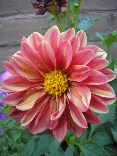
Pink and Yellow Dahlia
Dragonflies
Amy at Hope is the Word shares their entry: Pond Study - Cows and Dragonflies. She captured a beautiful dragonfly and their study ended with some very well-done journal pages. Their family shares another entry from their pond study with lots of great experiences to write about: Turtles, Geese, and Herons! She also shares why their nature study time is the highlight of their week. Awesome.

Phyllis writes about Nature Study of Water Habitats which shows their multifaceted nature study featuring many water creatures.This entry will inspire you to do some research about your local water habitat.

Don't miss reading Erin's entry for their Dragonfly Study.  She has some awesome images for you to enjoy!

Nicole (Journey to Excellence) seized the newsletter topic and they have started an ongoing pond study. Here in Pond Study #1 she shares their observations and journal entries using the suggestion from the August Newsletter. How about her follow-up entry? Here is Pond Study #2.

Kirsty joins the carnival with their family's Dragonflies Entry. They all did journal entries and share their outdoor time with carnival readers. They also submitted their pond dipping activity. I loved seeing their list of pond creatures they were able to observe with this project. Great job!

Leslie and her daughter had a chance to study some dragonflies at a local pond. You can read their entry here: Outdoor Hour Challenge - Dragonflies!

Jamie spent the day with her family on the river canoeing (not exactly a pond habitat but still on the water). They took the time encourage some water habitat nature study....their entry Canoeing the Chestatee shows a list of the things they observed  on their trip. Jamie has even started journaling about her experiences...great example Jamie. Would you like to read her daughter's blog entry, you can read her view of the day HERE.
 

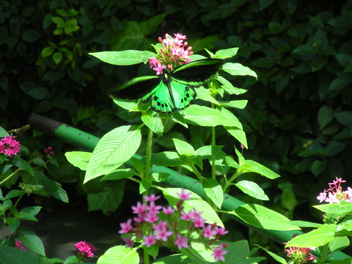
Butterfly at Six Flags
Frogs
Tricia shares their very unexpected nature study with Fabulous Find of the Frog Kind. Wonderful example for all of us to keep our eyes open and then let our schedule be flexible. Thanks for sharing! I am going to share another of their entries that shows more of their backyard tadpole habitat along with some other great nature study: Summer Nature Walks and Discoveries.

Jamie and her daughter are trying to start a year of nature study and they visited a near-by pond. They share their entry Pond Critters with carnival readers. 

Ducks
Nicole from One Hook Wonder shares their duck observations at a near-by lake. They combined some family time, a bike ride, and a little nature study. Perfect!

Cattails
Nicole and her family did a great cattail investigation as part of the OHC this month. They not only observed and recorded their cattail study but they found other things to learn about as well. Read their entry: OHC - Cattails.
 
Tricia's family had a day with their Creation Club at the pond. Guess what? They found cattails! Make sure to check out their wonderful pond study: Lily Pad Pond.

Jennifer joins the carnival with her entry: The Pond Outdoor Hour Study.  She shares their very successful pond nature study even with a toddler along for the ride. So glad they jumped in and gave it a try.

Amy from Hope is the Word writes about their second trip to the pond to view some cattails. Read all about it in her entry Pond Study: Cattails.  Don't miss their very well done nature journals.She enjoyed her study so much that she wrote a recap entry here: Pond Flora and Fauna.

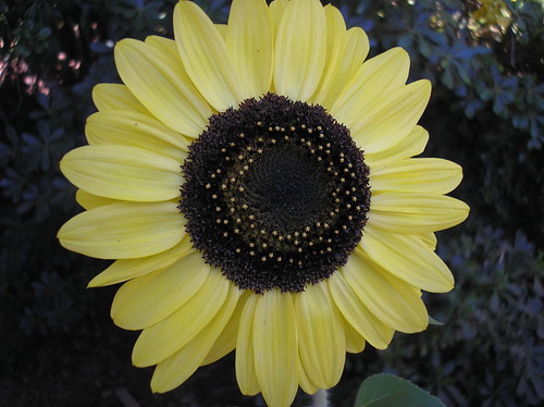
Perfect sunflower
Potpourri

Kim shares their entry, Experiments in Flight: Lift, Thrust, and Drag. Their family did direct observations of their backyard hummingbirds and then learned more in the more formal science study. Great job!

The Schoolhouse On The Prairie is just starting out with the challenges...they share Outdoor Hour Challenge #1. I'm sure she would love to have you leave her an encouraging comment. 

Amber is joining the carnival with Outdoor Hour Challenge #2....using their words.  Make sure to make Amber feel at home....let her know you read her entry. :)

Janet has submitted a great post on their Milkweed Adventures which also includes some other insect study as well. This is perfect as a warm up to next month's up-coming challenge for milkweed (stay tuned for that one).

Phyllis writes about their millipede and has some great images of this big guy in their submission to the carnival: Nature Study-North American Millipede. Phyllis also shares their water lily study...complete with pastel artwork to put the finishing touches on a already great study: The Water Lily and Lotus. How about one more from this family? Check out their Queen Anne's Lace study using the Handbook of Nature Study. Great job on all of these studies!

I have read about sunflower houses before and have always wanted to grow one. Amanda and her boys have one this year, complete with vining morning glories. Check out their entry on their blog: Our Sunflower House.  They also submit a very encouraging entry sharing their summer nature study in their own backyard: Gourd-eous.

Kristen shares their Leaf-cutter Bees using the Handbook of Nature Study. What a great example showing how to take advantage of the opportunities that come along in your own backyard. Their family also had a chance to study their Beetles and Cicadas..another great desert nature study. A trip to the ocean beach provided another opportunity to introduce some nature study objects for her young family: A Little Nature Study on Vacation.Thanks Kristen. 

Julie is jumping into the Carnival this time with Outdoor Hour Challenge #1. She shares their walk on the coast of San Diego. Here comes Outdoor Hour Challenge #2 as well...great job with this one too. On to Outdoor Hour Challenge #3....they are most definitely on a roll. Welcome Julie!

Nicole (One Hook Wonder) has written and submitted their Outdoor Hour Challenge Squirrels entry showing how they have enjoyed observing a squirrel visitor. Fun!

Kim shares her entry from her blog, A Child's Garden, in this carnival entry: Little Brown Birds.  What a wonderful entry showing how to pull so many resources together to tie your nature study up with other areas of learning. They also encountered a Hummingbird (Sphinx) moth which she writes about in another wonderful entry. Thanks Kim.

Amanda is back from her maternity/summer break to share her latest nature study with carnival readers....their family enjoyed observing, listening, and learning about crickets in this entry: A Cricket Cage.

That wraps up this edition of the Outdoor Hour Challenge Blog Carnival. Make sure to check out the September Newsletter for a fresh batch of topics and ideas for your nature study. You can submit entries to the next carnival HERE.

August Newsletter Giveaway
After generating a random number, it was determined that Tricia (Hodgepodge Mom) is going to receive the August Newsletter Giveaway prize of the Dover Backyard Nature Coloring Book. Congratulations Tricia! Send me an email with your mailing address and I will get that mailed out to you ASAP.

London Summer

Today is officially the last day of summer, apparantly not one of the sunniest or warmest. However it was a beautiful day last Sunday. Now we have the beautiful colours of autumn to look forward to.

Tuesday, August 30, 2011

Recipes and Remedies: an Autumn Almanac

This autumn Wellcome Collection will be holding a special series of Recipes and Remedies events exploring the connections between food, health and life.


Inspired by the intriguing collections of hand-written recipes and remedies in the Wellcome Library, we will be asking if food can cure, rooting through the history of culinary medicines and exploring contemporary scientific and cultural responses to food.


The series will gravitate around a edible experiment where, as the winter evenings draw in, we will challenge a chef to cook up a cure for melancholy, following the suggestions for food, drink and lifestyle in Robert Burton’s seminal 1621 text The Anatomy of Melancholy.


Elsewhere we will be investigating the future of food, the loaded relationships between food, class and morality, and how to navigate a healthy course between food science, social policy and the food industry in the face of ever-changing advice.


There will also be plenty of opportunity to get up close to Wellcome Collection’s unique treasures in sessions exploring topics such as localism and healthy eating then and now, how food remedies have allowed women to challenge male medical orthodoxy, and whether the bloggers of today can find counterparts in the recipe swappers of 400 years ago.


Dates for your almanac:


Gut Reactions. Thursday 15 September 2011

Bad Behaviour In The Kitchen. Thursday 29 September 2011

Packed Lunch: Breastfeeding. Wednesday 5 October 2011

Healthcare and Housewifery. Thursday 6 October 2011

Library Insight: Nourishing the Nation. Thursday 13 October 2011

Library Insight: The Cook’s Tour. Tuesday 25 October 2011 & Thursday 3 November 2011

Supper Salon: Future Food, with Stefan Gates. Wednesday 26 October 2011

A Feast to Cure Melancholy. Friday 11 November & Saturday 12 November

Reading Between the Lines. Thursday 17 November 2011


Everyone eats, so come along to share your views and delight your mental palate.


Last Week | Haegue Yang & Felix Gonzalez-Torres | The Sea Wall | Arnolfini | Bristol


Text by Regina Papachlimitzou

Setting the haunting installations of Berlin-based Korean artist Haegue Yang against the shimmering undulations of the work of late Cuban artist Felix Gonzalez-Torres, The Sea Wall presents an intriguing conversation between the two artists’ distinctive practices. Employing domestic materials stripped of their everyday use is a common thread running through the works of both Yang and Gonzalez-Torres, unexpectedly obliterating the demarcation between the artistic and private realms.

Gonzalez-Torres’s work Untitled (Water) (1995) proliferates throughout the galleries of Arnolfini. Upon entering the ground floor gallery, the visitor is confronted with possibly the largest of the work’s manifestations in the exhibition: a towering curtain of iridescent beads powerfully evocative of the sea, serves as a permeable boundary which the viewer is invited to appreciate on a visual, tactile, and auditory level. Dividing the gallery space about a third of the way in, the work half invites-half commands the viewer to experience it by walking through it, by running his or her fingers along it and listening to its constituent beads softly murmuring as they rub against each other. In the process, the personal becomes the social and eventually the political, when the work is considered through the filter of its position inside the Arnolfini, the Arnolfini’s strategic location in Bristol’s Floating Harbour, and the socio-historic connection between Bristol and sea-trade.

In contrast to Gonzalez-Torres’s invitingly sensual work, Yang’s 186.16m3/372.32m3 sharing the same gallery is forbidding in its near-intangible frailty. Consisting of equally-spaced threads so thin they almost disappear into the background work, this seemingly vulnerable installation nonetheless commands the gallery space by restricting access to it; and even though the threads could easily be torn apart by a careless visitor, the work nonetheless exudes an air of latent violence, reminiscent as it is of barbed wire enclosing space, forcibly keeping people out or in.

Several of Yang’s works showcased as part of The Sea Wall share this quality of quietly dividing, enclosing, and predicating space. To a significantly higher extent than other artists exhibiting at the Arnolfini, Yang very much inhabits the gallery spaces with her works –works in which the previously empty space they are situated in is as critically a part of the work as the material it consists of. The main gallery of the first floor is entirely taken up by Yang’s VIP’s Union, 2001-2011, a piece for which she personally contacted a number of VIPs belonging to the Bristol artistic and cultural sectors (including Nick Park of Aardman Animations, Arnolfini’s own Nav Haq, and even the Mayor of Bristol), to request for a temporary donation of a piece of their own furniture. This ragtag assortment of tables and chairs, arranged in small groups, thus transforms the gallery space into a silently heaving congregation: the furniture used is both pointedly empty and strangely animated, the close proximity of the chairs implying intimate conversation which is nonetheless countered by the obvious absence that inheres in the work as a whole.

In the smaller gallery to the left, Mirror Series plays with a similar, though inverted, use of space. The series comprises a number of mirror works that stubbornly reject passive reflection in favour of active response, while offering unanticipated alternatives in place of reflected image. Works such as Eyes Off, 2007, Back, 2006, and Ulterior Thought, 2007, each in its own way, defy the space they are situated in by either presenting their own, entirely unrelated image, or by refusing to reflect any image whatsoever. Consequently, the viewer expecting to see their own reflection is thus confronted with an abandoned room dotted with origami flowers, or with a mirror that seemingly prefers to reflect the wall. None of the mirrors in the series quite does what a mirror is expected to do, thus creating an unsettling feeling of doubt in the viewer, an impression of his or her presence being somehow called into question – the very validity of the viewer’s presence in the gallery challenged.

The Sea Wall brings together two artists who, through works of varying interactivity, invite the viewer to explore the role liminal spaces play in the subjective construction of identity. The space occupied by absence or defined by transience thus becomes as much a function of the viewer as a creation of the artist.

The Sea Wall: Haegue Yang with an inclusion by Felix Gonzalez-Torres continues until 4 September.

arnolfini.org.uk

Aesthetica Magazine
We hope you enjoy reading the Aesthetica Blog, if you want to explore more of the best in contemporary arts and culture you should read us in print too. You can buy it today by calling +44(0)1904 479 168. Even better, subscribe to Aesthetica and save 20%. Go on, enjoy!

Image:

Felix Gonzalez-Torres “Untitled” (Water) (1995)
Blue, clear and silver plastic beads, metal hanging rod.
Rue Saint-BenoÃŽt, 2008
Installation of eight sculptures
Installation shot, Arnolfini 2011
Photo: Jamie Woodley

Boy and Statue


One century leaning on the other and I'll bet the summer was like this back in the iron age too

Monday, August 29, 2011

Sleeping Beauty Tiles by Edward Burne-Jones

Illustration: Edward Burne-Jones. Sleeping Beauty ceramic tile panel, 1865.

Illustrated in this article are six tile panels made up of two ceramic tiles per panel. They are representations of the fairy tale Sleeping Beauty and were produced by William Morris company Morris, Marshall, Faulkner and Co in 1865. In all there were originally nine panels set in further floral and swan border panels with a text near the bottom that read: Of a certain Prince who delivered a King's daughter from a sleep of a hundred years, wherein she and all hers had been cast by enchantment. It is believed that Edward Burne-Jones designed the panels, although it is said that William Morris was also involved in the creative procedure and might well have designed some of the background details, particularly the wallcoverings. The tiles were hand-painted, though not by Burne-Jones.

Illustration: Edward Burne-Jones. Sleeping Beauty ceramic tile panel, 1865.

This particular ceramic tile panel was in fact part of a larger commission for Morris, whereby two other ceramic tile panels were produced, one depicting Beauty and the Beast and the other Cinderella, along with stained glass windows and other furnishings. They were intended for the home of the fine artist Myles Birket Foster for his new house at Witley in Surrey.

All three tile panels were destined for bedrooms, to be used as overmantels. They are relatively early examples of the collaboration between both Morris and Burne-Jones and clearly shows how successful the partnering was to be. Although Burne-Jones was by no means an employee of Morris company and had an incredibly successful solo career in his own right, it is very often the collaborative work produced for and with Morris that has proved as popular today as it was in the second half of the nineteenth century.

Illustration: Edward Burne-Jones. Sleeping Beauty ceramic tile panel, 1865.

The Sleeping Beauty tiles shown here are an interesting example of the changing of styles and tastes during the mid-nineteenth century. Whereas the story itself has no real style marker setting it in any particular era or decorative style, Burne-Jones and Morris have set it specifically in an idealised medieval period, along with medieval styled costumes and interiors. Another period than that of the mid-nineteenth century might well have portrayed the story in an entirely different decorative format. It is to be noted that many of the fairy tales such as Sleeping Beauty, Beauty and the Beast and Cinderella have tended to use a vague eighteenth century setting, particularly when thinking of the relatively recent interpretations by Disney, for example.

However, the 1860s was a period that saw the Gothic Revival probably at its most popular and therefore at its most extensive. The early years of the Revival had seen medievalism used mainly within an ecclesiastical context, A W N Pugin being a prime example of this early phase. However, with his death in 1852, the Gothic Revival appeared to break out of the constraints that, although not imposed by Pugin, still seemed framed by the architect and designers often biting criticism for any form of unecessary affectation outside of the realms of church services.

Illustration: Edward Burne-Jones. Sleeping Beauty ceramic tile panel, 1865.

By the 1860s, Gothic themed domestic work could be found being produced by varying companies across Britain, not all of them successfully so. Anything and everything seemed to have a medieval dimension, from stained glass through to wallpaper, ceramics, textiles, furniture, glass, books and more. There seemed no limitation to the decorative style and in some respects this was to eventually destroy it as a functioning format. The all pervasiveness of medievalism led to innovations in other style periods and the public eventually moved on from Gothic, though having said that medieval styled furniture was still being produced, all be it on a much reduced scale, as late as the 1920s.

In this respect it is hard perhaps to see Morris company being quite as innovative and creatively separate as it sometimes appears to us today. While there is no doubt that Morris and his company had particularly exacting standards, more so than many, it is perhaps unwise to see him as being quite as unique within his own period. Morris clearly identified himself as a businessman, particularly so within his earlier career, and this is a fact that is sometimes underplayed. The Gothic revival and medievalism in general was such a pervasive decorative style during the mid-nineteenth century that it would have been near impossible to have produced work in any other successful and fashionable style, particularly when running a decorative arts business.

Illustration: Edward Burne-Jones. Sleeping Beauty ceramic tile panel, 1865.

This is not to say that Morris was not innovative within his company. Procuring commissions through the work of such artists as Burne-Jones helped enormously. However, Morris did struggle to fill order books, particularly during the earlier phase of the company as Morris, Marshall, Faulkner and Co. He was after all, but one of many companies offering decorative interior accessories, a number of whom had much lengthier and more prestigious connections than his own. Many were also supplying goods in the same decorative style as Morris, and more successfully.

However, it is perhaps the early years of Morris and his company that appeals to us today. Much of the work including the six ceramic tile panels shown here, have an element of naivety and charm that was perhaps lacking in some of the more professional styled companies that rivalled Morris, Marshall, Faulkner and Co. It is after all the attention to hand detailing and hand production, rather than medievalism itself that was to eventually mark Morris and Co as a uniquely separate identity later in the century, and these early pieces give a good indication of the direction that that creative styling was to take.

Illustration: Edward Burne-Jones. Sleeping Beauty ceramic tile panel, 1865.

Anyone interested in seeing the complete Sleeping Beauty panel might like to take a look at this Victoria and Albert Museum link where the full set is now kept.

Further reading links:
Edward Burne-Jones: The Earthly Paradise
Burne-Jones: The Life and Works of Sir Edward Burne-Jones (1833-1898)
Sir Edward Burne-Jones (Pre-Raphaelite painters series)
Hidden Burne-Jones: Works on Paper by Edward Burne-Jones from Birmingham Museums and Art Gallery
Edward Burne Jones
Burne-Jones: An Illustrated Life of Sir Edward Burne-Jones (Shire Library)
William Morris, Edward Burne-Jones and the Kelmscott Chaucer
Tate British Artists: Edward Burne-Jones
William Morris and Edward Burne-Jones: Interlacings (Paul Mellon Centre for Studies in British Art)
William Morris and Morris & Co.
Morris & Co.
William Morris

Our Mallard Duck Study - Unexpected Place and Time

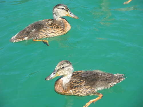
We have been on the lookout for an opportunity to study ducks this month as part of the Outdoor Hour Challenge newsletter suggestions for August. Our local pond is usually a good spot but we cruised by there earlier in the month only to discover that there were in fact no ducks on the pond right now, only geese. We were a little discouraged and trying to brainstorm another pond in the area to visit. As if they knew we were looking for some ducks to observe, a small group found us while we were out on a near-by lake having some fun with our boat.

Ducks at the Lake 1

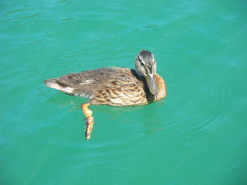
We were out on the lake taking a break from our water sports activities (wakeboarding for Mr. A and water-skiing for the Dad) when a mama and some juvenile mallard ducks came up to visit. There were six smaller ducks that we are assuming were the babies of the female in the group. The water was very clear and we could easily watch them use their specially designed feet to paddle around in the water. We noted that the little ducks had fluffy feathers on their backs and were not as smooth yet as the adult female in the group. We observed the flat long beak that they were dipping into the water. 

Ducks at the Lake 2

I am pretty sure they were inquiring to see if we had any crumbs or goodies to share with them. They were very bold and came right up to the side of the boat...not really quacking but making a sort of peeping/squeaking sound. We didn't see any males out on the water. We did read later that it is the females that incubate the eggs and take care of hatchlings so this fits in with our observations.

Ducks at the Lake 3
Here is what the AllAboutBirds website says about the female mallard (love the word dabbling):
  • Large dabbling duck

  • Streaked brown and tan overall

  • Dark blue patch on wing

  • Dull orange and black bill

We wondered as always why the females are not as colorful as the males....she does have a pretty blue spot on her wing which really is her only decoration.

We enjoyed our encounter with the lake ducks and it was fun to observe them from the waterside instead of from the shore. We could really see their swimming and paddling abilities in action. We could also note the way the water does really run off the feathers on their back, making them appear water resistant. Maybe next time we will observe some ducks flying....giving us another glimpse into this beautiful creature.

Make sure to submit your entries to the Outdoor Hour Challenge Blog Carnival. Tomorrow afternoon is going to be the deadline for entries since I need to finish it up early this month. You can submit your entries by following this LINK.

Surprise Party

Eben clearly has lots of friends. A huge effort here as they all prepare for his surprise party.


Sunday, August 28, 2011

Pretty Pumps

If you are keeping up to date with the latest trends you will know that everyone who is anyone is wearing ballerina pumps, Pippa, VB, Kate at home in front of the telly. So I thought I'd show you these that I spied yesterday in Pretty Ballerinas while wandering around Soho.


Saturday, August 27, 2011


A Reader Who Listened In ...

Hearing from Greenbriar readers is fun and informative on any occasion, but every so often, one will come forth with a lollapalooza that calls for GPS getting out an extra. Such was the case with today's e-mail from Lou Barbarelli, who shares a Horror Of Dracula memory we'd all wish to claim. As was reported in Part Two of Greenbriar's HoD posting (from 2/8/2011), a live radio telecast from station WOR in New York captured excitement of Dracula's opening (mid)night (May 28, 1958) at Broadway's Mayfair Theatre, air host Long John Nebel supplying blow-by-blow commentary as the movie unspooled. I expressed wish then for a recording of that historic broadcast, realizing slim chance of its survival. What I did get from Lou Barbarelli, however, was very much a next best thing, but I'll let him tell the story in his own words, and just say Thanks A Million for allowing me to share this account of a radio night to remember ...


Your website mentions this broadcast, stating that you wish you had a tape of it. I know of no recording in existence, but I heard the live broadcast in 1958 (I was 15) and remember a lot of it. For one thing, Nebel actually broadcast from the premiere, bringing some his "regulars" along, and you could hear the entire movie as it played to the opening night audience. An amazing broadcast. The broadcast was, to my knowledge, the first and only time a complete movie was ever broadcast live on radio. Nebel took some of his regular guests with him to the theater and they helped describe, by whispering into the microphone, the action taking place between the moments of dialogue. The effect was that the broadcasters were right in the audience, but they may have had a box seat or something. You could hear the shocked reaction of the entire audience when stakes were driven into the hearts of the various "undead" characters.


By prearrangement with the producers of the film, the broadcasters were silent during the last five minutes, so that radio audiences couldn't figure out the ending. That tactic pissed off some listeners, including me, because we weren't warned in advance that Nebel and his people would conceal the ending from us after we had listened for 80 minutes. You could still hear what was going on onscreen during those final five minutes, but it was all bombastic music, heavy breathing, smashing, etc. Frustrating but tantalizing!

After the film, Nebel and his colleagues interviewed several people in the audience. Their reactions to the film were uniformly positive. One of the people interviewed was famed columnist Sheila Graham who talked about attributes of the film that were unique at the time, (but that would reshape every horror film made thereafter). Among other things, she pointed out that the film was sensual as well as gory and that Dracula was a "very handsome man."


Another member of the audience was a high school English teacher who said that, if the movie hadn't been so terrifying, she would have loved to bring her students to a showing, because the actors spoke their lines with "perfect diction." She described the effect as "almost Shakespearean."


Unfortunately, I don't clearly remember the interview with Peter Cushing afterwards. I do remember something about a tall man standing off to one side in the shadows of the theater startling the departing theatergoers who noticed him lurking there. I believe that man was Christopher Lee, but I wouldn't swear to it. After all, it's been 54 years or so. After all that time, however, Sir Christopher is still lurking in the shadows-- thrilling us.

More Horror Of Dracula at Greenbriar Archives: Part One, Two, and Three, plus The Diary Of Jonathon Harker.