 Shibuya Restaurant getting into the spirit of halloween.
Showing posts with label Japanese. Show all posts
Showing posts with label Japanese. Show all posts
Monday, October 31, 2011
Friday, November 5, 2010
Tapestry Work of Paul Ranson

Illustration: Paul Ranson. Alpha and Omega tapestry, 1895.
The Frenchman Paul Ranson was both a fine and decorative artist who produced work in a number of fields including textiles, and more specifically that of tapestry. His work has been closely associated with the Nabis of which he was an enthusiastic member. The Nabis group was a pseudo-religious gathering of some of the most forward thinking fine artists of 1890s Paris. They including both full and partial members and ranged from Ranson himself to individual artists such Pierre Bonnard, Georges Lacombe, Aristide Malliol, Eduard Vuillard and the Hungarian Jozsef Rippl-Ronai. They dabbled with religious imagery and esoteric fashions of the day and included ideas on theosophy and philosophy amongst other subjects. However, it is sometimes distracting to concentrate too much on the Nabis and their philosophical and religious manifesto, and not enough time on the practicalities of some of the decorative work they produced during this period.

Illustration: Paul Ranson. Two nudes, 1890.
Ranson produced a number of tapestries, most of which differed very little compositionally, certainly in a narrative sense, from his fine art work. Interestingly he was amongst other things, a trained engraver and this perhaps gives some indication at to why his tapestry work gives the distinct impression of being akin to marquetry rather than a strictly woven fabric, marquetry was also a skill in which Ranson produced decorative work.
One of the reasons that Ranson produced tapestry work in the first place was the Nabis partial affiliation with the tenets of the English Arts & Crafts movement. Partial in the respect that the members wished to bring every day aspects of life within the sphere of fine art and vice versa, but did not necessarily wish to include the whole range of philosophy that was so much a part of the English movement. However, it did mean that artists such as Ranson were much more willing to open up creatively and work in a range of crafts and disciplines that could only add positively to their experience. Some of the tapestries designed by Ranson were woven by his wife which adds to the initial philosophy of the Arts & Crafts movement and its idealisation of both hand production and low key domestic participation in the crafts.

Illustration: Paul Ranson. Women in White tapestry, 1895.
Ranson himself, while working through his religious and esoteric symbolism which appeared on a number of canvases and tapestries, was influenced by Japanese prints in particular and with that the creative graphic experience which was such a large part of the media world of 1890s France. The lack of dimensions and the often sinuous lines in Ranson's work give a good indication that the artist was aware of trends and initiatives that were beginning to influence art, design and decoration across many disiplines and mediums in France.
Although not all of the illustrations in this article are concerned with Ranson's tapestry work, the fine art pieces do give the same feeling towards an aspect of Ranson's work that appeared both contemporary and indicative of the changes that were taking place across Europe, not just France. While there is every indication that Ranson, along with others within this particular era of European decorative and artistic history, were heavily influenced by Japanese art and print work, it would be a mistake to see this as an ending in itself. Where Ranson and others were taking this Japanese inspiration was to a completely different place creatively from the initial exposure. As can be seen in Ranson's Alpha and Omega tapestry piece, a whole range of complex initiatives have already been set in place, most deriving from the common European experience whether that be culturally, spiritually or creatively.
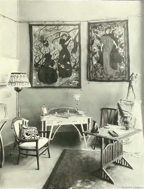
Illustration: Paul Ranson. Two tapestries, c1900.
All creative work is produced not in a vacuum, but in a rich spawning ground where initial inspiration can sometimes be both intense and emulative. However, truly creative initiatives quickly overcome this period and a uniquely individual approach will soon follow. This is true in the case of Ranson, the Nabis and the phenomenon of Japanese inspiration in general. Ranson's creative tapestries add to the already rich compositional narrative of the discipline that could be found amongst tapestry artists and designers across Europe during this changeover period from the nineteenth to the twentieth centuries.
Although the relationship between Ranson, the Nabis group and fine art is a complex one, this article is only concerned with the artists tapestry output. Although it is indeed difficult to separate the ideals and philosophy of an artist from his creative work, tapestry by its very nature is much more about decoration and the practicalities of design and therefore the Nabis philosophy has been laid aside for this particular need.

Illustration: Paul Ranson. Digitales, 1899.
Apple Tree with Red Fruit, c.1902 Art Poster Print by Paul Ranson, 32x24

Paul Elie Ranson: Du symbolisme a l'art nouveau (French Edition)

Oil Painting Reproductions, Art Reproductions, Paul Ranson, The Clearing Edge of the Wood, 30" x 46" (76cm x 117cm), 100% Hand Painted Oil On Canvas Replica Masterpiece

Paul Ranson, 18611909: Catalogue Raisonne, Japonisme, Symbolism

Oil Painting Reproductions, Art Reproductions, Paul Ranson, Japanese Style Landscape, 25.6" x 32" (65cm x 81cm), 100% Hand Painted Oil On Canvas Replica Masterpiece

Les Nabis. Taurus Number 11, May-June 1969

Christ and Buddha, circa 1890-1892 Artists Giclee Poster Print by Paul Ranson, 12x16

The Nabis: Bonnard, Vuillard and Their Circle

The Nabis (Art of Century)

Bonnard and the Nabis (Temporis)

Gauguin and the Nabis: Prophets of Modernism

Nabis (Schools & movements of painting)

The Nabis and the Parisian Avant-Garde


Thursday, September 9, 2010
Wallpaper Design by Hans Christiansen

Illustration: Hans Christiensen. Wallpaper design, c1901.
The German artist and designer Hans Christiansen produced a while range of textile based design work, most of which derives from the first two decades of the twentieth century, including the disciplines of printed textiles, carpet and rug, tapestry, embroidery and wallpaper design. However, Christiensen was also intimately involved in both fine art and graphics, as well as to a lesser degree in the disciplines of ceramics and glass.
Christiensen was one of the four founders of the Darmstadt Art Colony along with Paul Burck, Patriz Huber, and Rudolf Bosselt. He did, like many others, have a house built within the community but was never a strictly full time resident as he often spent the winter months in particular, in Paris. Although initially involved in the Arts & Crafts element of Germany, Christiensen soon became very much involved in both French Art Nouveau and the Jugendstil, but his work also had a large Japanese feel to it that often ran through most of the disciplines in which he produced design work.

Illustration: Hans Christiensen. Wallpaper design, c1901.
Although Christiensen was more comfortable and certainly more widely known for his fine art and graphic work, it was his wide-scaling decorative art work that really helped to mould some of the styling and ideals of the German Jugendstil movement. The examples of wallpaper design shown here were produced at the very beginning of the twentieth century and were indeed featured in the leading German art and design magazine of the period Deutsche Kunst und Dekoration.
Although the wallpaper design work shown here does very much follow some of the general lines of the French Art Nouveau movement, there is also a leaning towards at least some of the visual elements that made the German Jugendstil a style that while still part of the Art Nouveau scheme, was somewhat different in general outlook being slightly less involved in the extreme styling of the movement.

Illustration: Hans Christiensen. Wallpaper design, c1901.
The Japanese element which is always present within Art Nouveau decoration in general, whether to a lesser of higher degree, seems obviously present in Christiensen's wallpaper pattern work. However, this was not necessarily true of all of his decorative art output which sometimes had a decidedly graphic but Germanic rather than Japanese emphasis. It must be admitted though that Christiensen was a German that had a much closer affiliation to both the French interpretation of Art Nouveau and that of Japanese styling. It could be said that it was some of these elements that Christiensen brought to the Jugendstil, which enabled it to have a much broader appeal and allowed it to expand from its original German format.
From the First World War onwards, like so many fine artists that had turned to the decorative arts, Christiansen returned to his initial discipline and remained a painter for the rest of his life, even though in 1933, like so many other creative people in Germany, the Nazis banned him from publicly displaying his work.
I must apologise for the poor quality of the illustrations. They were the only ones I could obtain that were copyright free, but I thought that it was important for you all to see some of the wallpaper design work produced by Christiensen, rather than none.
Further reading links:
Modern Style: Jugendstil/Art Nouveau 1899-1905

Jugendstil aus Nurnberg: Nuremberg Jugendstil

Schmuck-Kunst im Jugendstil At Nouveau Jewellery

Jugendstil Building, Majolikahaus, Vienna, Austria Photographic Poster Print by Walter Bibikow, 32x24

Art nouveau in Munich: Masters of Jugendstil from the Stadtmuseum, Munich, and other public and private collections

Musik und Jugendstil (German Edition)
Wallpaper: A History of Style and Trends

Wallpaper, its history, design and use,

Fabrics and Wallpapers: Design Source Book

Pattern Design: Period Design Source Book

Twentieth-Century Pattern Design

Wallpaper and the Artist: From Durer to Warhol

Monday, July 6, 2009
Stories from Silence
 A free storytelling event for children and adults by the Wellcome Library.
Saturday 18 July, 14.00-15.30
Sunday 19 July, 14.00-15.30
Sunday 19 July, 14.00-15.30
A Native American in full war dress armed with bottles of prairie medicine, an exploding bucket, Japanese demons, and a voice from plague-ridden London in 1665 all feature in a live storytelling event to be held at Wellcome Collection on 18-19 July.
Four specially commissioned storytellers will use performances, Japanese story boards and live demonstrations to tell their stories, each inspired by one of four different objects in the Wellcome Library.
Story lovers of all ages will be transported to London during the Great Plague of 1665-66, to the magical land of Japanese spirits and demons, to Clapham Common in the 1890s - where assistants dressed as Native Americans (or 'Red Indians' as the Victorians knew them) touted Sequah medicines while volunteers had their teeth pulled - and taken on a school trip to San Diego in the mid-1990s to hear Francis Crick's colourful personal account of his early youthful, and at times explosive, experiments.
These four stories, spanning different countries and centuries, bring to life four fascinating items in the Wellcome Library - the world's greatest collections of books, manuscripts, pictures and films relating to the history of medicine.
Families and adults are welcome at this free event, which also includes audio description of the four central objects, as well as speech-to-text live subtitles (on Saturday 18 July) and BSL (on Sunday 19 July).
To book your free tickets, visit the Wellcome Collection website.
Wednesday, May 6, 2009
The Art Nouveau Whiplash

Illustration: Design work, 1900.
One of the defining emblems of the Art Nouveau movement was the whiplash motif. It has been known by various other names and formats, ranging from 'noodle' to 'tapeworm' but the moniker of 'whiplash' has stayed with the movement.
The lines that very often make up the design work of the period, were often seen as languorous, sensual and by some even lascivious, but they could also provoke ideas of sharper and more defined movement and gesture. 'Whiplash' is not the first word that comes to mind when thinking of the soporific qualities that Art Nouveau is often famed for. However, it does show that the movement could be adaptable and when it needed a harder edge, it could find one, even if just a metaphor.

Illustration: Design work, 1900.
No decorative style appears fully formed devoid of roots, and the Art Nouveau movement is no different. It has its origins in a number of styles and cultures from a range of eras that include Victorian Gothic and the Arts & Crafts movement. The iconic whiplash however, can trace its origin to a revived interest in the highly decorative, but very often fragile Rococo interiors of the eighteenth century.
Similarities between the two decorative styles are there and can be identified quite clearly. Both used the sensual and the sinuous in large quantities, and both have become associated as feminine in style and sympathy. However, they were also both often accused in their own contemporary eras of being overly fussy, convoluted and resorting to studied decadence and affectation. It would perhaps be stretching credulity a little too far to draw too many conclusions as to their shared similarities, this would imply that at some basic level ,they were the same, and they were clearly not. The world of the eighteenth century Rococo was not the same space as nineteenth century Art Nouveau, there were different theoretical ideals to the two decorative styles, as well as general social and political differences in the historical eras themselves.

Illustration: Design work, 1900.
There were also many new and different influences on the latter style than the former. For example, Art Nouveau was heavily indebted to traditional Japanese design culture, Japan being a largely isolated and unknown entity in the eighteenth century. Out of the interest in Japanese decorative styles and particularly their art and craft techniques, came the use of the graphic flat one-dimensional aspect of much of the Art Nouveau output. Although surface pattern and design was used extensively through much of the nineteenth century across Europe, it was the Japanese influence that produced some of the most recognised elements of the Art Nouveau period.

Illustration: Design work, 1900.
Which brings us back to the whiplash. While it undoubtedly has its origins in the European Rococo decorative style of the eighteenth century, it also owes a great debt to a range of style eras from Celtic to Japanese. it would perhaps be more accurate to call the whiplash and Art Nouveau in general an eclectic style may well help to sum up, at least broadly, both the appeal and purpose of the movement.
Further reading links:
Art Nouveau Designs (Design Source Books)

Art Nouveau

Art Nouveau: Utopia: Reconciling the Irreconcilable (Taschen's 25th Anniversary Special Editions Series)

422 Art Nouveau Designs and Motifs in Full Color (Dover Pictorial Archive Series)

Art Nouveau (Art and Ideas Series)

305 Authentic Art Nouveau Jewelry Designs

Treasury of Art Nouveau Design & Ornament (Dover Pictorial Archive Series)

Art Nouveau Flowers (Design Source Books)

300 Art Nouveau Designs and Motifs in Full Color (Dover Pictorial Archive Series)

Art Nouveau 1890-1914

Art Nouveau in Fin-de-Siecle France: Politics, Psychology, and Style (Studies on the History of Society and Culture)

The Art Nouveau Style

Art Nouveau Floral Patterns and Stencil Designs in Full Color (Dover Pictorial Archive Series)

The Essence of Art Nouveau

Art Nouveau: An Anthology of Design and Illustration from "The Studio" (Dover Pictorial Archive Series)

Subscribe to:
Posts (Atom)


