Saturday, December 31, 2011

Outdoor Hour Challenge Blog Carnival: Getting Ready for Winter Edition

OHC Blog CarnivalThe busy month of December is coming to a close and the winter months have now arrived. This month's Outdoor Hour Challenges suggested we spend some time exploring our neighborhoods looking for signs of plants and animals preparing for winter. Taking time outdoors for nature study in December was a rewarding experience. I want to thank all the participants of the carnival for sharing your December World.


Getting Ready for Winter Edition - Outdoor Hour Challenge Blog Carnival

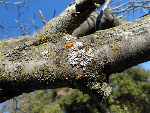
Lichen - Winter Color


December World 
  • Tricia gets us going with the first entry of the carnival, When A Millipede Interrupts Math. This entry so beautifully illustrates how being flexible and following interest lead to some wonderful nature study. 
  • Amanda from A Thousand Words has put together the account of their outing - Winter Color: Lost and Found. Wow...love this entry! They found a lot of beautiful winter images to share and their smiles too!
  • Angie from Petra School has submitted their Ready for Winter entry which combines the December World and Preparation for Winter challenges. I commented to her that there are just too many great things about this entry to even list them all. I encourage you to click over and read about their Oregon Coast style nature study.  Angie also shares their Winter Color Walk and hopes it isn't cheating to include this fabulous place. I really enjoyed it and you will too!
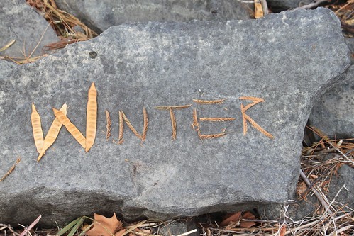
  • Winter - Nature Sign
    Photo Credit: Amanda at A Thousand Words
  • December Nature Study in Flip-Flops! Amy writes about their unseasonably warm nature study as part of their December  challenge. She shares their birds and a beautiful moth for carnival readers. She also has this entry to share Enjoying God's Creation. Thanks Amy.
  • Ann from Harvest Moon By Hand shares their Go On A Nature Walk entry with carnival readers. They had snow for this day's excursion...so very pretty. 
  • Tricia was able to squeeze in some outdoor time this past week with her children. Read about it in their On a Sunny December Day entry to see blooming flowers, bees, lizards, and more. 
  • This one really belongs down in the Potpourri section but I don't want you to miss it. Julie from Homeschool Balancing Act shares a mother's story worth reading: Brushing Off the Holidays and Getting Back to Nature. Thanks Julie.
  • Janet from Across the Page submits this end of the year nature walk entry with some wonderful images and thoughts: Tree Tales, Muted Colored, Birds and Musings.
Evergreens
  • Zonnah shares their Evergreen Investigation entry as part of the evergreen challenge posted last week. She shows us a great example of how to make nature study a family affair, even when someone is at first unwilling. She also includes some lovely images of cone scales. 
  • Jenny Anne from Royal Little Lambs writes the story of their evergreen study. They were able to observe a pine tree up close and conclude with journal entries.  
  • Shirley Anne from Under the English Sky sent in their Evergreens study for the carnival. It is sure fun to see their English countryside and winter evergreens. 
Preparing for Winter
  • Amanda writes about their Preparation for Winter nature study time. Funny squirrels and beautiful birds...quail some of my favorites. Awesome images.
  • Rachel from All Things Bright and Beautiful submits their Insects! in December entry as part of this carnival.  They used a field guide to give them some ideas of where to look for their insects preparing for winter. Great job!
  • Diana writes about their Preparation for Winter study in their neighborhood. Their family found some signs of winter coming and some extras too. 
  • Barbara from A Wildflower Morning has put together a very nice entry sharing their Milbert's Tortoiseshells in Winter.... read how this butterfly survives the cold winter as an adult. Wonderful!
 

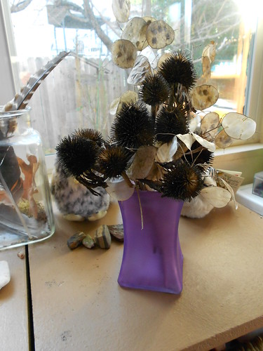
Winter Bouquet with seeds

Potpourri
  • Denise from Grace and Truth has entered their Seasonal Tree 2011 Study entry. What a visual treat! They picked a California Sycamore and a Queen Anne Palm tree for their tree work. She shares their year-long tree work with wonderful images of their trees and journals. 
  • Janet from Across the Page has submitted a fantastic entry about their local water habitat, A Bit About Beavers. You will enjoy the images and information about their beavers and muskrats. Great pictorial of their beaver's handiwork. 
  • Nicole at One Hook Wonder shares their Osage Oranges entry with carnival readers. They did a very child-friendly study of a topic not covered in the Handbook of Nature Study. They also did a Palm Tree study while on a trip, making some very good observations! Okay, now how about some alligators...well the hope of alligators anyway? You can read about their alligator adventure on her blog One Hook Wonder. One last entry to share their Beaver study. Awesome beaver observing spot!
  • Angie from Petra School has written up their Maple Hunt adventure, the one where she is humbled and we all get to enjoy her beautiful photos. Excellent.
  • Bethany from Little Homeschool Blessings gives carnival readers their Rainbow Scarab AKA Dung Beetle entry to view and read. She sets a very good example for the rest of us by digging a little deeper and uses What's That Bug? to figure out the insects identity.
  • Robin from Harris Homeschool shares their Bird Count entry....comparing visitors to their suet feeder and their sunflower seed feeder.  What a simple and fun idea!
  • Anne has shared four wonderful winter related nature study entries with carnival readers: Weather Experiments-Thermometer and HygrometerFrost and Snowflakes, Lights and Constellations,  and Make Treats for Birds.


More Nature Study #2 button
The winner of the December Giveaway (chosen by Random.Org) is Nicole from One Hook Wonder! She will receive a copy of my soon to be released More Nature Study Book 2 Winter Wonder! Thank you to everyone who made an entry to this edition of the Outdoor Hour Challenge Blog Carnival.

See you all next month! Remember that January's Newsletter link will be for subscribers of the blog only. You will need to subscribe by entering your email address in the subscription box on the sidebar of the blog.
3D Grabs Hold --- Part One

I'll tread lightly upon this subject of 3D for realizing there are experts that know it chapter/verse, and so humbly invite same to expand upon or correct data gathered here. Just understand that 3D represents a noble tradition of screw-ups and breakdowns, my own in respectful observance of that. I embark upon multi-posts about the process, mindful not to exceed an initial three (more will follow later) as we’ve all known fatigue too much 3D can inflict. Like a lot (most?) of you, I’ve never seen it decently presented. By that I mean with two projectors side-by-side running in perfect synchronization.

I'm for dealing out modern third dimensions this trip. The only sampling I’ve seen anyhow was a handful of ear-jangling IMAX shorts about jungle safaris. What I’m for exploring is so-called primitive 3D that excited patrons during 1953 and much of ’54. I was born during the boom and feel closer to it for that. The Egyptian Theatre in Hollywood has run two depth festivals with practically everything extant on view. A friend flew cross-country to see them while headache fears kept me home. An experienced operator will assure you that no pain comes of watching 3D provided those in the booth know what they’re doing. As this was/is/always will be a species rare, there’s little wonder the 50’s flame burned off quickly.


Moviegoing travels brought me twice to House Of Wax on single-strip reissues (1972 and 1983), both botched. Other than that, there was Revenge Of The Creature with 16mm reds and greens having faded, thus killing the 3D effect, and more recently the challenge of DVD-delivered Spooks, with The Three Stooges. Yet I’m rarin’ to go for 3D after boning up on 50’s showman efforts to get a rope ‘round a novelty most of them figured for the flash in the pan it turned out to be.


Old timers in the business said 3D reminded them of the mess that was Vitaphone, and here they were twenty-five years later reliving sync-up nightmares. Each to a man knew what a minefield that could be. There was always option of letting the craze pass, but what of lines and epic grosses your opposition’s fielding down the street? Exhibitors sought elixir to bring people back into theatres. Hit movies continued declining in number as solid attractions on TV carved inroads. Wouldn't you elect to stay home and watch Lucy or maybe Martin and Lewis doing the Colgate Comedy Hour over going out and paying admission for a commonplace feature?

By late 1952, most were voting the tube. Whoring out to a gimmick was desperation’s last resort for an industry down on canvass and taking the count. Independent producer Arch Oboler was an experimenter from radio who guessed 3D might click at feature-length. Maybe others considered it before, but he was first to throw dice with monies borrowed and bookings scavenged where management would gamble with an unsure thing. Two Paramount theatres in Hollywood were Oboler's testing Ground Zero. For four weeks they would play Bwana Devil to what observers called unprecedented business. They'd have kept it longer but for prior booking commitments. This was December 1952.


Arch Oboler at Bwana Devil's Hollywood Opening with Stereo-Realist Lobby Display

Just as industry watchers wondered if The Jazz Singer might be a fluke back in 1927, so too did studios flinch over dives into 3D. Another independent with spring in his step was Sol Lesser, always quick to move in on someone else’s good thing. A British developer leased him rights to a process called Tri-Optican and a handful of shorts utilizing its depth (including a documentary, cartoon, ballet, and an abstract film, according to Boxoffice). Some said the latter looked better than Oboler’s Natural Vision. Lesser’s Tri-Opticon was America debuted at Chicago’s Tele-News Theatre on Christmas Day 1952. $30,000 was rung up for a week that would normally average four to five G’s. Santa Claus was finally back in town to call on besieged exhibitors.

Seizing initiative as they had with talkies, Warner Bros. announced shooting would begin January 15, 1953 on Wax Works in Natural Vision 3-D. They understood this was a race for what Jack Warner called a fast dollar at the box office. Directors of the Theatre Owners of America exhibitors group convened in January 1953 to discuss future possibilities of 3-D, and provided a print could be secured, to inspect Bwana Devil as well. Sol Lesser was meanwhile delivering equipment and accessory packages to theatres booked for Tri-Opticon. They’d need a “metalized” screen, a coupling device for interlocking projectors, and Polaroid glasses, these being reusable provided they were sterilized after each show.


Paramount's Adolph Zukor Being Prepared for His 3-D Debut
 Harrison’s Reports saw those glasses as 3-D’s main obstacle to wide acceptance even as crowds braved snowstorms to break house records at northeastern theatres where Bwana Devil was playing. Every Hollywood studio was knee-deep in experimentation to develop their own “dimensional” format. Mid-January saw Fox announcing what they called Anamorphisis, the large-screen French process which offers a three-dimensional effect. The Robe was slated to be the company’s first in Anamorphisis. Paramount’s Adolph Zukor promised 3-D that would not require glasses (we’re still waiting for that). Sol Lesser was sufficiently buttressed by Tri-Opticom’s success to foresee twelve complete 3-D programs per year under his auspices. Arch Oboler meanwhile fielded offers from distributors eager to buy him out of Bwana Devil. He'd be in New York negotiating with United Artists for a sale of what was at that moment the industry’s hottest picture property.

Bollywood

I'm off to a Bollywood party to see the New Year in. I've learnt my dance moves - turn the light bulb, pat the dog. Have my finery. See you next year.
Where ever you are I hope you have a lovely New Year and thank you all for dropping by. Hope you'll stay with me in 2012.

Friday, December 30, 2011

Contemporary Art in Northern Ireland | Parliament Buildings | Stormont


Text by Angela Darby

Below the gilded King Edward VII chandeliers and between the Italian travertine engraved marble walkway the exhibition Contemporary Art in Northern Ireland is situated in The Great Hall of Parliament Buildings at Stormont. The exhibition’s curator Dr Suzanne Lyle, Head of Arts and Acquisitions at the Arts Council of Northern Ireland, states: “The invitation from the Speaker to bring this exhibition to Parliament Buildings is an important opportunity to champion our artists... business leaders will cite the strength of a society’s arts and culture as a key factor influencing any decision to invest...” Staging the exhibition in Stormont is a positive step to improving public access and additionally the political decision makers who allocate cultural funds can view firsthand the quality of the works on display. The 24 selected artists are drawn from emerging and established artists. Miguel Martin (b.1985), a talented young artist pays homage to an established artist with an intricate, detailed line drawing entitled Neil Shawcross’s Studio Space whilst internationally recognised artist Colin Darke (b.1957) raises questions concerning intellectual copyright and appropriation in his painting Mannish Boy V – Policeman. This breadth of practice is well represented throughout the exhibition.

Brendan Jamison’s (b.1979) large impressive sculpture Yellow Helicopter shares an eyeline with the bronze statue of Sir James Craig, the first Prime Minister of Northern Ireland. The striking work grabs the viewers’ attention with its skeletal composition and bright woolly draped flesh. The piece sits in The Hall as an ironic testament to the military occupation of Northern Ireland’s past. Artists such as Christopher McCambridge and Jennifer Trouton seem to relate metaphorically to the environment. In Re-interpretation: Falling for Grandeur, McCambridge meticulously stitches his canvas with royal blue, blossom pink and turquoise threads. The chinoiserie wallpaper referenced is rendered by the artist’s physical action into a luxurious tapestry, an historical artefact echoing the affluence of the architectural environment within which it hangs. Trouton’s oil on linen painting Harrow captures a similar sensibility. An intricate photo-realist painting of a textured blanket draped over a chair suggests a story of comfort and tranquillity. But the fragments of broken crockery strewn and discarded beside the chair disturb the picture’s equilibrium. As the painting’s title suggests there is no room for harmony.

Simon McWilliams’ oil on canvas, Stairwell captures a fragment of Belfast’s prolific re-development that spread throughout the city like a raging virus. Resembling invasive weeds on a riverbank, green fluorescent netting and scaffolding provide a stagnant ‘still’ from an emergent tower block’s metamorphic growth. Caught in a frozen moment the image reveals the city’s faltering regeneration. The artists Terry McAllister, Gareth Reid, Gail Ritchie and Robert Peters poignantly capture aspects of rural landscapes and woodlands. Ritchie’s Dead Tree, a fine graphite pencil drawing on paper, hauntingly commemorates the traditional 12th of July Orange March to the field in Edenderry Village, Belfast. The faces of menacing sprites and gargoyles emerge from the gnarled bark and twisted knots on the tree’s decaying surface. The tree’s totemic symbolism seems to point to a time before the transformation of the province’s political situation and a time when one community had a monopoly over the other. Robert Peters’ digital print, entitled Uccello of the Potato Field I and II, portrays a traditional children’s game played in the potato fields on his family farm during the 1970s. This is not a game of childish innocence however but one of brutal combat as the sport’s object is to target and hurt one’s opponent by hurling potatoes propelled from the sticks. Peters has arranged the composition of his improvised weaponry to correspond with the upright lances in The Battle of San Romano (1438-1440) by the Florentine painter Paolo Uccello.

In the works by Zoe Murdoch, Maria McKinney, Shaleen Temple and Carrie McKee there is a polar presence of escapism and capture. Murdoch’s sensitive and melancholic sculpture Oh Muse Be Near Me Now and Make a Strange Song is dedicated to a long distanced correspondence. The anatomical objects and printed text contained within the small wooden box form clues to the artists’ reflection on the frustrations of a relationship spent apart. Maria McKinney examines the pursuit of leisure time and the activities devised to combat monotony in an appropriated jigsaw composition The Earl of Leicester. The photographic portraits by Temple and McKee poignantly narrate the condition of each of their subject’s entrapment. From the series entitled Boys and Girls, Temple’s documentation of South African servants exposes a world of subordination and subservience. The artist’s subject, Jerita stands tentatively in the interior of her employer’s home in Johannesburg. The red wall’s arch and dark wooden furniture frames and engulfs Jerita, the very objects that define her occupation seem to imprison her. Temple draws attention to these domestic servants who would otherwise be overlooked and in so doing she credits them with the recognition that they deserve. McKee chooses the backdrop of derelict Belfast cityscapes for her stunning depictions of young dancers. In Orlaigh (2011), a girl poses defensively with her arms folded; she is dressed in a bright orange and fuchsia coloured costume, a large pink blossom frames her face. This beautiful, ‘tiger lily’ sprouts with strength and determination from the desolate wasteland, waiting for her hopes and aspirations to be fulfilled.

One can easily imagine how Stormont’s opulent surroundings and ornate architectural features might overshadow the exhibiting works, rendering them undistinguished and lacking in impact. Surprisingly this is not the case; Dr Lyle’s strong curatorial vision corresponds with the context of this stately environment.

Contemporary Art in Northern Ireland, 21/11/2011 - 04/01/2012, Parliament Buildings, Stormont. www.artscouncil-ni.org

Aesthetica Magazine
We hope you enjoy reading the Aesthetica Blog, if you want to explore more of the best in contemporary art and culture you should read us in print too. You can buy it today by calling +44(0)1904 479 168. Even better, subscribe to Aesthetica and save 20%. Go on, join us!

Caption:
Carrie Mckee Gilded Youth - Orlaigh Burns 2011
Courtesy the artist

British Cusine

Enough to have a French Chef throw their hands in the air.

Thursday, December 29, 2011

What Camera Do I Use? Updated December 2011

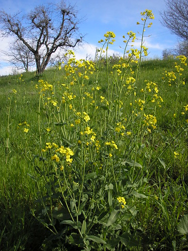
mustard plant
What kind of camera do I use for the photos on my blog?

First posted on May 1, 2008 and updated on December 29, 2011


I get asked this question a lot in comments and email. I have shared before that I really don't use a fancy camera but one that I can take with me everywhere in my pocket or in my backpack with no worries.

So what do I use? 

For most of my everyday shots I use the Nikon CoolPix S3300 (Point and Shoot). I also take some of my bird photos with my son's really old Canon Rebel with a zoom lens. I would say 90% of the photos on my blog are with the inexpensive point and shoot Nikon. Purple of course!


My point is that you don't need a fancy, expensive camera to take a good photo. If you learn a few tricks and practice taking photos, you will have more success.

Honestly, I use this camera for all my regular and macro photos with minimal cropping on the computer. I rarely, if ever, mess with anything other than that. If I do make any adjustments to a photo, they are done on Picnik (through my Flickr account).

Here are my tips for taking a good photo.
1. Take lots of photos. If I am trying to get a good photo of something for the blog, I will sometimes take ten photos of the same thing. I'm not kidding...with digital it doesn't really matter how many you take since you can delete the ones you don't like once you get home.


2. Learn to use your camera. I know those manuals are intimidating but you can skim through to find things that will help you take a better photo. What I did to take better photos was to learn what all those little symbols on the back of the camera meant and that immediately helped me take a better photo. I love the little flower setting....better known as macro. I can take close-ups of flowers or bugs now and they are truly in focus. I decided at the beginning of 2011 to read one page in my camera manual everyday and then practice what I learned. This was an easy way to work through the ins and outs of the camera and show me what it could do. 


portrait B
(This photo I took many years ago. On this day, I think I took 50 photos to get this one keeper.)
 

3. Pay attention to composition. Take that extra second to see if there is something weird in the background, to make sure your subject is framed in a pleasant way, and that you are not taking the photo directly into the sun.
 

4. Watch shadows on faces if you are outside.
 

5. Remember your flash typically doesn't work farther than about 5 or 6 feet.
 

6. Take flower shots early in the morning or later in the afternoon and not during the glare of mid-day.
Boys at Olmstead point 

7. Take photos from different angles. Get low and look up. Get high and look down. Go child level. Sometimes an interesting photo is just one that comes from a different perspective than normal.

Insect on lavender 2 

8. If you are taking a close-up photo, steady your arm or hand on something solid like a table or a fence post. Before pressing the shutter, breathe in and hold your breathe so you are as still as possible. This has made a huge difference in the quality of my close-up photos.

Taking a good photo is sometimes just a matter of being in the right place at the right time with your camera in your hand so take it everywhere you go.


You can see my Favorite Photos on Flickr:
Favorite Photos from 2005
Favorite Photos 2006 - this was a big year
Favorite Photos 2007
Favorite Photos 2009
Favorite Photos 2010 - my favorite slideshow
Don't know what happened in 2008....didn't tag my photos for some reason.

Item of the Month, December 2011: Sun Yat-sen and Sir James Cantlie

In March 1912 the provisional president of the newly created Republic of China, Sun Yat-sen, sent this letter to Mrs Mabel Cantlie, wife of the British tropical medicine specialist Dr James Cantlie. In it he surveys the enormous challenge the young republic faced less than three months into its existence. In fact Dr Sun was to play little further part in the immediate consolidation of the Chinese republic, as by the following year he was on the run from the military government of General Yuan Shikai, Sun’s successor as president, and self-appointed ‘Great Emperor of China’.

Dr James Cantlie (1851-1926), an Aberdeen trained physician, went to Hong Kong in 1887 at the invitation of Patrick Manson, whose medical practice he inherited. One of his earliest achievements was to assist Manson in establishing a medical training college for native students, one of the first of whom was the future president of China.

After graduating Sun Yat-sen remained in contact with the Cantlies, periodically appealing to the British government and public for support for democratic China through their good offices. The record of this involvement is reflected in Cantlie’s papers which were later donated to the Wellcome Library by his descendants.

Sun Yat-sen was already a well-known revolutionary agitator as a student, although still an assiduous enough scholar to graduate top of his class in 1892.

In 1895 he was part of small group of revolutionaries who planned to engineer an uprising in Guangzhou (Canton), only for their plot to be betrayed. Not for the last time Sun found himself a wanted man, escaping via Hong Kong to the United States, pursued by a banning order from the Hong Kong authorities. When the Cantlies returned to London the following year Sun Yat-sen moved to England, partly to benefit from the help and protection of his mentor. This was soon called in aid when Sun was kidnapped and imprisoned in the Chinese legation on Portland Place.

A high profile campaign in government and press was orchestrated by Cantlie to secure Sun’s release. The episode marked a turning point in Sun Yat-sen’s career, as it turned him into a celebrity, much in demand on the British lecture circuit, as this show card suggests.

His popularity in the UK was not reflected in Hong Kong, where the colonial authorities, anxious to maintain good relations with Imperial China, continued to warn Sun to stay away.

During the first decade of the twentieth century Sun Yat-sen was based mainly in Japan, one of the main centres of expatriate Chinese revolutionary activity, and Hawaii. There is little evidence of his activities during this period in Cantlie’s papers. In Tokyo Sun founded the party later known as the Kuomintang – the first political party of republican China. When a general insurrection spread across China during 1911 the Kuomintang was able to take power in Guangzhou in a bloodless coup in November.


Following events at a distance Cantlie was moved to upbraid The Times’s correspondent in Beijing, who was slow to comprehend the revolutionary moment.

Sun himself arrived in Shanghai on the 25th of December, setting foot in his homeland for the first time in sixteen years. He was elected provisional president four days later - so, one hundred years ago to this day - and sworn in on New Year’s Day 1912.

Sun Yat-sen, aware that he and his party had ridden to power on the coat tails of a military uprising, ceded the presidency to the military strongman Yuan Shikai, pending elections. When held in late 1912 these returned the Kuomintang as the largest party. Relations between the autocratic Yuan and his democratic opponents deteriorated rapidly; the parliamentary leader of the Kuomintang was assassinated at Shanghai railway station on Yuan’s orders in March 1913, one of the events that precipitated a lengthy, despairing telegram from Sun to Cantlie that was circulated in the press, and which is preserved in his papers.


By late 1913 Sun Yat-sen was again on the run, his party proscribed by Yuan.

Sun Yat-sen’s political career was far from over but the Cantlies had played their part. Their intervention to free him from the Chinese Legation in 1896 had no doubt saved his life. For this reason both Cantlie and London hold an honoured place in the foundation mythology of modern China, and during this centenary year the papers documenting Sun’s connection with his old tutor have been much in demand. They died within barely a year of each other, two lives that came together to change the world.


Images:
- Letter from Sun Yat Sen to Mrs Mabel Cantlie, 12th March 1912 (MS.7934)
- Hong Kong: College of Medicine for Chinese. Examination Papers in Anatomy: answered by Chinese Students. 1887. Page from Sun Yat Sen's examination paper, with
diagrams. (MS.2934)
- Excerpt from letter from Dr James Cantlie concerning Sun Yat Sen's imprisonment by the Chinese Legation in London, dated October 22nd 1886 (MS.7937/13)
- An episode in the revolutionary war in China, 1911: the march of the revolutionary army on Wuhan with two portraits of revolutionary leaders in roundels at top; the right one resembles Sun Yat Sen (Welcome Library no. 645607i)
- Telegram from Sun Yat Sen concerning the murder of Sung Chao-jen, leader of the Kuomintang political party, and the withdrawal of funds from the Peking government. Dated 2nd May 1913. Pages 1 and 2 (MS.7937/21)
- Portrait of Sun Yat Sen from 'Obituary and programme of memo for Dr Sun Yat Sen' (MS.7937/23)
- Sir James Cantlie. Oil painting by Harry Herman Salomon after a photograph (Wellcome Library no. 45529i)


Author: Richard Aspin

Saying Good-bye

Seeing friends off at Gatwick airport. I do find this airport friendlier and easier than Heathrow.

Wednesday, December 28, 2011

Gothic Revival Wallpaper Decoration and Pattern

Illustration: William Woollams and Co. Block wallpaper design, 1851.

The history of wallpaper design has very often been identified quite clearly with the history of the decorative arts. By its nature, particularly from the nineteenth century onwards, it appeared almost instantaneous compared to many other formats within an interior. Because wallpaper became connected with mass production, new and varied design work appeared on the market with an increasingly rapid turnover. Design styles were not only fashion orientated, but also connected with the different strata of society, along with the differences that became apparent in the nineteenth century between the interior requirements of domestic households, with wallpaper design work appearing to satisfy the perceived tastes of both the male and female dominated areas of the home.

The nineteenth century saw an extensive range of suppliers in both Europe and North America producing decorative pattern work to feed an ever expanding market. Although it is often assumed that wallpaper work in the nineteenth century was over-laden with excessive amounts of pattern and colour, it is sometimes interesting to examine some of the examples that were part of the market and to re-examine our preconceptions, many of which were coloured by ideas concerning the nineteenth century that were promulgated by the twentieth century.

The example shown in this article was produced in 1851 by the company of William Woollams and Co. This block printed design does not have any of the heavy formatting that we often associate with the Victorian era. It is simple, certainly within its colour range and was produced, although not specifically, for a picture hanging room where it would conceivably not clash with any of the compositions hung in front of it. Although not specifically machine produced, other examples similar to this were produced by machine. The common misconception is that machine produced wallpaper design work was both badly designed and of inferior workmanship. While machine produced wallpaper output could not hope to compete with hand production, the quality of pattern work was not always as clear cut as critics of the period would have the public believe. Many of the examples reached the same level of competence as this particular example, although to be fair, many did not.

The fact that this particular wallpaper design was produced at the beginning of a decade that was to see the spectacular rise of mainstream medievalism in the form of the Gothic Revival, is shown perhaps in the choice of pattern format. Perhaps not as obvious or structured as the work of A W N Pugin, it is nonetheless very much in the mould of medieval styling that was considered acceptable for the period. The scroll work could easily have been identified either with ecclesiastical stone work or elaborate door hinges; it could even have been identified with medieval book illustration. The fact that all of these origin points, as well as others, shows how non-specific some of the medieval sourcing for the Gothic Revival really was. 

Instigators of specific sourcing for the revival, such as A W N Pugin already mentioned, and that of Owen Jones, wanted deliberate and scholarly investigation into medieval pattern work, specifically the anatomy of the differing decorative styles that went to make up the era. That these investigations could then be used to both help and expand the vocabulary of contemporary nineteenth century pattern work, including that of wallpaper design, was widely expected. However, the interior decoration market has always been led by a largely pragmatic approach to decoration in its broadest sense. No large tomes regarding medieval decoration and ornament were followed by many of the suppliers of the interiors trade, although these were both written and published in large and varied profusion, particularly during the 1850s and 1860s.

Many of the wallpapers produced during this period were given the feel of medievalism without the strict structure of the original source. Many wallpaper suppliers and retailers were well aware that although the Gothic Revival had huge potential for expansion and exploitation, it was also one that had to harmonise with the relative relaxed and casual atmosphere of mid-nineteenth century domestic interiors. In other words, what had originally been produced for medieval ecclesiastical benevolence did not necessarily mean that the same effect was expected in a mid-nineteenth century parlour or library. 

To be fair, the original intention of the Gothic Revival had been one that was limited to the ecclesiastical, but as with so much in the region of fashion and taste; it soon escaped and was being both diverted and reimagined for public secular life and the wholly lighter shade of domestic life. 

It is interesting to note how many objects from strictly religious backgrounds became available for domestic accessories. The nineteenth century saw a particular penchant for Christian, Islamic and Hindu imagery whereby specific images were either used as decorative resources or were incorporated as loose accessories in the form of intriguing statuary. This theme continues into our own era whereby imagery is still being related to design interiors. However, the sourcing is now even more eclectic than it was perhaps in the nineteenth century, with anything from Ancient Egypt to Buddhism being incorporated into contemporary interiors.

In this respect it is perhaps wise to see the rise of medievalism in the nineteenth century, at least within the context of interiors, as part of the expanding interest in the eclectic. This does not necessarily negate any other factors that could also be incorporated into the rise, from Pugin's religious convictions to that of Jones fascination with the anatomy of decoration. However, there is also nothing against the celebration of decoration for its own sake. Pattern is one of our most ancient expressions and whether it derives from an abstract religious conviction or the observational shape of a flower of leaf, there is no reason why it should not also be celebrated within the context of a Victorian parlour or a contemporary living room of the twenty first century.

Further reading links: