Thursday, June 30, 2011

A lesser-known side of Marie Stopes


The Library has recently added to the catalogue a copy of Marie Stopes' little-known first (and only) novel, Love's Creation, published in 1928 under the rather transparent pseudonym of 'Marie Carmichael' (Stopes' mother's maiden name was Carmichael and her own full name was Marie Charlotte Carmichael Stopes). The copy was Stopes' own and is inscribed with her address inside the front cover.


Stopes is, of course, well-known for her best-selling works on marriage and birth control and related topics in sexual enlightenment. A few people have heard of her poetry (which was turned down for publication by Faber, politely but firmly, by T. S. Eliot) or of her plays, several of which achieved production, or of the film, Maisie's Marriage, which she scripted in order to convey the birth control message to a wider audience.


Love's Creation, however, remains a unique venture, at least in terms of having actually achieved publication. The copy in the Wellcome Library is a first edition, although it is probably truer to say the only edition as there were no reprints and no demands by publisher or literary agent to produce a successor, since it sold poorly. Neither did it gain critical recognition, being largely dismissed, when reviewed at all, with a brief notice rather than extensive critical discussion. One notice indeed described it as 'old-fashioned', and this seems not unjust when we consider that other works appearing on the literary scene in 1928 included Virginia Woolf's Orlando, Radclyffe Hall's The Well of Loneliness, and Aldous Huxley's Point Counterpoint. Mary Abbott, a friend of Stopes, suggested in a letter to her that the furore around Hall's novel of lesbian advocacy might have had a knock-on impact on libraries and booksellers, making them cautious of anything that might turn out to be scandalous, but this seems rather improbable as an explanation for the popular and critical apathy which greeted Love's Creation.


Since Stopes was working on versions of the novel that eventually appeared in 1928 for a period of some twelve years, it presumably had some particular personal significance for her, given the many other demands on her time and energies. Although she at one time had considered embodying the ideas about marriage that eventually became her best-selling manual Married Love in fictional form, Love's Creation does not appear to be the fictional version of her message to 'young husbands and all who are betrothed in love'.


The novel begins with the arrival of a female scientist in a laboratory previously all male. While one might hope that this might become the largely untold tale of a woman in science, it soon turns into the romance between Lilian and her colleague Kenneth. Shortly after their marriage, Lilian dies in a road accident. A second strand of the plot is the story of her younger sister, Rose Amber, and her disastrous marriage. Meanwhile, the widowed Kenneth throws up his university position in favour of travel for scientific purposes (his experiences very closely mirror Stopes' as recounted in her Journal from Japan, 1910). Its depiction of the characters and roles of women and men seems strangely conventional given Stopes' own pioneering career and achievements. It depicts one marriage abruptly terminated by accidental death and one made hellish by the husband's pathological jealousy (this may well draw on Stopes' experiences in her first marriage). While the ending promises a future union along the lines set out in Married Love, such an ideal is nowhere presented fictionally within the novel. The story is also, for a realist work, curiously unanchored in history: it is never clear whether the action is taking place before or after the Great War, which is never mentioned. There is also an entire chapter putting forward a 'large cosmic theory' through the mouth of Kenneth. Stopes, who was capable of producing non-fictional works which were and are extremely readable and which early readers found compelling, had less success when it came to telling a story.


It seems probable that very few people have ever read this novel: I only did so when I was invited to contribute a chapter on Stopes - 'Uniting Science and Sensibility: Marie Stopes and the Narratives of Marriage in the 1920s' - to the essay collection Rediscovering Forgotten Radicals: British Women Writers 1889-1939 edited by Angela Ingram and Daphne Patai (University of North Carolina Press, 1993). It remains, however, a historical curiosity and a sidelight on the complex character of Marie Stopes.

Outdoor Hour Challenge Blog Carnival - June Newsletter Edition

Outdoor Hour buttonThere seems to have been a malfunction with the Blog Carnival website this month. I know some of your had trouble submitting your entries and I know I didn't receive notice for many of the entries. PLEASE let me know if I somehow missed your entry and you would like to be included in the carnival.

PLEASE READ THIS SECTION: There were four suggested topics in the newsletter but I don't want to limit any of you to just those topics. There is a section at the bottom of the carnival that I titled "Potpourri" and I have included the entries that don't fall into the suggested four topics there. I think this really gives the carnival a great flavor and I truly enjoyed reading each and every entry.

I would like for the entries to include some element of an Outdoor Hour Challenge - reading in the Handbook of Nature Study, outdoor time exploring as a family, and following up with discussion, research, and an opportunity for a nature journal entry. One thing I would like to ask of you in return is to include in your entries a link back to the Outdoor Hour Challenge Newsletter or the Handbook of Nature Study blog. I want as many people as possible to learn about our activities and jump in and participate. If you want to use the Outdoor Hour Challenge logo in your entries that is encouraged too but not required.


June Newsletter Topics

Birds
  • Angie and her sons have voted their woodpecker bird study their Favorite Nature Study ever! Now that says a lot because they have done a lot of nature study. Take a look at their entry and their journals: Hairy
    Woodpecker.
  • Serena from Casting Pearls has captured their June Nature Study in her entry to the carnival. They started out going to an apple orchard but they found it filled with a flock of Cedar Waxwings. She has the most gorgeous images of the birds in the apple blossoms! Don't miss seeing their family's entry.
  •  Heather posted their Killdeer Nature Study on their family's blog, Kingdom Arrows. I love that they were able to incorporate the Bird Study Grid from the June newsletter and take advantage of the notebook page. Thanks Heather.
  • Ann from Harvest Moon by Hand always shows how much you can pack into one nature study topic. This Spring Bird Study entry is no exception and you will enjoy reading about their bird song study. She writes, "One of the things Olivia mentioned was that she heard so many birds singing all at the same time.  One would start and then another and another.  'I couldn't tell the old birds from the new birds.'  It did sound like - a constant symphony of birds singing and calling to one another." Click over to see her whole entry.
  • Zonnah shares their Dove Study on her blog this month. Check out their nature journal entries and it looks like they used the Bird List from the June Newsletter too!
  • Kristin and her girls looked for Backyard Desert Birds in the very hot desert temperatures! They made a quick outdoor study and even found some feathers to observe. Make sure to see the gilded flicker images. Wonderful!
  • What a treat of an entry Tricia and her children put together for the carnival! Check out Bird Watching on their Hodgepodge Homeschool blog. They used the Bird Study Grid and the Bird List from the Newsletter. Don't miss all the wonderful images and their journal entries
  • Alex from Canadian Home Learning submits to the carnival their Unplanned Nature Study of ducks and a Mudpuppy. Don't know what that is? Click over and read all about it and don't miss the adorable duckling photos.
  • Susan from Learning All The Time writes about their June bird study as outlined in the June Newsletter. I really enjoyed seeing their bird list and their journals. Thanks for sharing with the carnival.  
  • Holli from Settled In My Home shares their bird study: Surprised By Barn Swallows. I love that they took the opportunity when it arose to study these beautiful and interesting birds with the HNS.
  • Nicole's boys each picked a bird to study as part of the June Newsletter suggestion. Read about their OHC on One Hook Wonder.
Garden Critters
  • Tricia from Hodgepodge Homeschool shares their Backyard Bunnies nature study to the carnival. Adorable, sweet bunnies! They did a great job using the Handbook of Nature Study to learn more and they used the notebook page from the June Newsletter for their nature journal.
  • As the Garden Grows is Jessy's entry to the carnival. They are giving us an update on their square foot garden which includes one big black spider!
  • Kattie from 2 Ladybugs and  Lizard submits their Plant and Flower Study....she has pulled everything together nicely in this entry....make sure to see their very well done nature journals. 
  • Kristin writes about her adventures in the desert with preschoolers and garden critters in her blog entry Garden Critters (aka Running and Screaming). 
  • Spittle Bugs! Read the entry on the Urban Cottage Homeschool to see their Garden Critter entry featuring this interesting insect. You might want to see their beautiful garden images too.
  • Susan from Learning All The Time! has put together a wonderful entry for the Tiger Swallowtail Study.  The images and nature journal entries are worth a click over to see...such careful work in the sketches. I really enjoyed this entry.
Crop Plants
  • Tricia has given us a treat of an entry in their Crop Plant Study of Squash. Not only does she pack it with interesting images and facts, we get a recipe too! I am anxious to do a squash study with my boys soon. 
Tree Study
  • Zonnah gives us a great example to follow when our children are not as excited as we would like them to be about nature study. She allows some flexibility and they have a wonderful entry to share: Oaks.  
  • Crape Myrtle Tree Study - Heather and her family chose to study their own crape myrtle trees as part of the Outdoor Hour Challenge. Make sure to view their nature journals since they are very good examples of how simple sketches and captions still make a wonder record of your nature study. 
    First Day of Summer
    • Nicole from Journey to Excellence writes about their First Day of Summer and shares their notebook page. Thanks for sharing your day!
    • Jenny Anne from Royal Little Lambs also completed their First Day of Summer activities with a notebook page. She also shares some glimpses into their garden. So pretty!
    • This entry really could go into several categories but I will put it here: Tricia from Hodgepodge Homeschool submits this wonderful entry about her Daddy's garden....and a visit they had last week.  I appreciate how much their family supports their nature study. Thanks Tricia and family!
    • Another family marked the First Day of Summer with some nature study and a notebook page. Thanks Susan and family for sharing your day.!
    Potpourri
    • Wildflowers - Tricia (Hodgepodge Mom) and  her family were able to do a wonderful observation and nature study of their Queen Anne's Lace Abundance. They had their patch but now they see it everywhere. Great journal examples for you all to see in this entry as well.
    • Wildflowers - Nicole shares their family's experience with keeping track of all the wildflowers they saw from March to May. Read her entry on her blog, One Hook Wonder
    • Elk and Prairie Dogs - While on vacation, Nicole and her family were able to make some up-close observations of elk. They followed up with questions to be answered and here is there entry on One Hook Wonder.  The also had the opportunity to study up close some prairie dogs and their colony. See their entry Black-Tailed Prairie Dogs.
    • Box Turtle - Heather's family completed their very first Outdoor Hour Challenge. They observed, read about, and then journaled a box turtle they found at their home. Here is their Box Turtle Entry - Excellent job!
    • Tricia has had another little creature visit their backyard. First they had a bunny and now a Baby Squirrel or Is It? What a great entry....don't miss the backyard rainbow. 
    • Ann shares two wonderful entries that show their summer nature study activities, Strawberries and Outdoor Picnic. Great job!
    • Kim's son shares their family's experience with a bat. I love hearing his version of the event. You can read all about it in their entry: Nature Study: Bats (Much to the Dismay of My Husband).

    Now for the giveaway for the Squirrel-Buster Birdfeeder!

    I randomly drew numbers and Nicole from Journey to Excellence will receive the birdfeeder. Congratulations Nicole and family! Thank you for your entry into the carnival this month.

    In fact, thank you to everyone who entered into Outdoor Hour Challenge Blog Carnival this month. I will be posting the July Newsletter tomorrow so make sure to download and save the June Newsletter before it is gone. I am seriously loving the new format for the Outdoor Hour Challenge and I have heard from many of you too that you like the flexibility and the added resources. I hope you spread the word about the Outdoor Hour Challenge Newsletters to all your readers!

    Barb-Harmony Art Mom

    Twenty: Celebrating 20 Years of the Irish Museum of Modern Art, Dublin.

    Review by Rosa Abbott

    The Irish Museum of Modern Art is celebrating its 20th anniversary with Twenty - an exhibition drawing upon its existing collections to showcase the works of 20 of the most exciting contemporary artists it has acquired pieces from. The artists selected are linked predominantly by matter of circumstance, and not so much by aesthetic. All are Irish, or have a special relationship with Ireland (though many live abroad). All are around about twice the age of the twenty-year-old IMMA, and are on the cusp of establishing a solid international reputation. But beyond these three binding factors, the emphasis is on diversity, and so Twenty becomes a theme-less exhibition made up of various media, the only agenda being that of the institution itself: to celebrate the art that is being produced right now.

    Painting is well represented in Twenty with works by abstract artists Fergus Feehily and Patrick Michael Fitzgerald; a William McKeown series titled Tomorrow and appropriated imagery from Nevan Lehart (who pillages the archives of that other avid appropriator, Richard Hamilton). However the downside of exhibiting painting in a multi-disciplinary exhibition such as this one is that the works can be easily overshadowed by the scale and three-dimensionality of adjacent pieces. It’s no surprise then that the most commanding work to be hung from a wall is Stephen Brandes’s contribution, Chandelier – an intricately decorated piece of floor vinyl measuring almost four metres by three metres. Brandes painstakingly recreates “a perpetually reinvented fictional world”, mapped out as a series of floating islands radiating from one central dystopian creation, in an arrangement resembling a light fitting.

    Sculpture is a stronger area, with works coming from Corban Walker, Ireland’s representative at this year’s Venice Biennale, and Eva Rothschild – who is currently the subject of a large-scale show at the Hepworth Gallery in Wakefield. These two names in particular stand out as artists who are becoming increasingly prominent on the international stage, and both their structures live up to their escalating reputations. Walker’s architectonic glass sheets glint in the light that radiates through IMMA’s windows – turning the static and angular work into a more fluid experience with the viewers’ movements. Rothschild, on the other hand, creates an atmosphere of threat with the jutting black spikes of Stalker (2004).

    Katie Holton’s 137.5ยบ/It Started on the C train (2002) is another highlight. A seemingly chaotic sprawl of plant-like forms, the work looks like an organic exploration of nature stereotypically appropriate to her feminine materials of Irish lace crochet. However the artist claims the piece is actually governed by rigorous scientific and mathematical theorems, from the age-old Golden Ratio and Fibonacci series to maps of the artists’ Carbon Footprint – challenging the initial ‘feminine’ connotations of the work and thus undermining the binaries which give rise to such reductive divisions. It seems to be in installations such as these that IMMA’s Collection finds its strength: equally thought-provoking discourse is generated by the other installation artists in the exhibition, such as Liam O’Callaghan, Alan Phelan, Niamh McCann and Sean Lynch.

    There are also several film works on show, the most effective of which is Hereafter (2004), by Patrick Jolley, Rebecca Trost and Inger Lise Hansen. It is a harrowing depiction of Ballymun Flats - a notorious set of tenement housing blocks in a poverty-stricken area of North Dublin that is currently facing ongoing demolition. Dramatically set to a hauntingly entrancing soundtrack, the beautifully shot film documents the decay and destruction of the infamous structure in the final days before its demise. Abandoned bedrooms are left with cut outs from cheap teen magazines still adorning the walls. Water drips down, slowly filling the desolate homes with a dusty solution. Furniture crashes through a hole in a ceiling at the tension-swelling climax to the piece.

    Though the visual impact of this film is no doubt any less for the many tourists who pass through IMMA’s doors, for Dubliners, Hereafter packs an extra punch due to the subject matter. Ballymun has acquired an almost iconic status (albeit as a symbol of destitution) since its erection in the seventies; the familiarity and recentness of the work contribute to its aesthetic effect when exhibited in Dublin. This is also, in a sense, the case for the exhibition en masse. After all, the selection criteria for Twenty is defined by spatial and temporal proximity, using recent works from artists linked to Ireland. The exhibition is thus somewhat unavoidably steeped in the specificities of a singular time and place, and though the artists’ approaches may vary, the collection works fairly accurately as a snapshot documenting where Irish contemporary art is right now. Whether that art is more affecting because of it’s proximity time can only tell, but right now, it’s looking pretty good.

    Twenty continues until October 31 at the Irish Museum of Modern Art, Dublin.

    imma.ie

    Aesthetica Magazine
    We hope you enjoying reading the Aesthetica Blog, if you want to explore more of the best in contemporary arts and culture you should read us in print too. In the spirit of celebration, Issue 41 includes a piece on Guggenheimn Bilbao where the Luminous Interval features internationally acclaimed artists such as Louise Bourgeois, Kiki Smith and Damien Hirst, ArtAngel's new commission at MIF, Bruce Nauman's retrospective at The Kunsthalle Mannheim and Cory Arcangel's Pro Tools at the Whitney in NYC. You can buy it today by calling +44(0)1904 479 168. Even better, subscribe to Aesthetica and save 20%. Go on, enjoy!

    Image:
    Courtesy of the artist and Thomas Dane Gallery, London.

    Cooling Off

    How to manage the very hot days.

    Wednesday, June 29, 2011

    The Anatomy of Pattern by Lewis Foreman Day

    Illustration: Lewis Foreman Day. The Lattice and the Diamond, from The Anatomy of Pattern, 1887.

    In 1887, the English designer and critic Lewis Forman Day published the book The Anatomy of Pattern. It was one of a series of important and influential books that he wrote during this period, which saw the nineteenth century slowly draw to a close.

    Books that classified the differing styles and accomplishments of both architecture and decoration had been published for centuries in Europe. However, ones dealing specifically with decoration and ornament were particularly popular in the eighteenth century and continued to be so in the nineteenth and into the twentieth century. The myriad titles produced over this long period of the decorative arts tended to deal with the specifics of technical and practical knowledge for the professional decorator. Many of the books gave detailed drawings of decoration that could be used in a variety of situations from the wealthy to the less so.

    Illustration: Lewis Foreman Day. The Triangle, from The Anatomy of Pattern, 1887.

    However, it was not until the nineteenth century that there began a form of rationalisation of decoration and ornament. Books began to appear that were aimed at the understanding of decoration and pattern. It was thought by many that rather than aimlessly copying a particular style, it was perhaps better to understand the anatomy of that particular decorative style. In many respects, this both changed the knowledge base of individuals involved in the decorative arts, but also helped to push forward a much more fundamental respect for, and understanding of, the vital and fundamental elements of the vocabulary that went to make up the history of decoration.

    Day's approach to understanding decoration is particularly interesting, as he seems to be well aware that information concerning the anatomy of pattern itself could often be sketchy and ill taught. Therefore, in his short introduction to The Anatomy of Pattern he quickly draws attention to the fact that:

    Illustration: Lewis Foreman Day. The Hexagon, from The Anatomy of Pattern, 1887.

    'There was a time in my own struggling for artistic existence, when I should have been so grateful for any practical teaching in ornament, that I fancy there must be students who will find it helpful to have set plainly before them what I have had to puzzle out for myself.'

    To be fair these small books could only ever have been meant as a learning tool for younger students who were starting with little or no knowledge of the vocabulary of decoration, ornament and pattern. However, these booklets would have been supported by a whole range of books that began to appear in the nineteenth century, even before Owen Jones The Grammar of Ornament in 1856. They were particularly popular in Britain, France and Germany and although many were initially based on the different aspects of classicism, the genre soon broke free and books began to appear with a number of differing and often increasingly interconnected themes.

    Illustration: Lewis Foreman Day. The Octagon, from The Anatomy of Pattern, 1887.

    Two of the most popular from the mid-nineteenth century onwards would have been that of medieval and Islamic decoration and it is interesting to note that Day himself places a certain emphasis on the basics of both pattern systems. What is even more interesting is how fundamentally similar are the founding structures of decoration. Day clearly implies through drawing and text that all decorative styles can be drawn with a few basic design and decoration rules. With a simple skeletal form many styles of pattern can be hung. This revelation opens up a world of infinite variety and possibility for the young student, which is its implication.

    Illustration: Lewis Foreman Day. Diapers of Circles, from The Anatomy of Pattern, 1887.

    Day's series of small books which also included The Application of Ornament and The Planning of Ornament, although by no means weighty tomes describing every detail and minutiae of decoration and ornament, were still inevitably able to inspire the student to understand the creative possibilities that could be fostered by a simple analysis of the rules that governed the vocabulary of pattern work. That it may well have taken successive generations who produce these rules and guides, goes without saying. Ultimately praise of their often anonymous achievements, which helped to produce the themes for Day's books, would inevitably have been silently dedicated by the author.

    A glance at the Further reading links section below will give some indication as to the breadth of subject Day covered in his numerous publications. More examples from a number of Day's books will inevitably follow as articles on The Textile Blog in the coming weeks and months.

    Further reading links:
    Art nouveau embroidery =: Art in needlework
    Nature and ornament;: Nature, the raw material of design
    Penmanship of the Xvi, XVII and Xviiith Centuries: A Series of Typical Examples from English and Foreign Writing Books
    Windows
    Pattern design: A book for students treating in a practical way of the anatomy, planning & evolution of repeated ornament
    Alphabets old and new, for the use of craftsmen: with an introductory essay on Art in the alphabet
    Ornamental design, embracing The Anatomy of pattern: The planning of ornament; The application of ornament
    Every-Day Art; Short Essays on the Arts Not Fine
    Stained Glass
    The Anatomy of Pattern
    Nature In Ornament; An Enquiry Into The Natural Element In Ornamental Design & A Survey Of The Ornamental Treatment Of Natural Forms
    Ornament & its application; a book for students, treating in a practical way of the relation of design to material, tools and methods of work
    The application of ornament
    Enamelling, a comparative account of the development and practice of the art
    Alphabets old & new: Containing over one hundred and fifty complete alphabets, thirty series of numerals, and numerous facsimiles of ancient dates, etc., ... alphabet" (Text books of ornamental design)
    Every-Day Art

    Planning a Garden and Watching it Grow

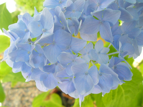
    6 27 11 Garden Potted Hydrangeas

    So as I walked through my garden this week I realized that having a garden is like watching an awakening of a new life. When we plant a seed, we know in our head that it will produce a particular kind of plant. After a period of time we know that it will grow into a flower or veggie. But have you stopped lately to consider just why it does that? That life comes from somewhere...it is not mere mechanics. I choose to give all the glory to the Master Gardener in heaven. Here are some of His creations that have come to life in my yard.

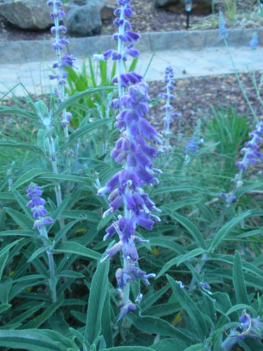
    6 27 11 Sage

    Sometimes I choose a plant because of its color, sometimes its fragrance, and sometimes its texture. My new Sage has it all...another bee loving plant in our remodeled frontyard. I love this plant and I hope it continues to grow right where it is in the middle of my walk-way plantings.

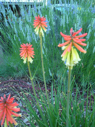
    6 27 11 Red Hot Poker

    This plant is Mr. A's favorite and he asked if we could add it to the front yard when we were planning the new beds. This Red Hot Poker is a favorite of the hummingbirds. I actually thought it was dead this past winter because it didn't look at all like it had any life left in it but here it is....glorious. You can see my English Lavender in the background as it is bursting with blossoms and bees.

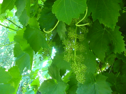
    6 27 11 Grapes on the Vine

    Our grapes coming along strong. In fact, we had to cut them back already because they were overwhelming the corner of the garden where we sit in their shade. We have a couple varieties planted but I am pretty sure these are the Thompson seedless...good eating grapes.

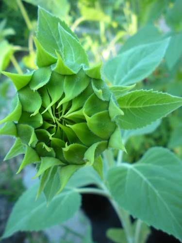
    6 27 11 Garden Sunflowers

    Sunflowers by the dozens are all starting to form in our bee garden. Wake up sunflowers!

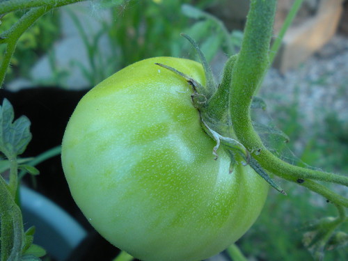
    6 27 11 Tomatoes

    Tomatoes are green but hold the promise of being sweet juicy morsels soon.

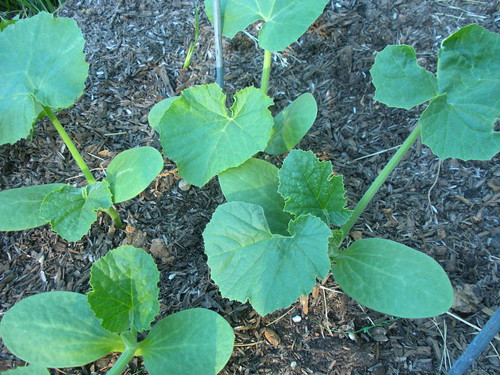
    6 27 11 Pumpkins!

    Pumpkins in the Three Sisters Garden are growing by the minute. We had a few days of hot hot weather and they loved it. I am thrilled they are looking so great!

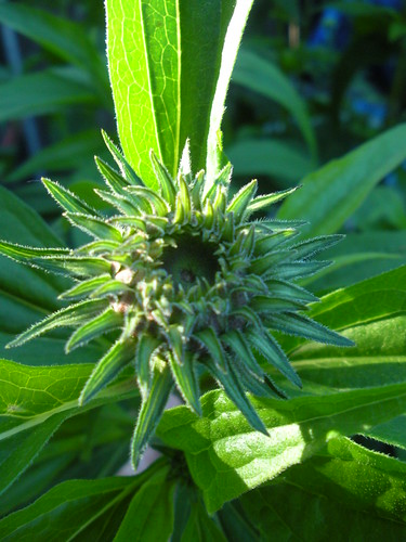
    6 27 11 Coneflowers

    We have coneflowers that are almost taller than I am this year.I think the buds are almost as pretty as the flowers but the bees are waiting on the real thing.

    6 27 11 Green Beans on the Pole
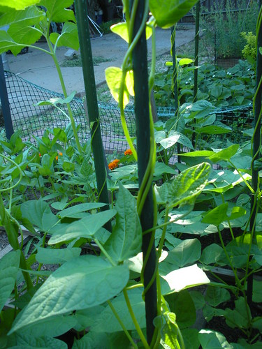
    Our pole beans are holding on tight and climbing towards the summer sky. I swear I put the poles in and the next day they were already half way up....I need to do a time lapse. My morning glories are doing the same thing out in the other garden.

    6 27 11 Butterfly Bush Purple

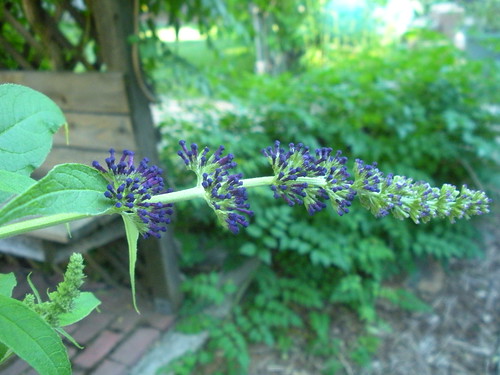
    The Butterfly bush is going to be in full bloom soon. We planted three new bushes this year and I love the graceful way they grow. I am not a tidy gardener so it is fine with me that they sort of grow as they wish. My garden this year is by far the most free-flowing of all gardens. I decided it is more fun not to try to control everything.

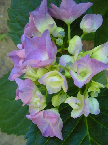
    6 27 11 Garden Hydrangeas

    One last hydrangea image....especially for my hydrangea loving friend Tricia.

    Hope you enjoyed your stroll through our gardens this week. We had two inches of rain last night so I am glad that I got out and took the photos a few days ago. We never get that much rain in June so it continues to be an unusual year here in Northern California.


    Jami's Tuesday Garden Party meme is open from Tuesday to Thursday so there is still time for you to jump in and participate!

    Rain

    It has been hot and humid with rain expected for a couple of days. Yesterday afternoon the rain came with a few bursts of thunder. Lovely big drops of rain. Relief from the humidity at last.
    I do love taking pictures in the rain, I just need to work out a better way to hold the umbrella when my camera is in two hands.

    A Major New Public Artwork: Martin Creed, Work No.1059, Edinburgh Art Festival.


    2011 sees the unveiling of a major new public artwork by Turner Prize winning artist Martin Creed for the historic Scotsman Steps. Commissioned by The Fruitmarket Gallery, Work No.1059 is an impressive feat – 104 steps leading from the Scotsman Hotel on North Bridge to Waverley Station and The Fruitmarket Gallery on Market Street, each step clad in a different colour of marble.

    Martin Creed is an artist of international reputation, who makes work of the highest quality. His work is generous, direct and convincing, with an economy of means that belies the complexity of its affect. In 2001, he won the Turner Prize with Work No. 227: The lights going on and off. His recent exhibition Down Over Up at The Fruitmarket Gallery was one of the highlights of the 2010 Edinburgh Art Festival.

    The Scotsman Steps were built in 1899 as part of the Scotsman Building for the Scotsman newspaper. The Steps are contained in an octagonal stone tower and form a pedestrian link between Edinburgh’s old and new towns. The Steps were somewhat dilapidated, and have been refurbished by Edinburgh City Council and Edinburgh World Heritage. Creed’s sculpture forms a key addition to the refurbishment.

    Work No.1059 sees Creed re-surfacing the Scotsman Steps with different and contrasting types of marble from all over the world, creating a visually spectacular, beautiful and thoughtful response to this historic artery. Creed describes the project as a microcosm of the whole world – stepping on the different marble steps is like walking through the world, the new staircase dramatising Edinburgh’s internationalism and contemporary significance while recognising and respecting its historical importance. This is both a typical Creed idea, involving as it does the direct engagement of the public in a work whose simplicity belies its conceptual and architectural complexity, and an appropriate response to the particular situation of the Steps. Built into the fabric of Edinburgh, this new work will become a new and joyful part of the experience of the city for both inhabitants and visitors alike.

    Edinburgh Art Festival runs from 4 August - 4 September.

    edinburghartfestival.com
    fruitmarket.co.uk

    Aesthetica Magazine
    We hope you enjoying reading the Aesthetica Blog, if you want to explore more of the best in contemporary arts and culture you should read us in print too. In the spirit of celebration, Issue 41 includes a piece on Guggenheimn Bilbao where the Luminous Interval features internationally acclaimed artists such as Louise Bourgeois, Kiki Smith and Damien Hirst, ArtAngel's new commission at MIF, Bruce Nauman's retrospective at The Kunsthalle Mannheim and Cory Arcangel's Pro Tools at the Whitney in NYC. You can buy it today by calling +44(0)1904 479 168. Even better, subscribe to Aesthetica and save 20%. Go on, enjoy!

    Image:
    Martin Creed Work No. 1059, 2011. New Commission for the Scotsman Steps.
    Courtesy the artist and Hauser & Wirth. Copyright: The Fruitmarket Gallery. Photograph: Gautier Deblonde.

    Tuesday, June 28, 2011

    Our June Bird Study: Lesser Goldfinches Eat My Sunflowers

    6 27 11 Sunflower Leaves - Eaten by Finches
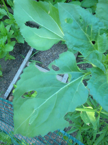
    Sunflowers in our garden (self-seeded). Tasty snack for the goldfinches.


    We have a beautiful songbird in our backyard that sings to us as we garden. He often is seen in our finch feeder but he also has another part of his diet that is interesting. The Lesser goldfinch eats our sunflower's leaves! They must be so very light because they can land on the leaves and they hardly dip under the weight. They nibble the green parts of the leaves and leave holes and skeleton leaves on the plants.

    I found this video on YouTube.com that shows what we observed in our garden.


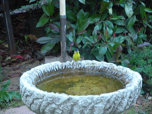
    5 11 11 Garden birds Goldfinch in the Birdbath
    I caught this Lesser goldfinch in our birdbath....bathing and singing.
    There is a lesson in the Handbook of Nature Study (Lesson 10) and a previous Outdoor Hour Challenge (Yellow Birds) for the goldfinch which includes this link: Get Gorgeous Goldfinches! The article gives you tips for attracting and then feeding your own goldfinches. If you would like to hear the goldfinches song, you can listen at AllAboutBirds.com.


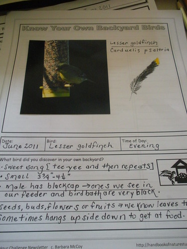
    Goldfinch Notebook Page
    We used a photo and the notebook page from the June Newsletter.
    We read on AllAboutBirds.com that the Lesser goldfinch sometimes makes its nest in among grapevines to shade the nest from the sun. We think our finches are nesting in our grapevines that are near our back birdfeeder. I never thought to look there.

    We love these little birds and even though they cause a little mischief in the sunflower patch, we hope they stick around for awhile.

    This is the last of our June Newsletter Challenges. We were able to complete all four this time.
    Here are links to the other three:
    Garden Critter: Honeybee
    Tree: Sitka Spruce
    Crop Plant: Corn


    Tweet and See button

    Now for our Tweet and See list for June 2011
    Backyard and Neighborhood:
    1. Turkey vultures
    2. Steller's jay
    3. Oak titmouse
    4. Lesser goldfinch
    5. Anna's hummingbirds
    6. California quail
    7. Western scrub jays
    8. Mourning doves
    9. Acorn woodpecker
    10. Common raven
    11. Wild turkeys
    12. Cooper's hawk
    13. White-breasted nuthatch
    14. California towhee
    15. Spotted towhee
    16. House finches
    17. American crows

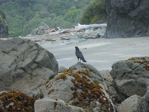
    Tidepool morning and Crows
    Trip to Oregon-There were more birds that I didn't know so I can't list:
    1. Osprey
    2. Brown pelican
    3. Song sparrow
    4. American crows
    5. Turkey vultures
    6. American robins
    7. White-crowned sparrows
    8. Western gull
    9. California quail
    10. Black oysercatcher
    11. Winter wren

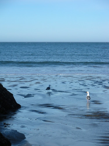
    Tidepool Morning and the Gulls

    Happy Birding!

    Item of the Month, June 2011 - "An important alchemical manuscript..."

    This year's Manchester International Festival sees the premier of a new opera, based on the life of the Elizabethan mathematician, astrologer and alchemist, John Dee.

    We've already tweeted about the Opera and flagged up some Dee-related items from our collections. We didn't highlight the following item however, saving it for a more detailed 'Item of the Month' post.

    What you see here is a page from our MS.239, titled 'Practica et accurtaciones Georgii Ryplay et Raimundi' (in other words, notes on the alchemists George Ripley and Ramon Lull). It consists of 67 pages, in English and Latin, written in italic and in a secretary hand - the handwriting being that of John Dee himself.


    The manuscript was purchased for Henry Wellcome on 17th February 1931 from an auction at Sotheby's, where it was described in the sale catalogue as "an important Alchemical manuscript...on the transmutation of metals and search for the Elixir of Life". Tha author of the sale catalogue was guarded on its provenance, stating it was "probably in the hand of John Dee" but noting the manuscript's "very detailed resemblances to the varied hand of Dee".

    By the time the manuscript was catalogued by the Wellcome, cataloguer S.A.J. Moorat was more certain of Dee being its author, noting that "there seems little doubt that this MS. is by the hand of the famous astrologer and alchemist". Moorat noted the initials J.D. are found - identical with those in other authentic Dee MSS - on five of the manuscript's pages.

    Also noted by Moorat - and visible on the image above - is Dee's small 'ladder sign' given as one of his attributable marks in the 1921 title Preface to the List of MSS. formerly owned by Dr. John Dee. This reference work was produced by the then Provost of Eton College, Montague Rhodes James - now remembered more for his seminal tales of the supernatural, than for his scholarly research.

    It's rather fitting that Dee and James are linked by this manuscript: it's easy to imagine its occult contents - and the elucidation of them by curious antiquarians - to lie at the dark heart of one of James's stories.

    For more on the possible influence of Dee on James's story 'Count Magnus', see this essay from the M R James site, Ghosts and Scholars

    Salt of the Earth: Ken & Julia Yonetani, Still Life: The Food Bowl - Artereal Gallery, Sydney.

    Review by Isabella Andronos

    A decadent feast appears in the space at Artereal Gallery; a table set with goblets and candlesticks among abundant seafood, fruit and wine. Rococo style pillars topped with urns spilling fruit, an enormous chandelier and five detailed frames also occupy the space. These are sculptural works made by Ken and Julia Yonetani, each comprised entirely of salt. The works explore a contemporary interpretation of a traditional theme in painting, the still life, taking this idea into the third dimension.

    Salt is vital for all living creatures. It is essential, but salt can also be deadly. The work of Ken and Julia Yonetani has particular relevance to contemporary Australian issues, related to the highly saline groundwater along the Murray-Darling Basin. Supported by the Australian Network for Art and Technology, Sunrise 21, Murray-Darling Freshwater Research Centre and the Australia Council for the Arts the works emerged as part of a Synapse residency in Mildura. Salt from the Murray-Darling area was used to create the sculptural works. Enacted entirely of salt, the works herald a link to this site, challenging audiences to consider the destructive implications of salinisation and the possibility of environmental decline.

    There are obvious visual ties to the decadent table spreads in traditional still life painting, particularly of the Vanitas genre. Showing painted depictions of indulgent spreads of food, wine, flowers and skulls, these works aimed to represent the brevity of human life and the problems associated with a hedonistic lifestyle. Understanding salt as a destructive element, as in the case of the Murray-Darling Basin, the works can be seen as a warning, as an ominous symbol for the possibility of the death of the ecosystem. Devoid of colour, the white of the salt acts as a stark distinction between the Yonetani’s work and the boldly coloured images of the traditional still life painting. Their work transcends the two-dimensional painted surface of traditional still life painting, drawing sculptural elements together to create an intimate representation of contemporary issues. By depicting a lavish table setting, the Yonetari’s make reference to the global issues related to food; food wastage, food shortage, and human destruction of the environment.

    An enormous chandelier, comprised of 5 000 individually cast grapes, hangs close to the front window of the gallery. Each grape has a grainy textural surface, every single piece created using Murray-Darling salt. Suspended from the ceiling, the small cast shapes appear like crystals. At over two meters high, the sculpture becomes an enigmatic representation of bourgeois decadence. Also in the gallery space is The Five Senses, a series of five ornamental frames made of salt which are displayed on the walls of the gallery. There is no picture within the frame; the void space shows only the wall it is displayed on. The intricate pattern on the surface of the frames can be linked to the traditional gilded frames of the Renaissance period. The small grains of salt which comprise the structure glisten as they catch the light from the gallery. The title of the works comes from the series of paintings, The Five Senses, 1617-1618, by Jan Brueghel and Peter Paul Rubens, each which depicts one sense; taste, smell, vision, touch and hearing. These paintings, with all the decadence of the Renaissance aesthetic, depict elaborate scenes busy with objects, furniture, human figures, animals, paintings, food, musical instruments and both the interior and exterior landscape. Removed from the lively and chaotic traditional images, the Yonetani’s work appears quite minimal. Subverting the traditional use of the frame, seen as a means of hanging a painting, the frames created by the Yonetani’s act as aesthetic objects. They are paired back and stripped of their traditional context. They exist as objects in themselves, rather than acting simply as a structure to contain an image.

    Salt aids in the formation of clouds, it was used for funeral offerings in ancient Egypt, it was traded for wine and commodities by the ancient Celts; it is essential for life but also dangerous in excess. The work of Ken and Julia Yonetani is enigmatic, salt structures have been created which symbolise the importance of balance within ecosystems. Using salt from the Murray-Darling Basin, the works create awareness about salinisation and problems with environmental decline in this area.

    Still Life: The Food Bowl by Ken + Julia Yonetani continues until 2 July, 2011 at Artereal Gallery, Australia.

    Still Life continues to Arts Mildura as part of Mildura Palimpsest #8: Collaborators and Saboteurs 9 – 11 Sept and
    GV Art, London from 6 Oct - 22 Nov.

    kenandjuliayonetani.com
    artereal.com.au

    Aesthetica Magazine
    We hope you enjoying reading the Aesthetica Blog, if you want to explore more of the best in contemporary arts and culture you should read us in print too. In the spirit of celebration, Issue 41 includes a piece on Guggenheimn Bilbao where the Luminous Interval features internationally acclaimed artists such as Louise Bourgeois, Kiki Smith and Damien Hirst, ArtAngel's new commission at MIF, Bruce Nauman's retrospective at The Kunsthalle Mannheim and Cory Arcangel's Pro Tools at the Whitney in NYC. You can buy it today by calling +44(0)1904 479 168. Even better, subscribe to Aesthetica and save 20%. Go on, enjoy!

    Image:
    Ken + Julia Yonetani
    Still Life: The Food Bowl (installation shot)
    2011
    Murray River salt
    Dimensions variable
    Images courtesy of the Artists and Artereal Gallery, Sydney.

    Legs

    Showing off the girls. I'm thinking of doing a series on tattoos, there are so many around now. What do you think?

    Monday, June 27, 2011

    Wallpaper Design by Emanuel Josef Margold

    Illustration: Emanuel Josef Margold. Wallpaper design, c1910.

    Wallpaper design work is often looked down upon as one of the lesser decorative skills. William Morris was particularly sneering and saw no real creative value or point to wallpaper pattern work. However, that did not stop him from producing prodigious rolls of the stuff throughout most of his career and to a certain extent, it could be said to have kept Morris & Co afloat through the most difficult economic times of the company.

    Wallpaper design work is often indicative of a specific design style and can be easily identified and associated, often more so than textiles, with a particular decorative era. Sometimes wallpaper pattern work could even be slightly ahead of the more generalised decorative periods, and examples of wallpaper work can be seen that pre-empted a number of the major interior styles and movements, particularly in the twentieth century. However, even when considering nineteenth and indeed eighteenth century wallpaper work, styles and pattern work were often relatively immediate and topical. Whether this had more to do with the immediacy of the medium, compared to other areas of interiors such as textiles and furniture, or whether it had more to do with the large number of companies involved in the business of wallpaper making and the extreme competition that that engendered, is to be debated.

    Wallpaper decoration and the professional designers that fed the industry, usually on a freelance commission basis, were wide-ranging and covered a host of skills from illustration to architecture. Many had little or no experience in the basics of wallpaper design, which is a technical as well as creative occupation. That a large proportion of designers, both commissioned and employed by wallpaper companies were primarily textile designers, suggests a similarity in both design fields. This would help to explain why textiles and wallpaper design are often so closely linked as disciplines when discussing the history of interiors.

    The Austrian architect and designer Emanuel Josef Margold produced the two wallpaper designs that illustrate this article at the turn of the first decade of the twentieth century, in about 1910. Margold was known to have produced a range of work during the early twentieth century that included printed and woven textiles, embroidery, and wallpaper design. He was a member of the Wiener Werkstatte where he was for a while Josef Hoffmann's assistant. This relationship often gives the impression that Margold's work was derived from that of Hoffmann, and while there is a certain similarity, it only really corresponds when seen in the larger light of Austrian and German Jugendstil decoration. It has to be remembered that while Margold was indeed a member of the Wiener Werkstatte, he was also a one time resident at the Darmstadt Artists' colony, and also a member of both the German and Austrian Werkbund. This perhaps gives Margold a much larger and more comprehensive appreciation of the decorative arts in Central Europe before the First World War, and also that of his place within it, than perhaps the generalised moniker of being an assistant to Josef Hoffmann.

    Illustration: Emanuel Josef Margold. Wallpaper design, c1910.

    As to the two examples of his decorative wallpaper work, both appear bold, strikingly confident and graphically motivated. Neither show any of the complexity and involved style that was popular in both France and Britain. To be fair there was an element of pairing down and simplifying of wallpaper design even in France and Britain, although both came to this result from different directions, which was often the result of revivals and historical precedents. However, neither country was involved in modern ideals on anywhere near the scale produced in Central Europe. The movement in Germany and Austria was very much a matter of looking for new concepts and ideas and using many of the new skills being rapidly developed in both architecture and illustration.

    This initial discovery and exploration was to become an unstoppable movement that would take decoration and pattern into a whole new area of exploration during the 1920s and 1930s. Inevitably due to the start already made by Margold and others like him throughout Germany and Austria in the first decade of the twentieth century, the notion of true modernism and the exploration and development of that decorative ideal went much further and faster than that of France with its conservatively and elitist led Art Deco formula. 

    That decoration and pattern itself was to suffer the shock of being removed or at least disassociated from architecture, and to an extent interiors by the Modernist movement, has led to a seemingly permanent disruption of the central role decoration played for centuries in the cultural life of Europe. That Modernism generally saw the decorative arts as an irrelevance, is still very much with us today and can clearly be seen when considering the very subservient role that the decorative arts play in the world of contemporary architecture.

    This was clearly not in the minds of those who designed wallpaper pattern work in 1910. However, the direction of increased simplicity on all fronts of the decorative arts during this period, does beg the question as to the reasoning behind the simplifying and de-cluttering of interiors. It seems as if there was perhaps more significance to the downsizing and eventual downgrading of decoration and pattern than being merely that of the removal of the more ornate excesses of late Victorian decoration and the increasingly scientific approach to health and interiors. Not a conspiracy as such, but perhaps a generalised shift in emphasis and ideal.

    Further reading links:
    Wallpaper: A History of Style and Trends
    Pattern Design: Period Design Source Book
    Wallpaper, its history, design and use,
    Twentieth-Century Pattern Design
    German Modernism: Music and the Arts (California Studies in 20th-Century Music)
    Exotic Spaces in German Modernism (Oxford Modern Languages & Literature Monographs)
    The Total Work of Art in European Modernism (Signale: Modern German Letters, Cultures, and Thought)
    Erich Mendelsohn and the Architecture of German Modernism (Modern Architecture and Cultural Identity)
    German Cities and Bourgeois Modernism, 1890-1924
    German Encounters with Modernism, 1840-1945
    The Divided Heritage: Themes and Problems in German Modernism
    Wiener Werkstatte: 1903-1932 (Special Edition)
    Wiener Werkstatte: Design in Vienna 1903-1932
    Textiles of the Wiener Werkstatte: 1910-1932
    Viennese Design and the Wiener Werkstatte
    Wiener Werkstatte: Avantgarde, Art Deco, Industrial Design (German Edition)
    Wonderful Wiener Werkstatte